#
One of the downloads for this is a CBR file, which is really just a compressed RAR file. Comic book reader programs can read these without you needing to extract the files.
#
I was experimenting with a way to organize a story into as few frames as possible. I came up with this Sonic lemon to test out this approach. First, I narrowed it down to just the 4 sex scenes, and tried to figure out how I'd tell the story with just 4 frames. Then, I'd do it again, but devote 2 frames for each part instead of just 1, and figure out how best to tell the story with 8 frames. Then I tried it with 3 frames per part, and that seemed to be a good compromise between story comprehension and laziness.
Then, whenever I felt like it, I drew one of the frames. I'm not really slow, just very lazy. I used to be able to crank out a comic with each frame taking 20 minutes, but it's been awhile so it took about an hour for each picture. It took 12 hours to color and shade all of these. And instead of going to the trouble of designing a frame composition, I decided to parody a newspaper comic strip.
#
Now for the juicy technical details. The rendering was done in Photoshop using the following process:
- I set the sketch layer to use "Multiply" blending.
- I made a layer called "colors" underneath it and used a hard brush to gave the characters and objects flat colors.
- Then I made a layer called "BG" above this, used the magic wand to select the areas outside the objects and characters, turned the selection into a layer mask, and threw together a cheap background on that layer.
- (optional) I'd make a layer above the background layer and name it "mood", then I'd fill it with a radial gradient, set its blend to "hard light" and reduce its opacity. This is a cheap way to add atmosphere.
- I made a layer called "shading" above the "colors" layer, set its blending mode to "hard light", and filled it with 50% gray.
- I used a large soft brush, with its flow set to 1%, and its spacing set to 2%. I set my palette to 25% gray and 75% gray. Then I shaded the picture. (SHORTCUTS: [ and ] adjust brush size. X swaps palette colors.)
- I added iridescence to the shaded colors by duplicating the "shading" layer, inverting it, using levels to make the shadow areas white and everything else black, I copied this inverted image, hit "Q" to go into quick-mask mode, pasted it, and hit "Q" to exit quick-mask. Then with this selection active, I created an adjustment layer above the "colors" layer and shifted the hues down by -20. I then deleted the inverted layer. (I only used it to select the shadows) Iridescence makes the shading look better. Many artists achieve this by shading with complementary colors. But I'm lazy and just shade in grayscale and later shift the colors this way.
- The image is done. Now to add a couple cheap enhancements. The first is Bloom. I selected the whole image, then hit CTRL+Shift+C (copy merged), then pasted this above everything. I set its opacity to 50% and gave it a gaussian blur of about 5.
- Then I added another cheap enhancement: Texture. I created a layer called "texture" above everything, filled it with 50% gray, set its blend to "overlay", added noise (10% gaussian monochromatic noise), gave it a gaussian blur of 2, gave it a motion blur of 20 at any angle that looks good, and sometimes set its opacity to 50%.
#
A finished comic-frame has these layers:
- texture
- bloom
- lines
- mood
- BG
- shading
- iridescence
- colors
#
Then I just flattened it, shrunk it to half size (bicubic sharper), and literally pasted it over a Garfield strip.
#
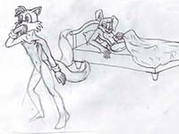
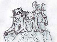
I’ve also uploaded some of the sketches I drew while working on this comic, so you can see some of the alternate poses and the thought process behind each image.
 Frame 7
 Frame 8
 Frame 9
 Frame 10


