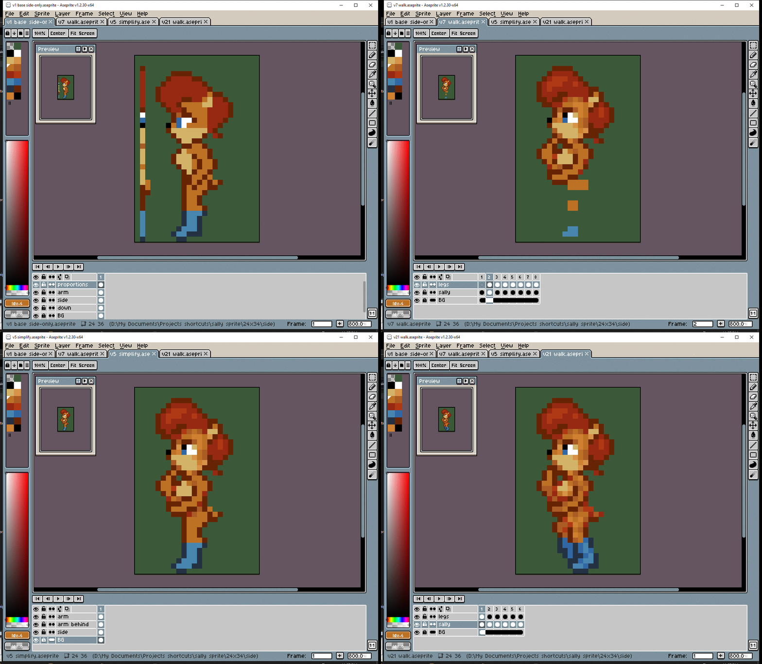
#You Turn Me Right Round!
# Let’s make the side view. I start with side-by-side to try to keep the proportions the same, but the distance between them can make it hard to line things up.
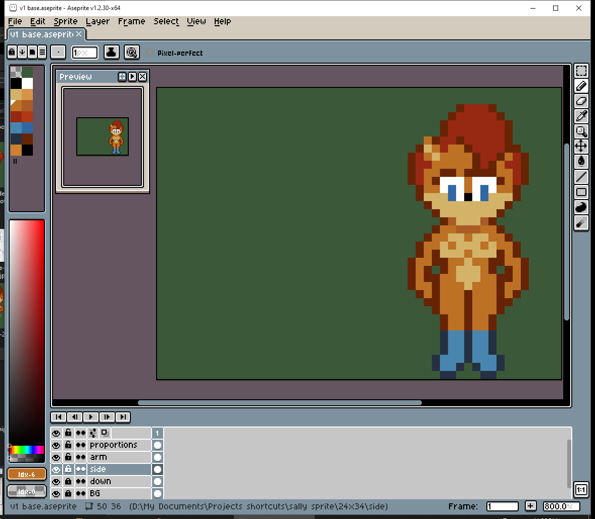
# But then I had an idea. Draw a thin line of pixels, with the colors of important details. I can put this line right next to the side view while I’m making it. I think this technique worked pretty well.
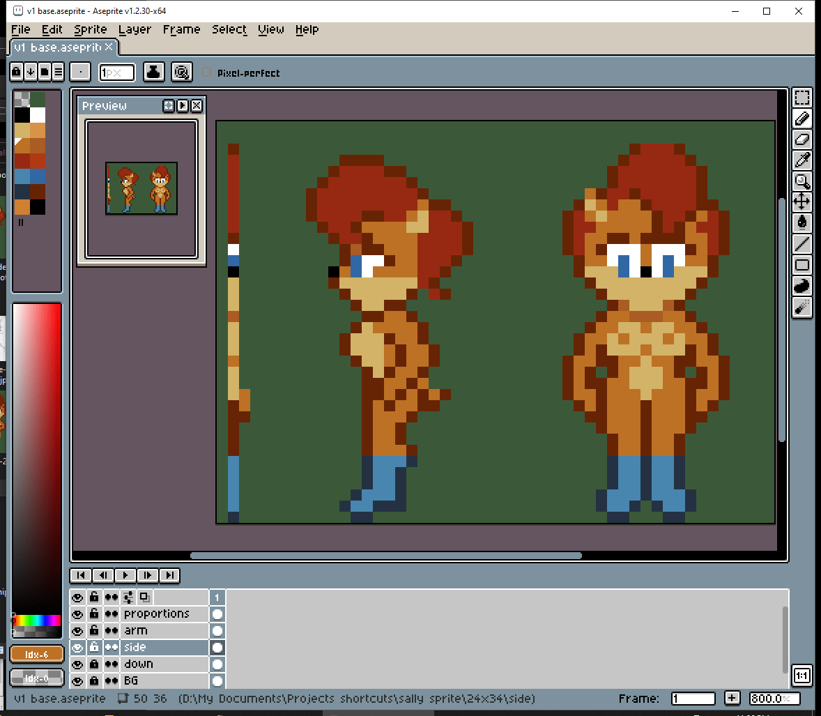
#A Preview of Things to Come
# Now to immediately add as much detail as possible. I haven’t even given her a pose yet. I just want to see what the end-result will probably look like.
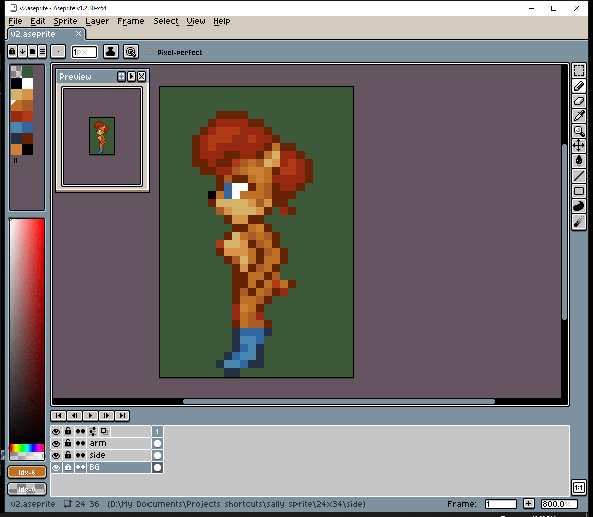
# After doing a TON of experiments with the eyes in the front view, I decided they needed more contrast. (somebody actually suggested big anime eyes would look better, but I found them harder to work with)
# Okay, before I dive into making the walk cycle, I should figure out her pose. The way she walks should show her personality. Well… nothing too crazy, but Sally IS a thinker.
#Get a Move On!
# Now to immediately undo everything just I did! No actually I’m just simplifying the colors before I start animating.
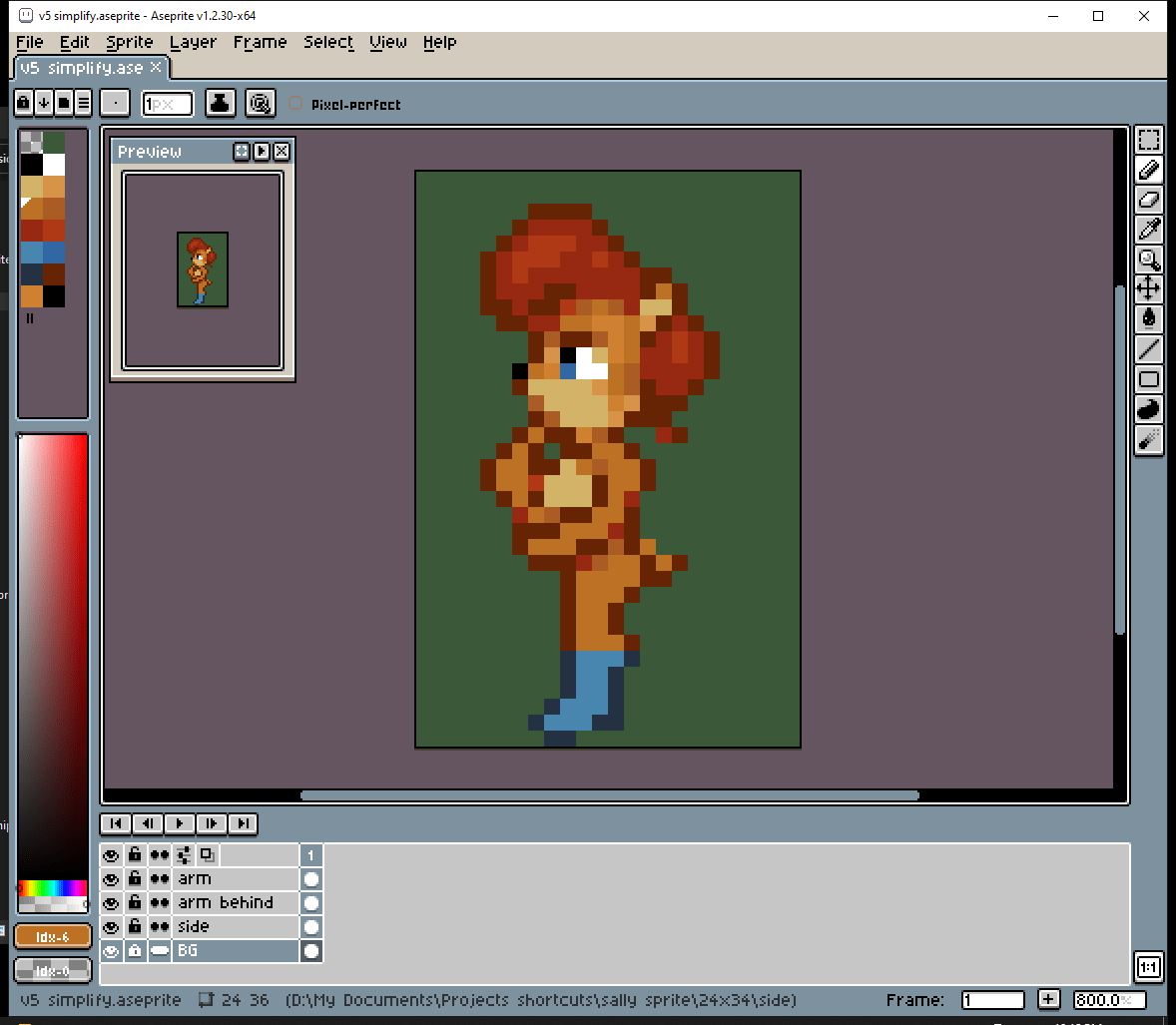
# Simplify moar!!
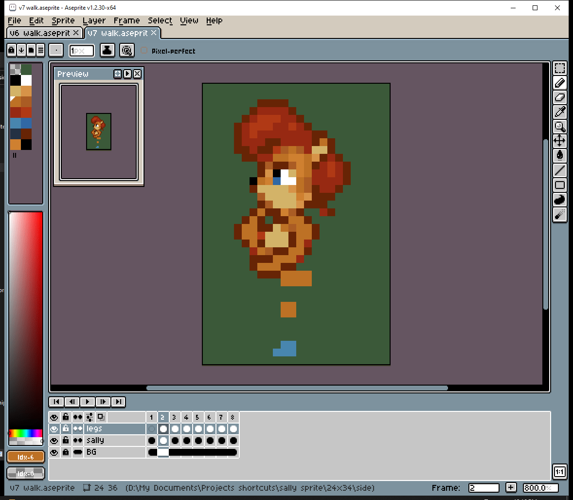
# This is my “walking dots” technique. Just figure out the positions of the feet and knees. After everything is positioned juuust right, I’ll just “connect the dots”

# Well… after outlining them.

# It’s really more of an “outline and fill” technique.

# The back leg is darker to indicate that it’s further back. Her whole body is basically casting a shadow on it.
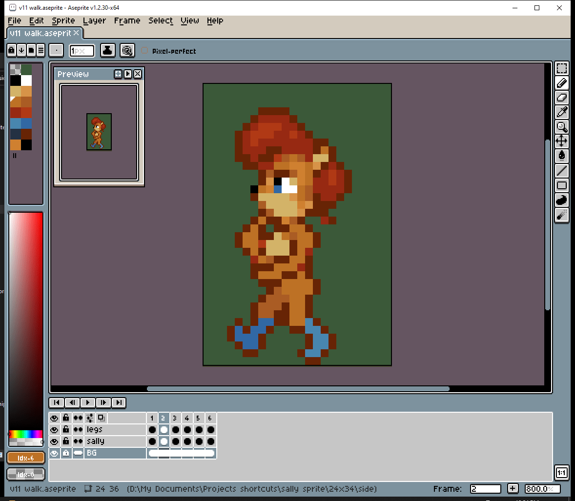
# Now to go through and tweak all the outlines until these… things start looking like legs. Obviously I wouldn’t get everything perfect the first time. It’s my… “outline and fill and fix” technique?

# Shading the boots. They need these extra details to show their intended shape.
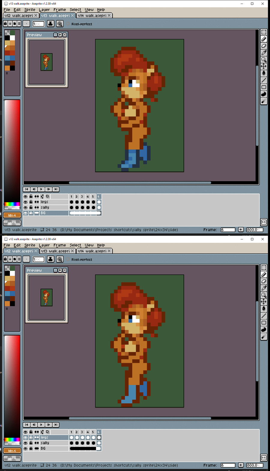
# Legs too. Shading = sweet sexy curves.
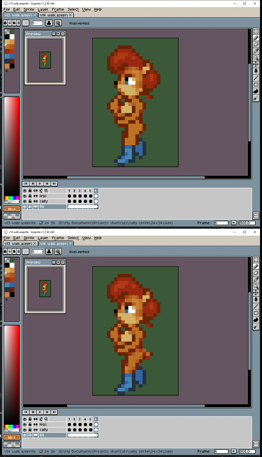
# It’s starting to come together. But I am NOT DONE YET!

#Secondary Movement
# The REAL reason why I’m making this walk cycle.

# There’s a whole lotta weight sitting on top of that head. It’s gonna move. Just like in the front pose.

# Yeah girl! Shake dat… finger.

#Question Everything
# Everyone knows that More shading = Better art.
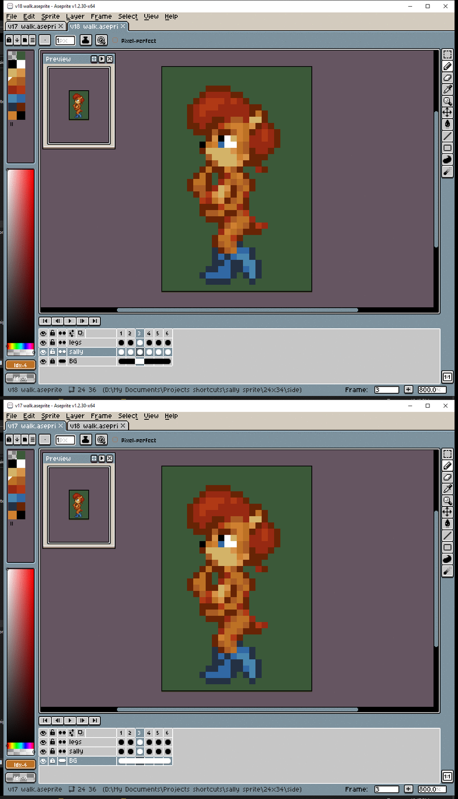
# People on Discord weren’t sure if the tail’s pixels looked right. Is the gratuitous movement to blame?

# The tail was tricky. I originally had a lighter pixel to show where it connected but having a light pixel against the background looked odd since that never occurs anywhere else.

# The tail is pretty small. Realistically it might not have any noticeable movement. But while I think this looks… fine. The more-animated version makes my eyeballs happier.


# The outline of the boobs was getting kind of lost at the bottom. I was too busy trying to add contrast to make that nipple noticeable. But when it comes to outlines, defining the large shapes should take priority over teeny-tiny details.
#The Result
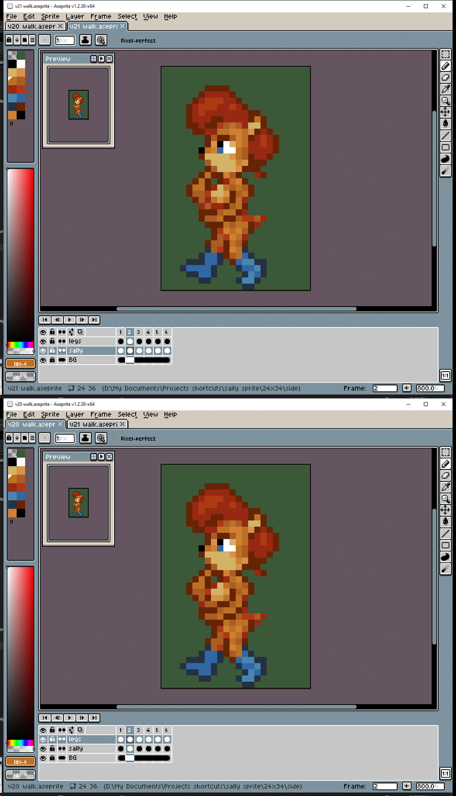
# Aaaaaand…. done!


# Proportions, simplify, animate, refine shapes, gratuitious shading.
