#The Idea
# I’m feeling inspired by @isadultart’s Rouge animation. I think I’ll try creating a boob-sway idle animation for my RPG characters. But I don’t want to just re-create this exact same pose. https://twitter.com/servedasiS/status/1170512309007069184

# I want to do something more like Marle’s standing pose with the shoulders idly swaying back and forth to create lots of chest movement.
#The Challenge
# The challenge is my sprites are much smaller. This animation is mostly about subtle movements that can’t be prototyped using big chunky pixels. It needs sub-pixel anti-aliasing. Normally that’s the LAST step I do, not the first. So I can’t use my usual process.

# If I can’t improvise this in low resolution. Maybe I should plan it out first at high resolution using drawings or something. Once I know exactly WHAT every frame looks like, it should be possible to re-create the movements as a low resolution sprite.
# I just need to be careful to use the same chibi proportions so that the pose is actually possible in low resolution. I should probably figure that out first before I make any high resolution sketches.
#Attempt 1
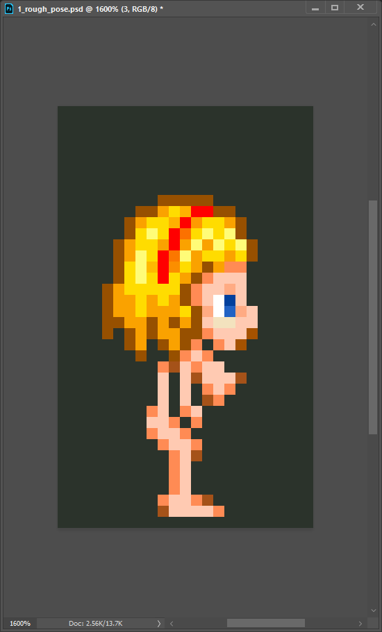
# I made an attempt, but it’s turning into RottyTops with most of the movement in the hips. It’s kind of nice, but this was not my goal. I might come back to this version later after I finish the animation I’m trying to make.

# This is what Rottytops looks like in the Shantae games, by the way.

# Right after creating my last sprite animation, the skill that goes into Wayforward’s Shantae games seems even more impressive to me now.
# Somehow, they manage to keep the outlines the same color and animate mostly in full-pixel increments. I suspect it’s a combination of using slightly larger sprites and motions that are more readable as a 2D silhouette. (greater lateral movement instead of rotating in 3D space)
# So my own technique seems to rely more heavily on sub-pixel antialiasing to show movements in 3D space. That sounds impressive but it’s more time-consuming and results in less readable motions. So it’s less practical. But I still like it and think it’s damn cool.
# From an animation standpoint, it’s generally recommended to use clearly readable poses and motions. (recognizable silhouette shape and lateral movement are more easily understood by the eye)
#New Method, New Tool
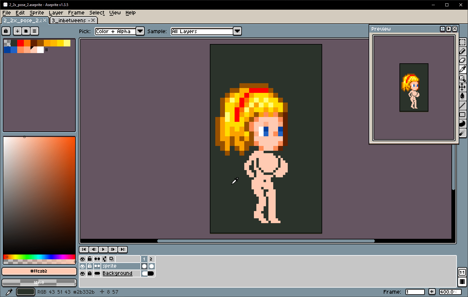
# I decided the simplest thing was to just work at 2x scale. I’d like to have onion skinning to preview nearby frames, but Photoshop sucks at that, so I’m trying out Aseprite. So far it’s fantastic.

#Attempt 2
# I think I have the basic motion figured out. Now to add the boob motions and then re-create it at half size with sub-pixel hints.

# Boobs in place.

# Now to tween the rest of the body’s frames so everything animates cohesively.

# Tweened the body. I thought the boob animation looked off, so I’m redoing it by “attaching” them to the pits of the arms to anchor them to the body. I’ll add velocity follow-through afterwards.

# And now with some slight follow-through added to create delightful boob-collisions.

#The Method
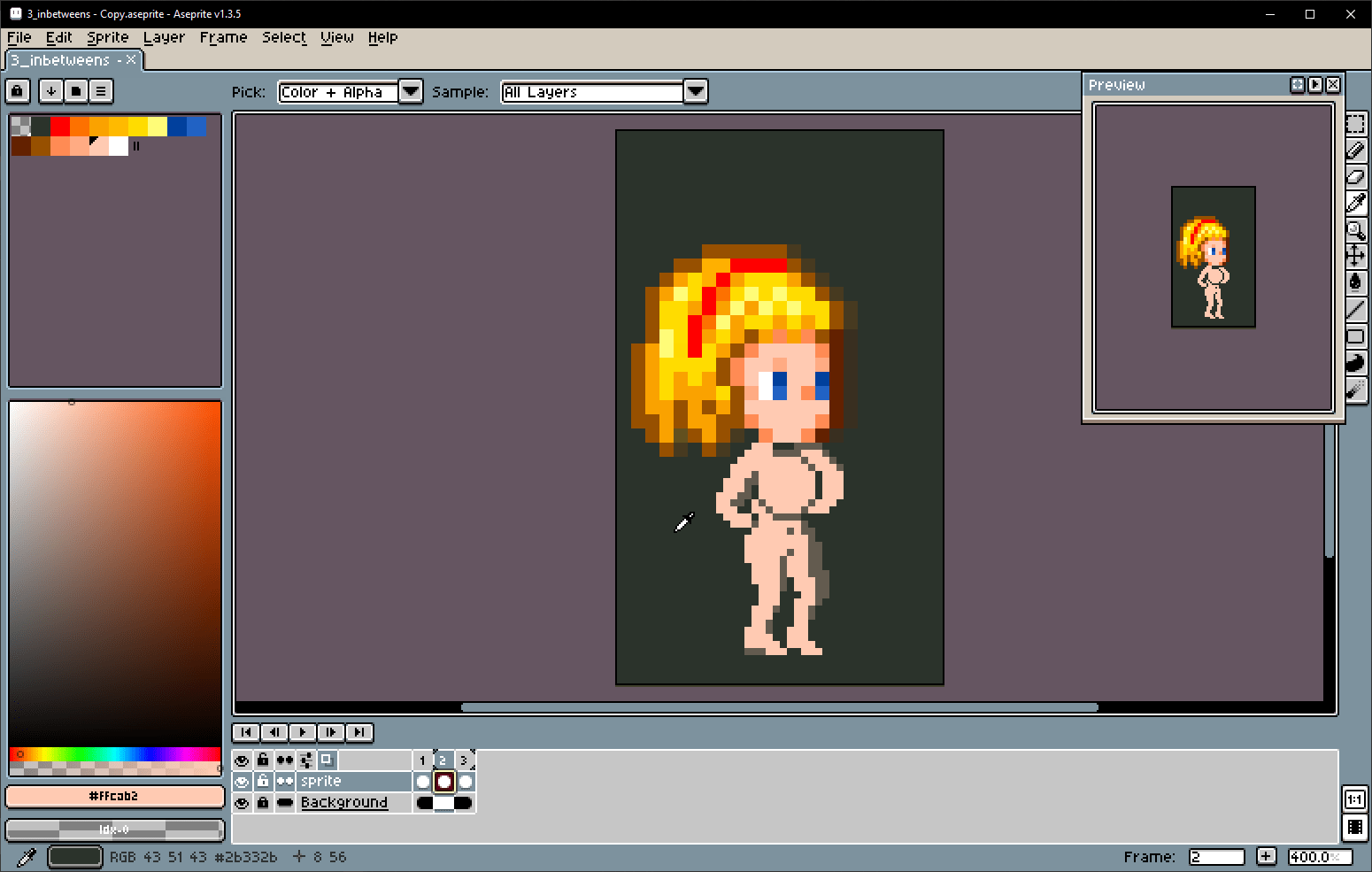
# I think I got it figured out. Use a 2x2 brush snapping to a 2x2 grid and sample colors directly from the reference picture. Looks like this will work.

# Welp, that worked. I discovered that instead of redrawing each frame from scratch it was easier to copy the previous frame and then just shift things around.

# I just realized that this actually looks more like the character has their hands tied behind the back and they’re struggling. It’s probably a combination of the fast frame-rate and the exaggerated motion. Maybe it’ll look “idle” if I slow it down?

# The noticeable bend of the elbows also implies that they’re tied-up. Whereas straighter arms would look more relaxed and “idle”
# I’ve decided to use this as a struggling pose. I’ve exported it to Photoshop and used linked smart objects to add an automatically swappable head so I can easily generate this pose for any of my characters.

#Attempt 3 (The right way?)
# Okay, let’s try making that swaying animation again.

# This time, I’ll resist the urge to bend the knees. I’ve planned the “rotation” of the boobs as the body turns.

# Hmm… maybe I should adjust the pose first. Thrust the hips forward and arch the back more. If the head tilts down this will create a more “cute” pose. (picture by Dan Heron)

# … Or maybe not? That might be too much. I want this to be a casual idle pose for an oblivious character, so I don’t want her to look bashful, just curious.

# I’ve definitely got a better torso-twist going this time around. It seems to stick out awfully far, but that works for a “curious” pose and will probably do nice things with the boobs.

# Let’s start by anchoring these puppies to the shoulders. Then add separation and overlap to make the torso “turn.” I like the silhouette this is making.

# I only had to add some slight velocity follow-through to the right boob. The torso-twist-overlap of the left boob already implies the follow-through for that one.

# It works okay. The pose does communicate. But the boob motions are mostly too subtle to be visible. Maybe adding another color shade would allow me to add a couple more hints..

# I added another color and adjusted the boobs. Not sure if the color actually made a noticeable difference with the chest but there’s a small improvement with the legs.

# After a certain point, adding more colors to a sprite usually gives diminishing returns. Too many colors just adds more effort with no real benefit.
# The arms behind the back are bugging me. At small sizes it’s hard to tell whether or not she even has arms.
# This looks better. Not sure if this looks idle or if she just has an itchy back.

# Something still looks off. She looks off-balance somehow. Maybe I should try shifting her lower legs back a little?
#Attempt 4 (Four years later)
# One night I was playing Shantae the Pirate’s Curse and became so delightfully jealous of their awesome sprite animation that I decided to take another crack at this pose. Maybe bring in more of this hip sway?

# But I’ll start from scratch. To help guarantee that my new animation resembles this character’s proportions, I’ll start with new walk pose…
#
![]()
 Erase the outlines to make editing the shapes easier
# … modify it to something approximately like the new pose I want…

# … And then double to resolution so I can fill in the missing details. By drawing the animation frames at this double resolution I am basically figuring out what the sub-pixel details are GOING TO BE without needing to directly draw them AS sub-pixels. I can just draw them using full pixels and anti-aliasing them down later.

# … using my pixel-counting technique.
# It works pretty well!


