#
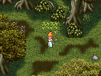
This is Marle being delightfully chaotic, and throwing out things she doesn’t need… like clothes.
#
I made this for a
 remake
of the old
 Guardia Forest
game. The plan is that each scene will include a detailed close-up picture.
#
This picture was also a way for me to test out a new Wacom tablet. It definitely makes it a lot easier to clean up the lines of a sketch and allows for more intuitive, subtle shading. It also makes it possible to improvise hair pretty easily.
#
In this picture, I also managed to improve my technique for adding iridescence, which gave her skin more natural-looking blush tones. The new technique involves creating two real-time hue/saturation layers in Photoshop with one set to a hue of -20 and the other one above it set to a hue of +20. They cancel each other out. But then I copy the grayscale shading layer and use it as a layer mask for the +20 hue layer. For cold color tones, you want to apply the mask to the -20 hue layer instead of the +20 layer. So this picture actually has 4 hue/saturation layers, 2 for all the warm colors, and 2 for all the cold colors. The overall effect gives shadows a different hue than the highlights, and allows me to get away with shading the picture using pure black and white. Shading with just black and white is traditionally discouraged in art because a picture looks bland without any analogous hues or complimentary colors. My iridescence technique is an easy way to add analogous colors without having to choose them manually while painting or shading.

