#What’s The Big Idea?
#
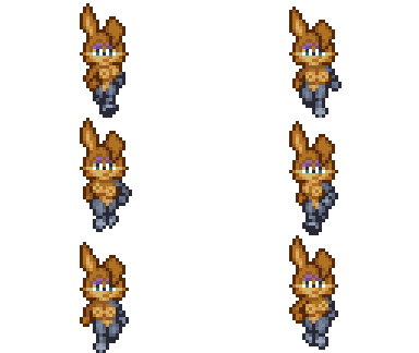
I’ve gotta make a walking sprite of Bunnie Rabbot! Her sweater-puppies are going to be so much fun to animate.
#
 Let’s make Bunnie shorter than Sally. I think it’s kind of canonical, but more importantly this will lean toward “short-stack” proportions that will help make her breasts look bigger.
#
I’ll start by modifying my Sally sprite. That way I can guarantee the proportions and palettes will work well together.

#
If I make the background as dark as the outline, I can skip adding outlines until the end. This way I can just focus on adding and adjusting shapes.

#
Bunnie has scruffier cheek fur. I think it gives her sprite a bit more personality.
#


#
Behold! The magic of short-stack proportions! She’s only 2 pixels shorter and the breasts are only 1 pixel lower from her head, but they end up looking bigger on her body.

#Design is Done, Now Make it Move!
#
I’ve finished adding the anti-aliasing…

#
… so now it’s time to erase it all! I usually simplify a sprite before I animate it. But figuring out the anti-aliasing gives me a good idea of what I want to result to look like.

#
For the walk-cycle I think I’ll copy my own homework. I made this nude edit of Ayla some time ago and figured out a good movement for her breasts. No need to re-invent the wheel. Besides Chrono Trigger characters subtly show their personality in the way they walk. Ayla swings her fists. And since Bunnie Rabbot is a strong confident character, it makes sense to use a similar walk cycle for her.

#
But first… simplify moar!!

#
This way I can focus entirely on where the hands and feet go in each frame and figure out the while “limb” thing later.

#Learning From the Masters
#
Ayla’s walk animation has an interesting quirk. The center line of her legs shifts left and right. I think it has something to do with the way her legs overlap and the twist of her hips.

#
It’s hard to see on her sprite because her fists get in the way, but if you think about it each time she takes a step, one side of her hips will be higher than the other. So when she steps forward, the front hip will be lower and the back hip will be higher.
#


#
I pretty much just copied the position of Ayla’s arms in each frame, but I noticed some interesting subtleties while doing this. Such as the way the arm shading gets darker as it recedes back. And the way her fist swings outward away from her body, then forward (brighter shading), before overlapping in front of her.

#
Once I felt fairly confident about the positions of everything I started adding anti-aliasing.

#
And then the outlines. I use a bright background help be see any missing pixels that might break up the outline. It also discourages me from the temptation to add brighter pixels in the outline to expand or curve the shapes. Sometimes you can get away with that if you don’t go too bright. But you still want the outline to at least appear to be solid against bright backgrounds. Providing contrast is an outline’s entire purpose.

#
This looks pretty good, but her face still has that neutral expression.

#
NOW she has a personality!

#
I know it wastes a palette color, but I think I need to darken the bottom of her eyes to help contrast against her smile. There’s no room to separate them but it just wouldn’t be Bunnie without her flirty smile.

#
In the end this took about 4 hours to make… mostly because I’m obsessive about the details.
#The Result


