#
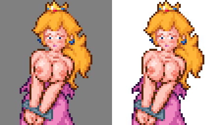
I decided I wanted something similar to this pose, but instead of being tied up I wanted Cream to be spreading her legs and masturbating with some kind of horny look on her face.

#The Face
#
 Keeping the same expression would look more “resigned” than horny. But I find pictures more exciting when the girl is enjoying it.
#
TenshiGarden drew a picture with an expression that was pretty much perfect for this. A nice lusty gaze at you. But I explored a few other options as well.
#


#
 This was another very strong possibility. A horny daze.
#
But then I tried using this mouth, and it gave her a more impatient “needy” expression, that makes her look more focused on you.
#


#
 Combining that mouth with the lusty gaze turned out to be a nice combination! It makes her look less submissive and more demanding. Which I find more reassuring.
#
I didn’t want her tied up, so I “lowered” the legs.

#Bewbs
#
What kind of boobs should she have? Her age? Bah! Who cares about what makes sense? I’m just here to have fun, and epic breasts are one of my favorite things! My girls have to have boobies!
#
Hmm… decisions, decisions…
#


#
I didn’t want to go too big or I might risk covering up the expression on her face. Ideally I would leave a gap between the breasts and her face in case I needed some room to juggle pixels around while making the sprite.
#
To be honest, the choice was mostly a toss-up between the first two breasts (four?). I ultimately chose the (relatively) small breasts because their ribcage made it look like she was arching her back, which makes her look even more horny.

#Anti-aliasing
#
Now I’ll jump ahead after I drew the rest of the fuckin’ owl. You already know how it goes… use Aseprite, turn on “pixel perfect” mode and just draw lines over the reference picture. And for most people this would be a perfectly cromulent piece of pixel-art. But you know me… I sure do love me some anti-aliasing!

#
Lately I have discovered a simple approach to anti-aliasing that I call “side-by-side”. Where you use a single color to bridge the transition between the jaggies of a line.
#
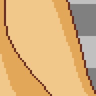

#
It also makes it easy to slightly nudge a curve outward or inward, depending on where you put the anti-aliasing along the line.
#
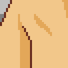
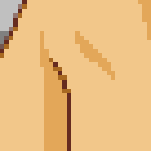
#
This also makes it easy to transition between colors. Normally this is very tricky to figure out with anti-aliasing. But here you just soften the edges with a medium-dark shade of a color, and then replace some of those pixels with an equivalent shade of a different color.
#


#
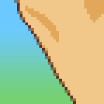
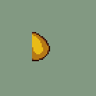
If you want to use translucent pixels, this side-by-side blending can make it much easier to figure out where to place them. This gives the line a more consistent thickness and your picture can look good against any background without worrying about brighter backgrounds blending with medium-shade pixels and making the line look “broken”
#

#
Brighter backgrounds can make outlines look “broken” if they have medium-shade pixels in them. Translucent pixels can fix this.
#
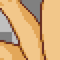
Adding anti-aliasing inside of solid pixels can accidentally make the outline seem thicker in some places, making the line look inconsistent. Translucent pixels can also fix this.
#

#
I actually got the inspiration for this “side-by-side” anti-aliasing technique from one of Masahiro Sakurai’s videos about pixel art where he showed off how just a single shade of grey can create effective anti-aliasing. Thank you Sakurai-san, you are a credit to porn artists everywhere!
#
It can create surprisingly decent results!

#
But there is a hazard with this approach. How dark should those in-between pixels be? It turns out that what looks perfect on your monitor might look too bright on some other monitors, so I recommend shifting the pixels to look slightly dark, just to be on the safe side.
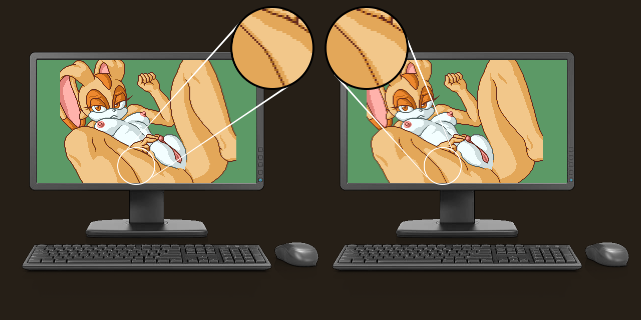

#
This anti-aliasing technique is not quite perfect. In the end I decided that I wanted the edges to look just a little bit softer.
#

#
… and this was the final result.

#Comparison
#
For comparison, let’s lay out all the stages of this picture so you can flip between them.
#


#Sources
Images Used
Pose
 Created by: Saikyou Anaheim
Mouth
 Created by: Barbariank
Fingers
 Created by: Elle Murakami
Eyes
 Created by: TenshiGarden
Head
 Created by: Kekitopu
Leg
 Created by: MR.TakeALook
Leg
 Created by: VenisonCreamPie
Breasts
 Created by: Xylas

