#
So lately I’ve been playing Final Fantasy Tactics Advance 2 for the Nintendo DS and… holy crap this game is gorgeous! But it had me thinking. This isn’t pure pixel art. Those backgrounds look more like paintings. And the character portraits look like resized art that was adjusted by hand afterwards to make the outlines and details clearer.

#
… I suspect that’s how they did it because there is a less-finished portrait that accidentally made it into the game. You can see evidence of a subtle unsharp mask and raw broken edges.
#
But the whole thing had me thinking about the process of creating this game’s art. Those background details are pretty sharp, so maybe they painted the art at something close to the native resolution? After all, the less resizing you have to do, the less blurry the details will be.

#
Ah what the hell, let’s try it!

#
First let’s figure out what to draw. I’m thinking something along the lines of… Sally crossing her arms looking serious while her boobs poke out above them.

#
So I doodled out a silhouette by hand.

#
Now let’s try shrinking it to half size…

#
… and make a sprite out of it. I’m just gonna free-hand this one. No need for super-exact tracing.

#
Okay, maybe I went a little too small. We’re going to need a bigger size so we can properly see her face.

#
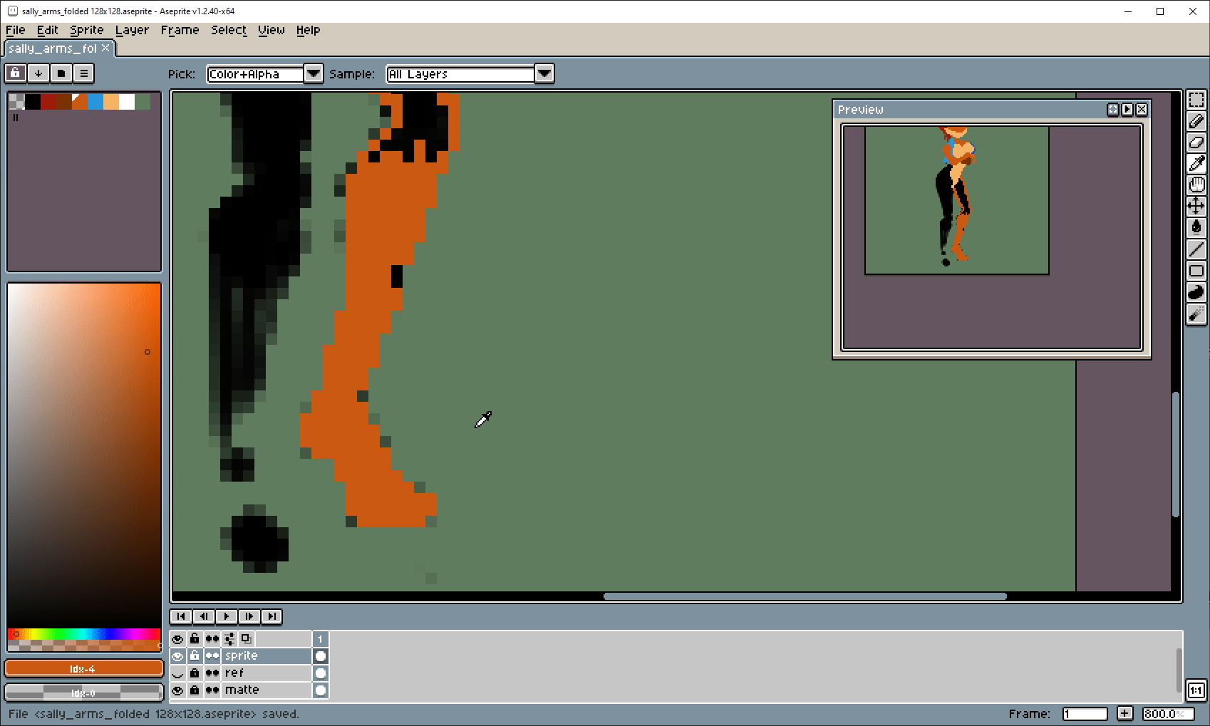
I use “levels” to sharpen the silhouette so I can more easily trace the shapes without too much blur.

#
It doesn’t have to be super exact. I’ll adjust the shapes later.
#

#
Now Sally’s ready for her Atari 2600 debut!

#
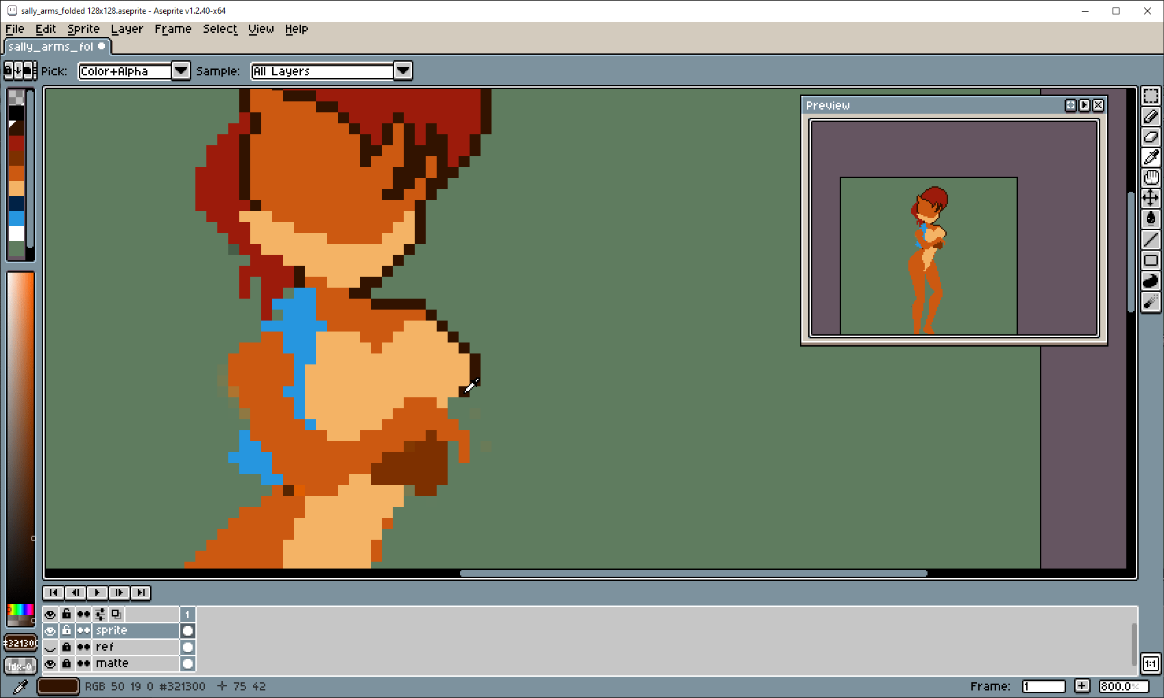
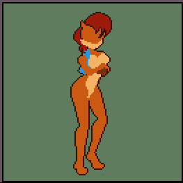
Okay let’s throw some outlines on this…
#
#
… and make some adjustments.

#
Okay, that takes care of the basic details. Whoops, I forgot something…

#
… her tail!

#
A sketch doesn’t have to be pretty. It’s just an approximate plan for where things go.

#
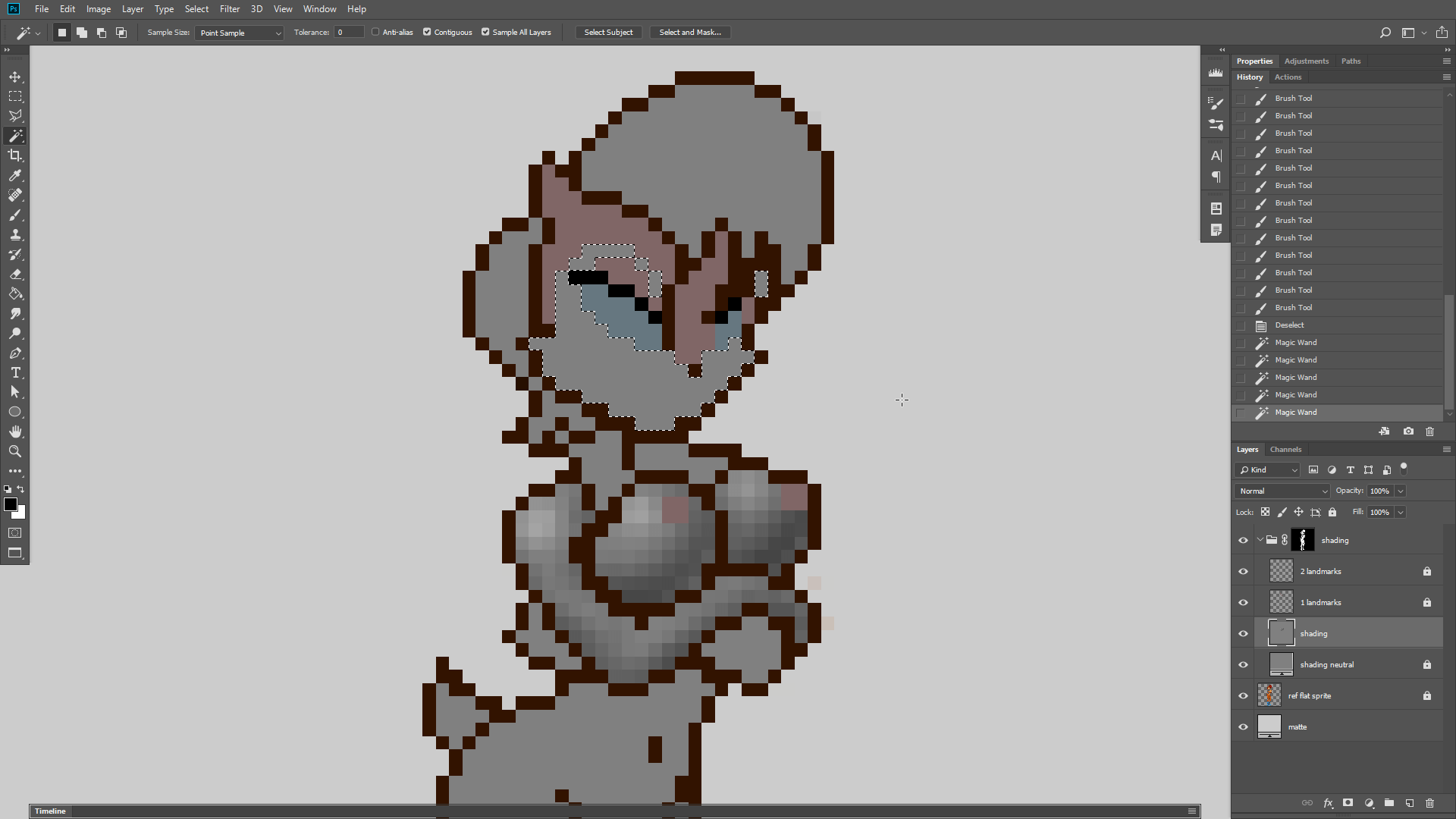
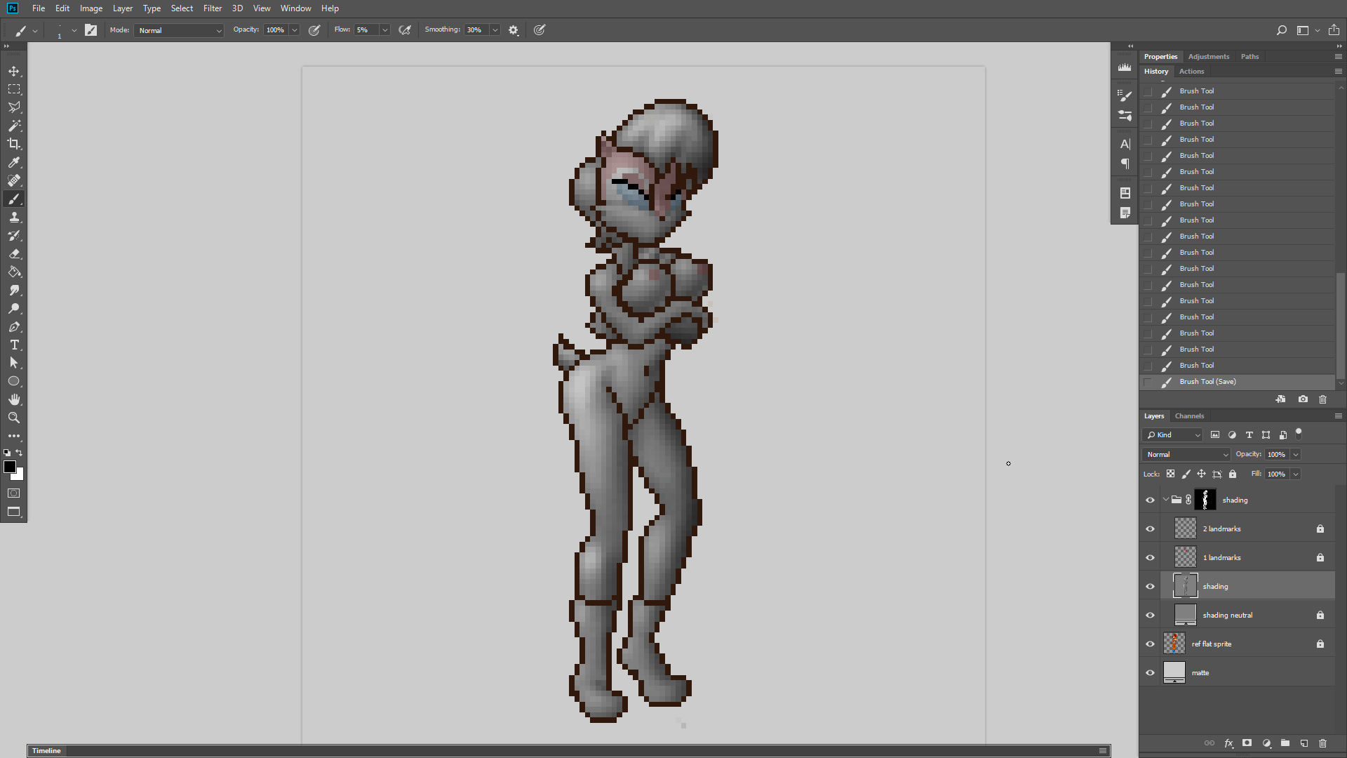
So for this experiment, I’m going to do full quality shading in Photoshop.

#
Just select an area, hide the dotted line, and go-ham with the brush!
#

#
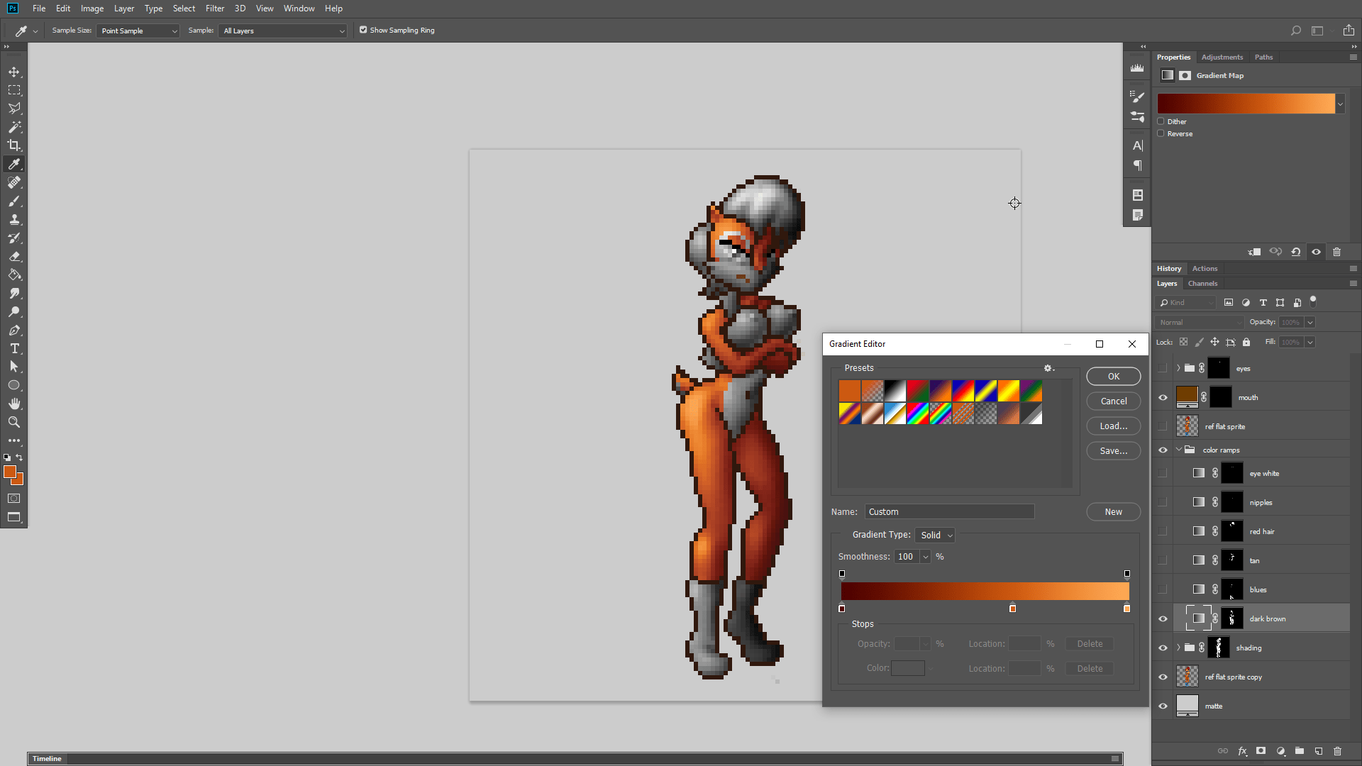
Now for the colors. First I’ll boost the shading’s contrast so it reaches full blacks and bright whites, then I can use gradient maps to give me complete control over all the colors used for the shading, including how bright or dark they get. For example the dark brown has a bit more red in the shadows and a bit more yellow in the highlights.
#

#
In theory this might be “done” if I wanted a sprite with unlimited colors.

#
… although it doesn’t look half bad at 16 colors either. But… those harsh black outlines are kind of bugging me.

#
Let’s soften them up.

#
This looks much more “painterly”

#
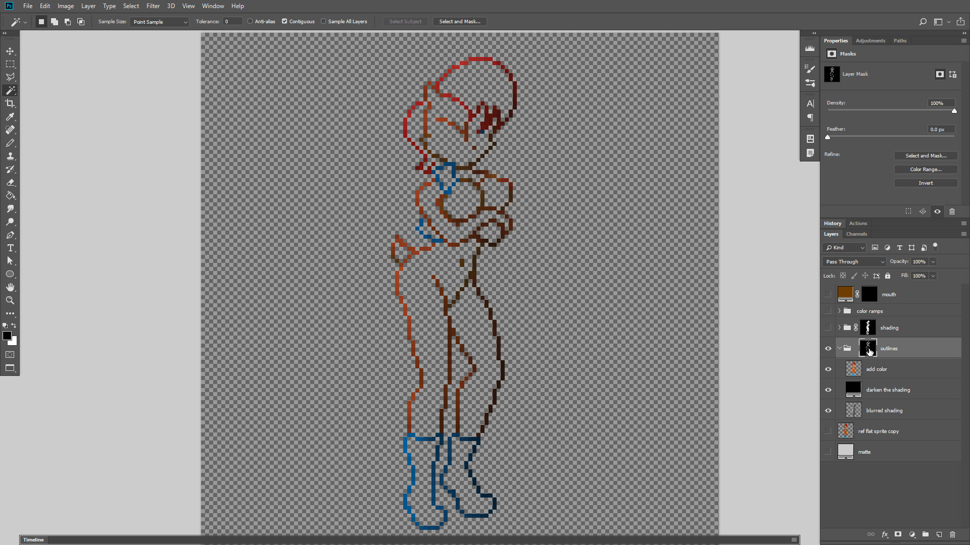
The whole trick is to just make the outline the same color as the shaded sprite, only darker.
#
Step 1. Expand the colors.
#
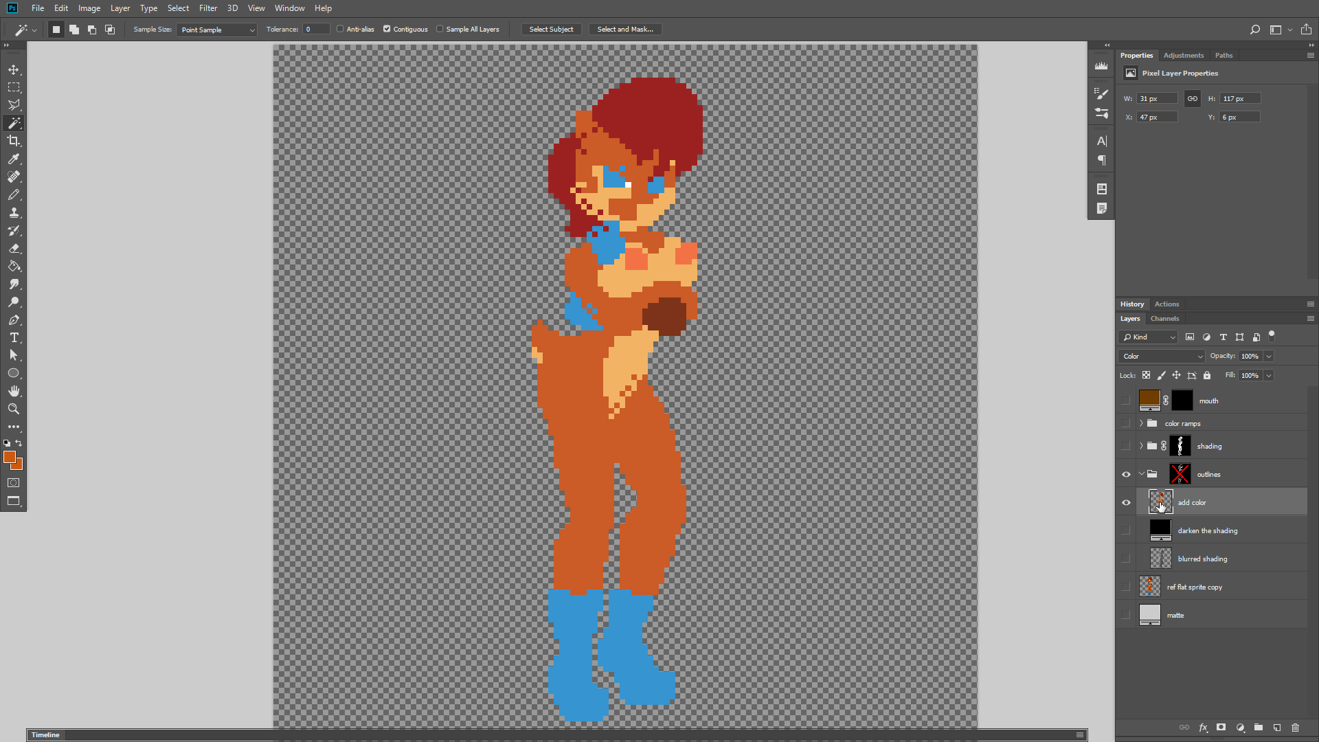
You can “expand” the colors into the outline by taking the flat “fill” colors, blurring them, and then repeatedly layering them until the transparent parts turn solid.
#
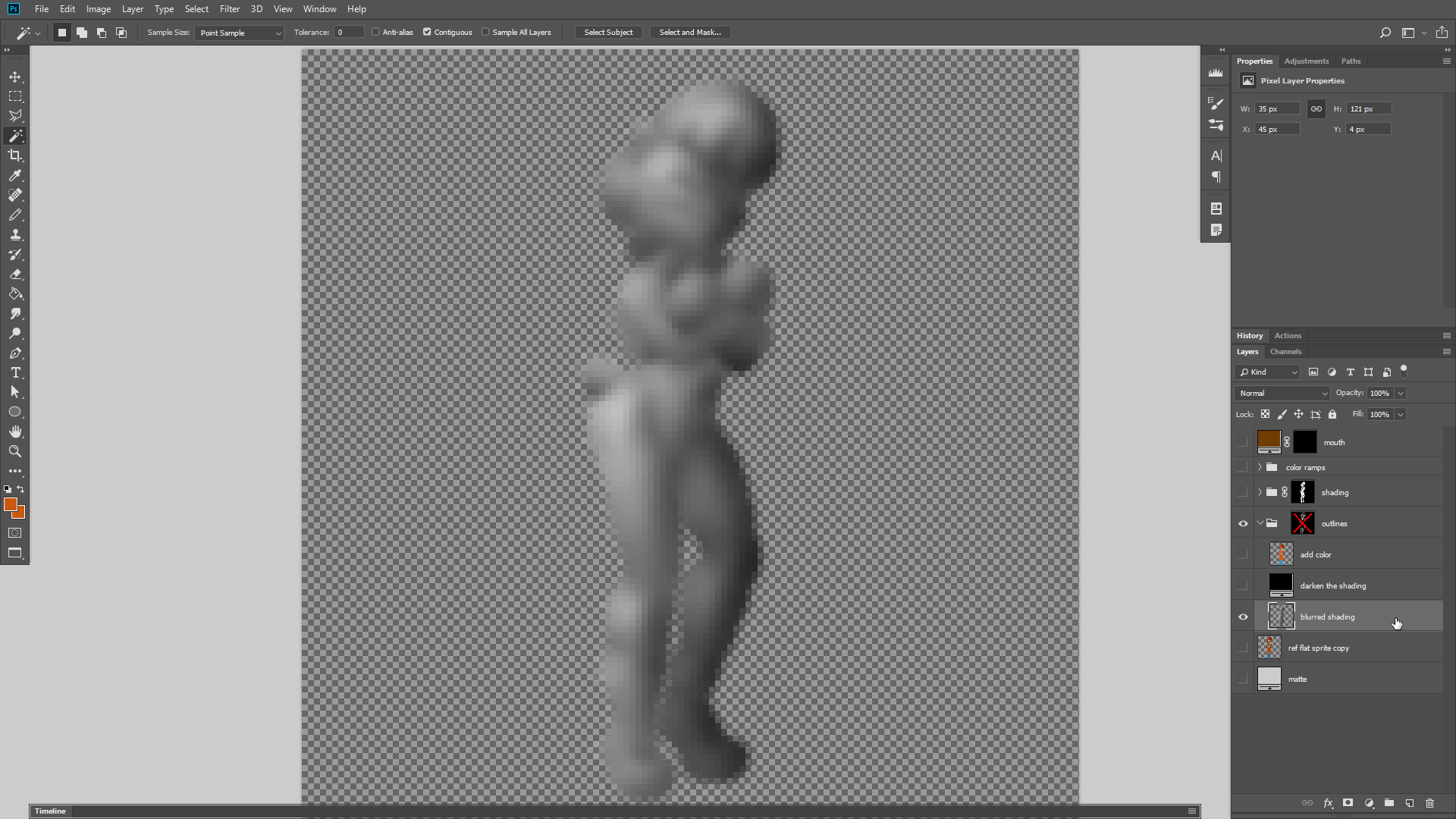
Step 2. Expand the shading.
#
Then you do the same thing with the shading. Blur it to expand it outward. The reason why you use the shading is because we want the outline to be similar in brightness to the pixels inside the sprite, only darker.
#
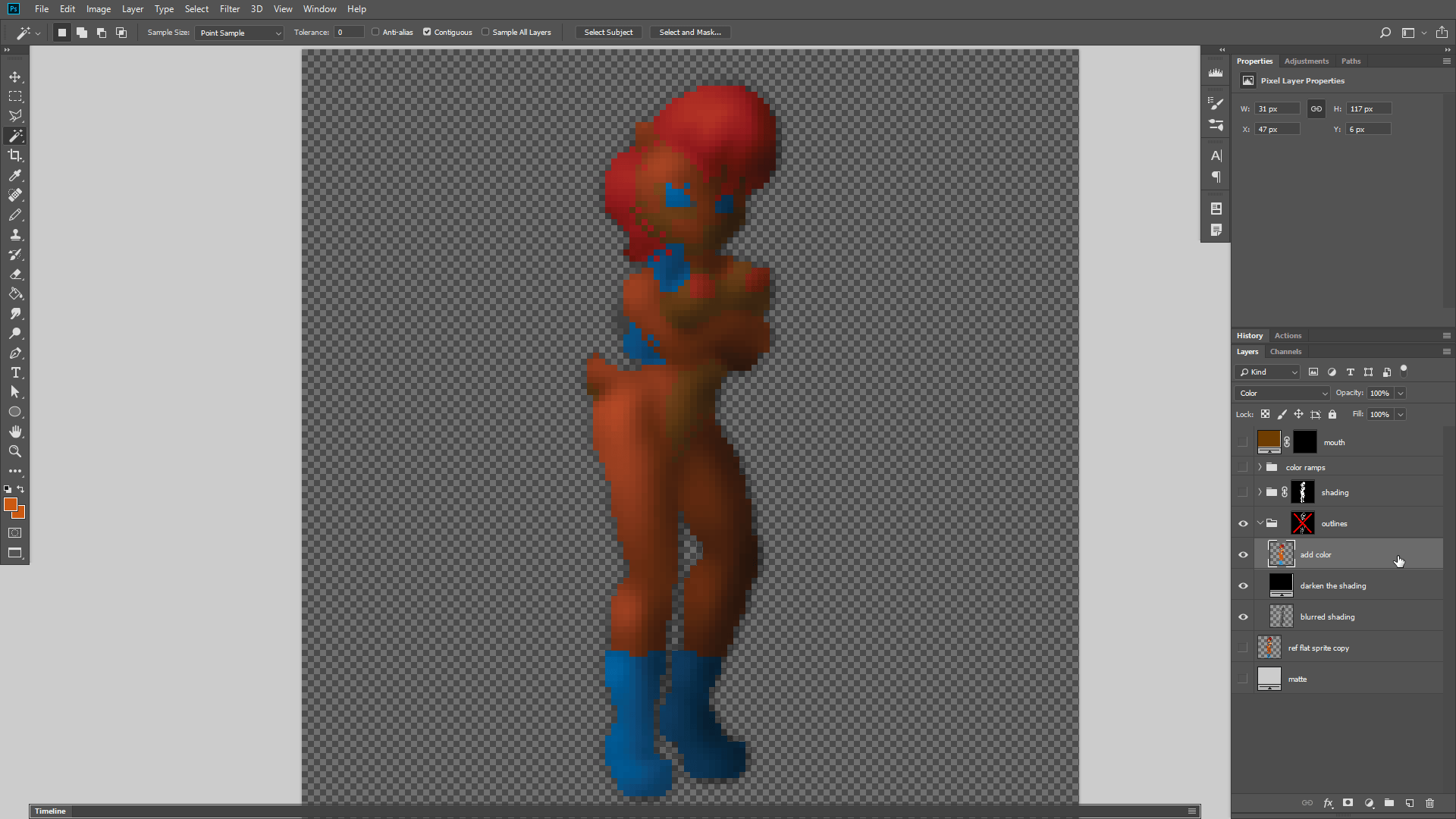
Step 3. Combine and Darken
#
So the next step is to combine the shading with the colors using the “color” blending mode, and then just make the entire thing darker, by adding 50% black or something.
#
Step 4. Mask it
#
Now we just apply the original outline as a mask, so that these darkened colors replace the outline.

#
This results in a surprisingly impressive improvement.

#
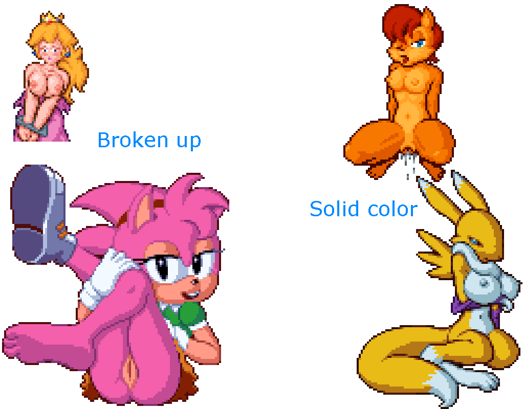 And the cherry on top is that this also solves the “broken outline” problem I was struggling with when I was manually anti-aliasing my outlines. This looks good against any background! The only trade-off is slightly reduced contrast. And this technique is faster too!
#
#
Let’s see if we can get some better dithering. This is one thing that PixeLover is half-decent at. I can adjust how “wide” the dithering bands are and even bias them toward brighter or darker areas.

#
Hmm… different parts of the picture look better with different dither settings.

#
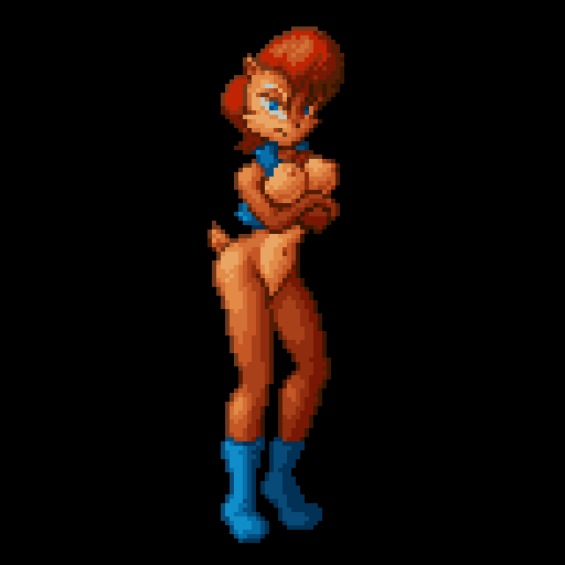
Let’s just export all 3 of these and then pick and choose which dithering to use by-hand. The trick with dithering is that you don’t want to over-do it. Only enough to create the illusion that there are more colors without making everything look grainy.

#
And finally I’ll just finish it off by adjusting some of the shading by hand.

#
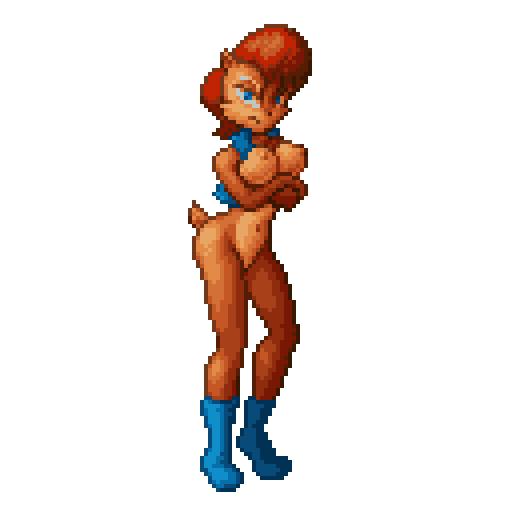
Croikey, now THAT is a sprite! 16 colors baby!


