#
While comparing a couple of sprites I made, I noticed something interesting. Sometimes I have a clear outline, but sometimes I manage to seamlessly merge the shading into the outline so that you cannot tell where the shading ends and the outlines begin. It’s like a painting. I love it! So I decided to try doing that again.
#
 Clear outline
 blended outline
#
But what to draw? Hmm… it has been awhile since I last drew Misty. Let’s find a good pose for her. Ooh! I think I could do something fun with this one.

Inspiration
 Created by: Maagori
#
I have been making a ton of large pixel art over the past couple of years. With larger sprites I tend to use the same techniques as I do with large artwork. In fact at this point the process is identical except with a couple of added steps. I just resize and trace over my sketch in Aseprite to create pixel outlines, and I posterize the shading to reduce the colors down to a limited palette.
#


#
These are perfectly plausible sprites. For example, Donkey Kong Country’s title screen uses 99 colors. My pictures have far fewer colors than that. A Super Nintendo could totally display these.
#
 99 colors17 colors
 59 colors
#
After a day, this is what I ended up with. I tried to use strong contrast and add shading to the outline edges to blend them together. The effect mostly works with her shorts but her skin ended up being too pale to completely pull it off. Maybe I should have gotten even more aggressive with the shading? But then I got distracted by the obvious color banding and decided to try dithering to blend things more smoothly.

#The Palette
#
I tried using my Photoshop dithering technique, but the details started to get lost in the grainy texture.

#
And dithering with “Save for Web” creates a lot of distracting stray pixels in the highlights.


#
Next I tried using PixelOver because it gives me more control over how large the dithering areas are. But I didn’t like how it mixed colors into places they didn’t belong, and the shirt lost a lot of detail.

#
So next I tried making PixelOver dither a grayscale image and then apply color to it in Photoshop. This seemed better. But it added way too many colors. This didn’t seem very efficient. Not everything needed 8 shades.

#
So I tried telling PixelOver to re-create the same posterizing that I had in Photoshop. This was a painstaking process because I had to export every color area into PixelOver as a separate picture so that I could manipulate them separately.


#
This finally gave me some nice smooth skin shading. But now everything was too light. I also didn’t like how Caterpie looked and the shirt still had less detail.

#
For some reason I couldn’t get Pixelover to export a dark enough picture to achieve better contrast, so instead I just adjusted things in Photoshop and excluded some areas to use my old shading instead so I could get the best of both.

#
Then I added a bluish tint to the shadow areas to make those colors more similar to each other. This tint allowed those colors to combine more easily when I reduced the palette. After all, monochromatic colors are interchangeable. Therefore partially monochromatic colors are somewhat interchangeable, and look less out-of-place next to each other. As a result I managed to crunch this down to 39 colors without the background.
#
The tint also made the sprite fit in with the nighttime background as well.

#
A day later I just couldn’t help myself and tried one more palette experiment. This time skipped all the manual posterizing, and just let PixelOver generate a new 40 color palette from the smoothly shaded picture and quickly dither everything. This is a lot faster and it looks good… almost too good if there is such a thing. I know I’m being silly here. It’s all subjective. But it barely looks like hand-crafted pixel art anymore. Instead it looks like what it is: Regular artwork with a manual pixel outline and automated dithering. Which isn’t a bad thing. After all the original goal of sprite art was to make the best art possible within a limited resolution and limited color palette and I have accomplished exactly that.
#
I guess that just means I succeeded at making a “pixel-art painting.” That’s the whole idea that inspired all this madness.

#The Background
#
Oh yeah, I also threw in a background. I guess I should probably talk about that.
#
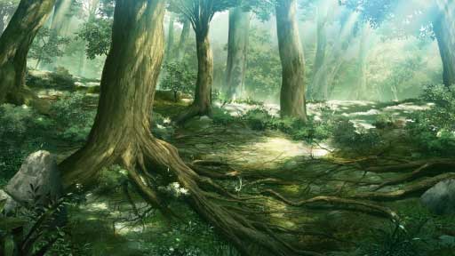
I mostly just used an anime forest and added stuff to it. I was searching for some background art from the Pokemon anime.
#

#
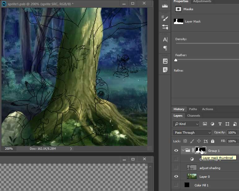
My original sketch had the outline of a tree but I decided that finding a picture of one would blend in better with the background than a manually drawn tree would. Besides drawing trees is boring. I came here to draw boobs. I think the picture I found was some AI generated “painting” or something.
#
#
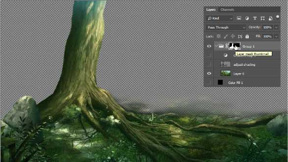
… so I cut out the tree with a mask…
#
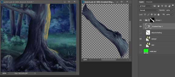
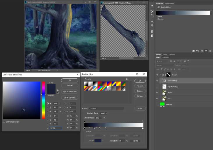
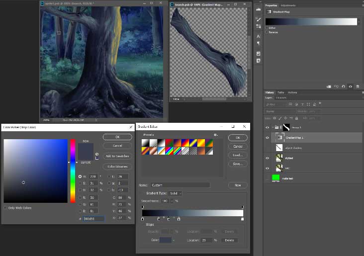
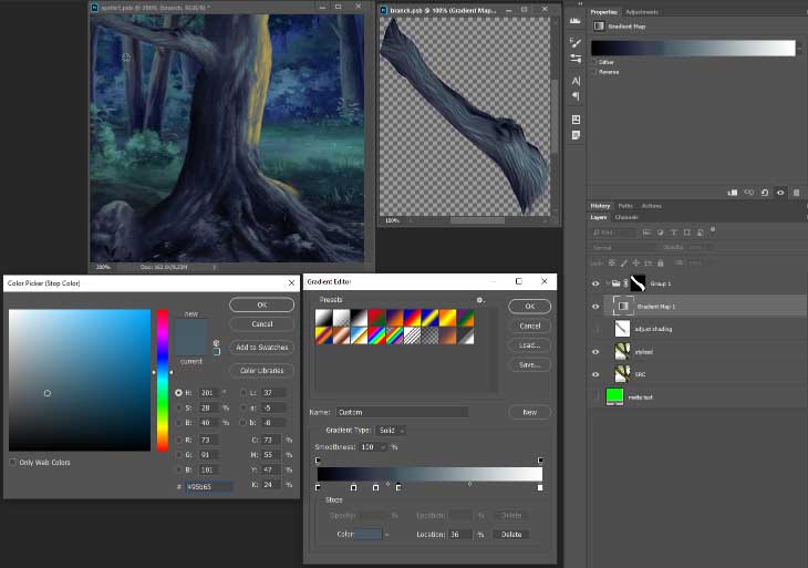
And then I added the real magic… A gradient map to match the colors of the background.
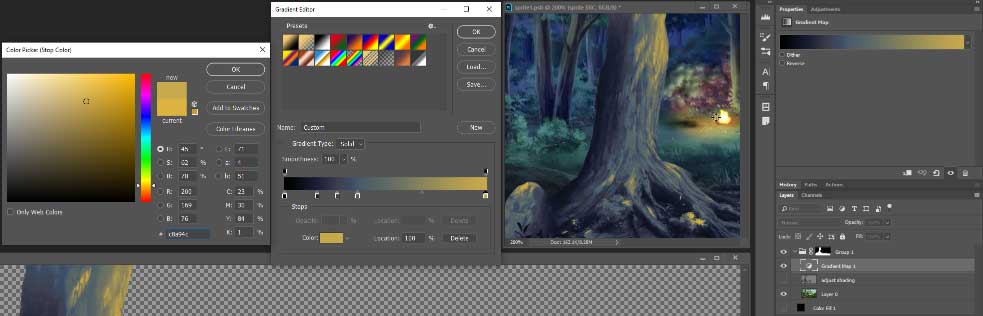
#
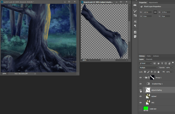
I also manually brightened and darkened areas underneath the gradient map to adjust the lighting. The gradient map made brighter areas start to turn orange, so I could basically draw the campfire glow onto the tree. This doesn’t overwrite the details of the tree because I’m only brightening the existing image instead of painting over it.
#
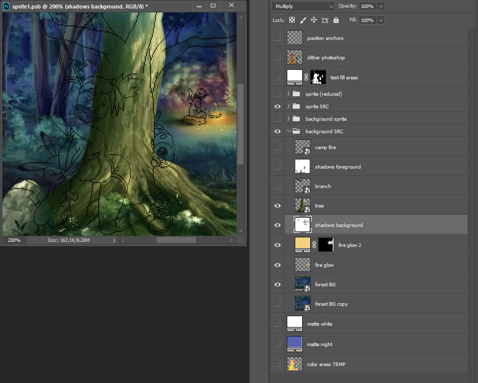
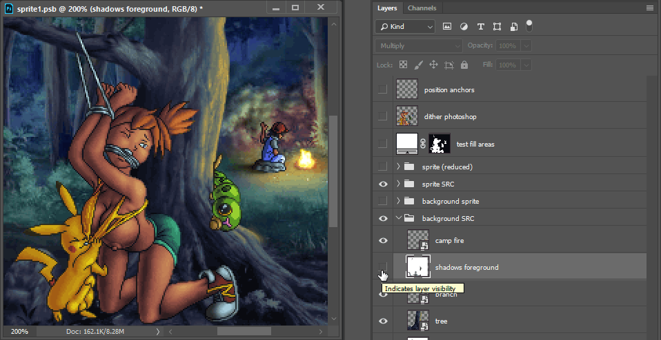
Adding the camp fire glow to the background was just a matter of grabbing a paintbrush and blending bright orange over the image, basically shifting the background’s colors and brightness. Then I added shadows to the bushes to make it look like the fire was casting light.
#
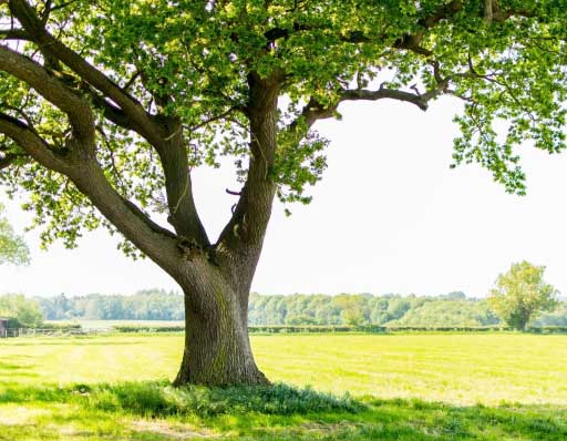
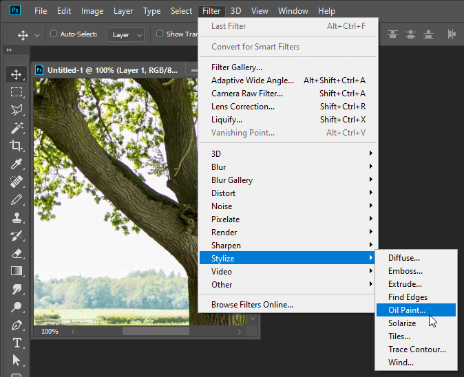
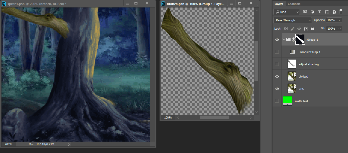
Now I needed to add a tree branch because Misty is supposed to be tied to one, so I searched for more pictures of trees and found a decent photograph.
#
Of course just masking it and sticking it into the picture would not be enough.
#
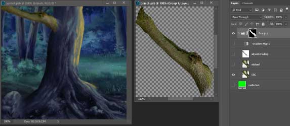
Photographs tend to look coarse and noisy, so I tried Photoshop’s “oil paint” stylize effect. Not perfect, but a good enough improvement.
#
#
Next I need to give it the same colors as everything else by using another gradient map.
#
I literally picked colors from trees in the background to use as the shading colors.
#
#
And as a final touch I manually brightened and darkened areas to adjust the lighting. I also used this to paint in gnarly crevices similar to the rest of the tree.
#
The last thing I did was add cast shadows so that the characters looked like they are actually in the forest instead of just hovering in front of it.
#
Then I used PixelOver to crunch the colors down to make it fit the style of the sprite art.

#
To recap here are the four major versions of this picture.
#


#
In the end I worked on this picture for about 4 days. I don’t think I ever spent so long on one picture before. But about 3 of those days were just spent nitpicking and experimenting with the dithering and palette.
#
What can I say? I love adjusting things. I love a good puzzle, and I had a bunch of interesting ideas I wanted to try out. It was a perfect storm of motivation.
