#The Plan
# To test out my 3x3 pixel grid anti-aliasing technique, let’s see if I can achieve a Shantae style sprite animation.
# Maybe something similar to Rottytops, except with Risky Boots?
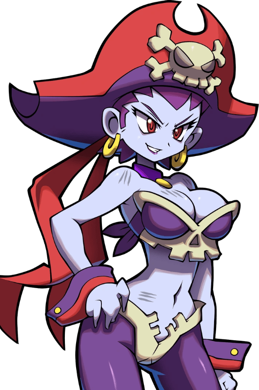
# I’m not going to directly copy Rottytop’s pose. I’ll just take a little inspiration from it while doing something a little different.
# Also, I don’t want to directly copy Risky’s sprite. Let’s try reverse-engineering it, and then creating a new sprite from there.
#Reverse Engineering a Sprite
# How do you reverse-engineer a sprite? Let’s try vaguely tracing over it with pencil, to get the general idea of the sprite, and then create a new sprite from that pencil sketch.
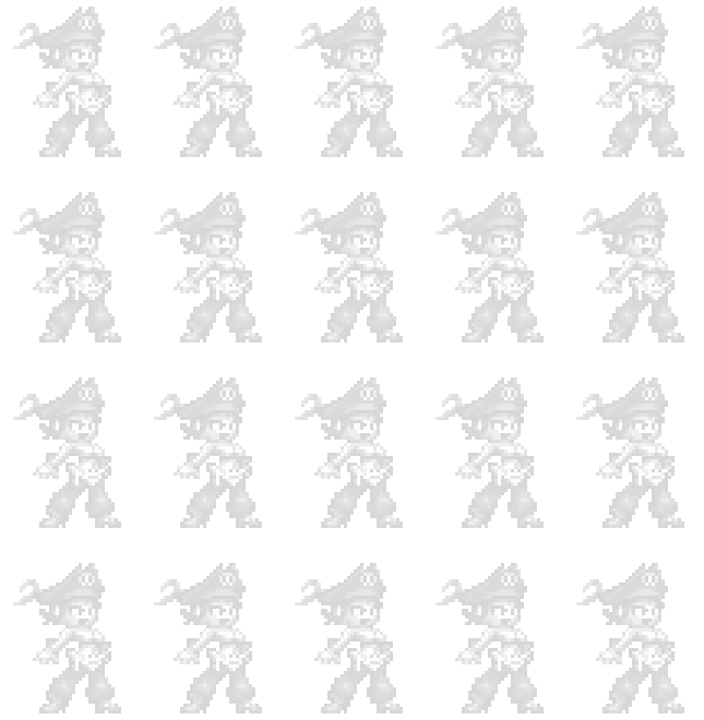
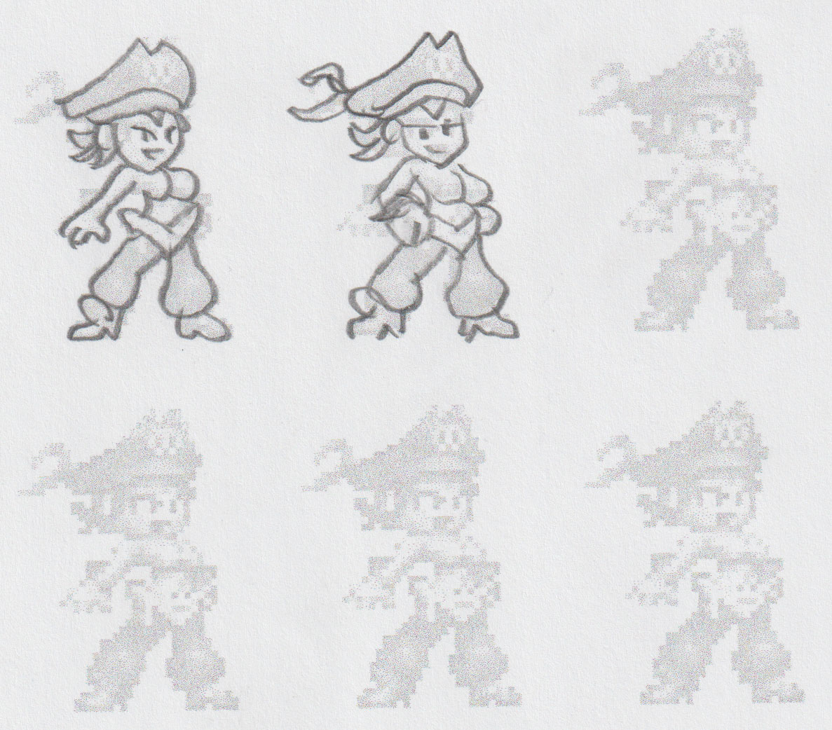
# From here I’ll just use my usual sprite tracing technique. Scale the image to double the intended size. Ink the lines using Paint tool Sai’s vector “curve” tool. Scale that image down by half. Use that as reference in Aseprite and trace over it with pixels.

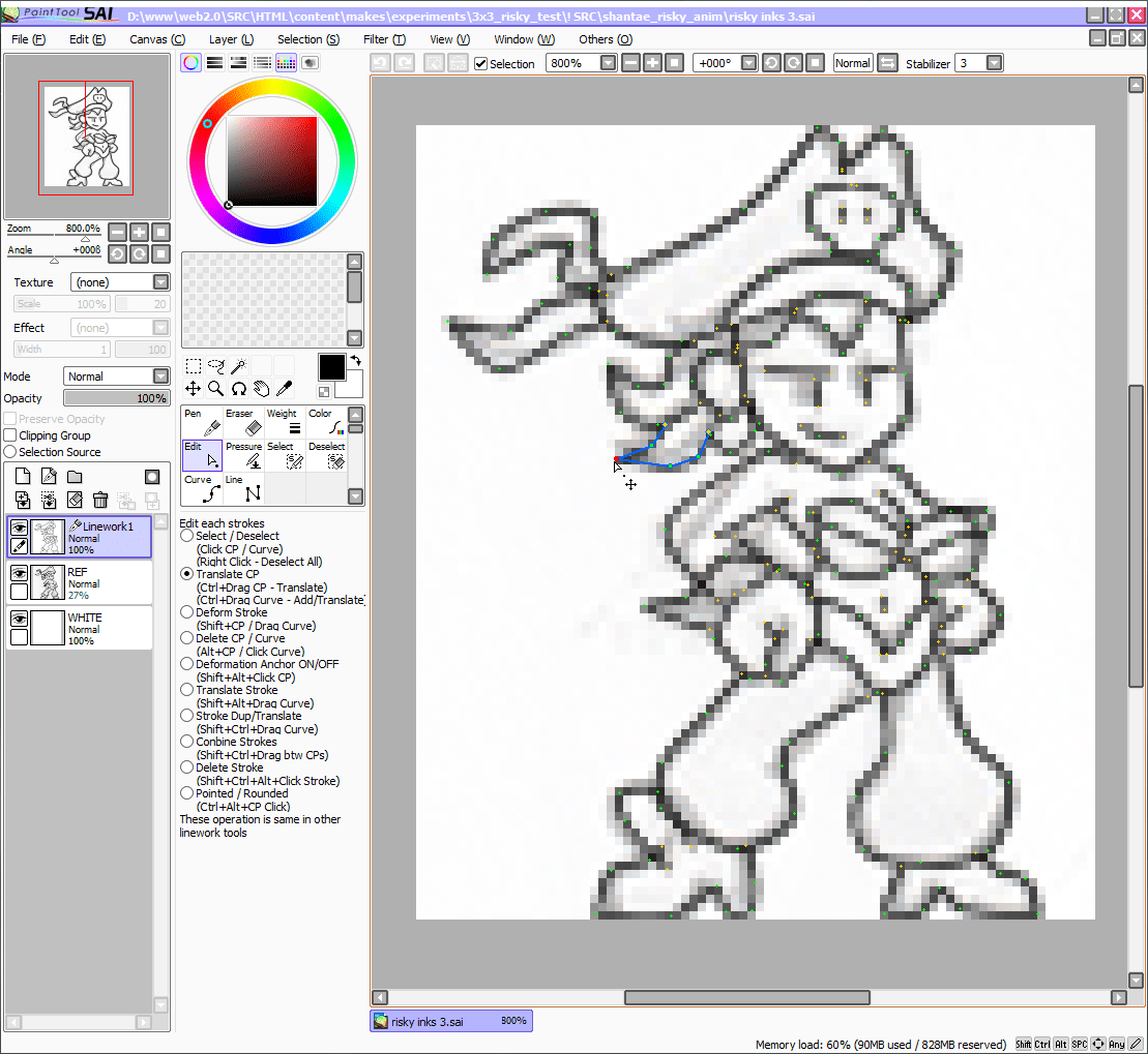


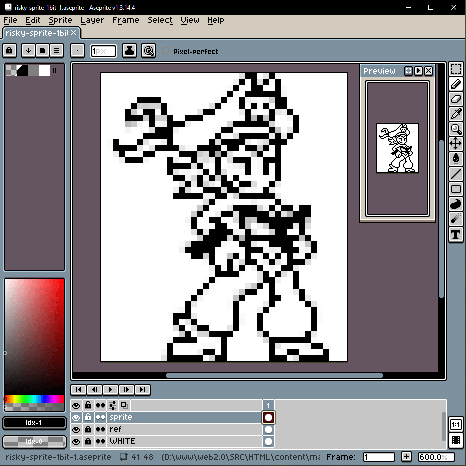
# Now if I did this right, my new sprite should be the same height as the game’s original sprite.
# … Apparently it’s 2 pixels taller. Ah whatever. That’s close enough for this test.

#The Process
# Let’s figure out how I want the sprite to look in the end. I’ll give this single image the full rendering treatment.

# Now to animate this sucker. I’ll start by animating the black and white lines first.
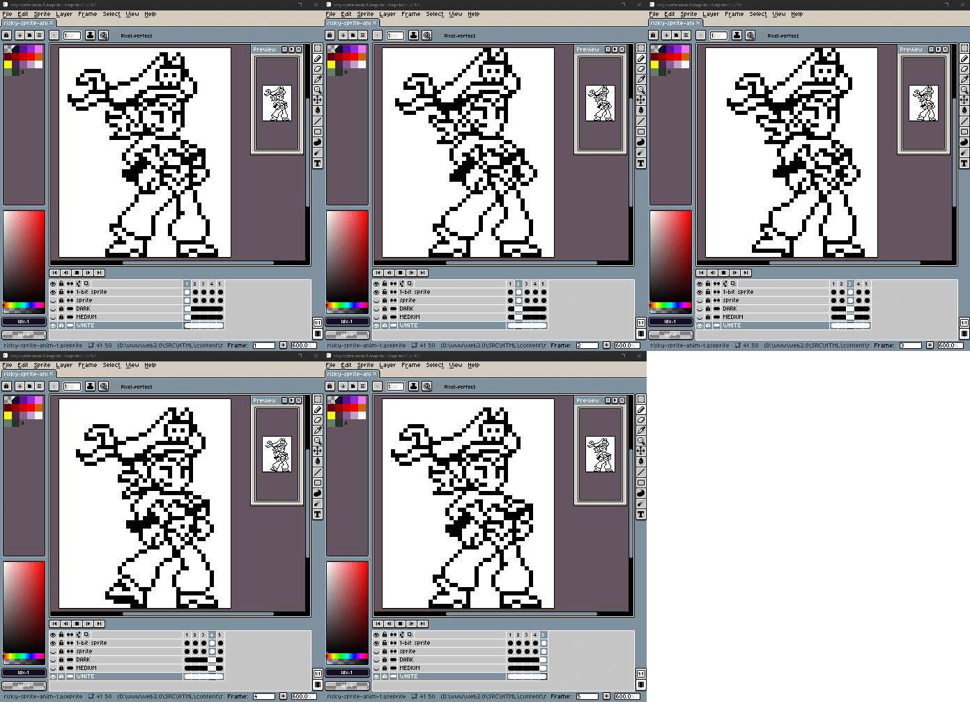
# Now I’ll triple the size and add frames with pixels moving between the grid lines.
# By the way, doing motion interpolation like this by hand is freakin’ tedious!
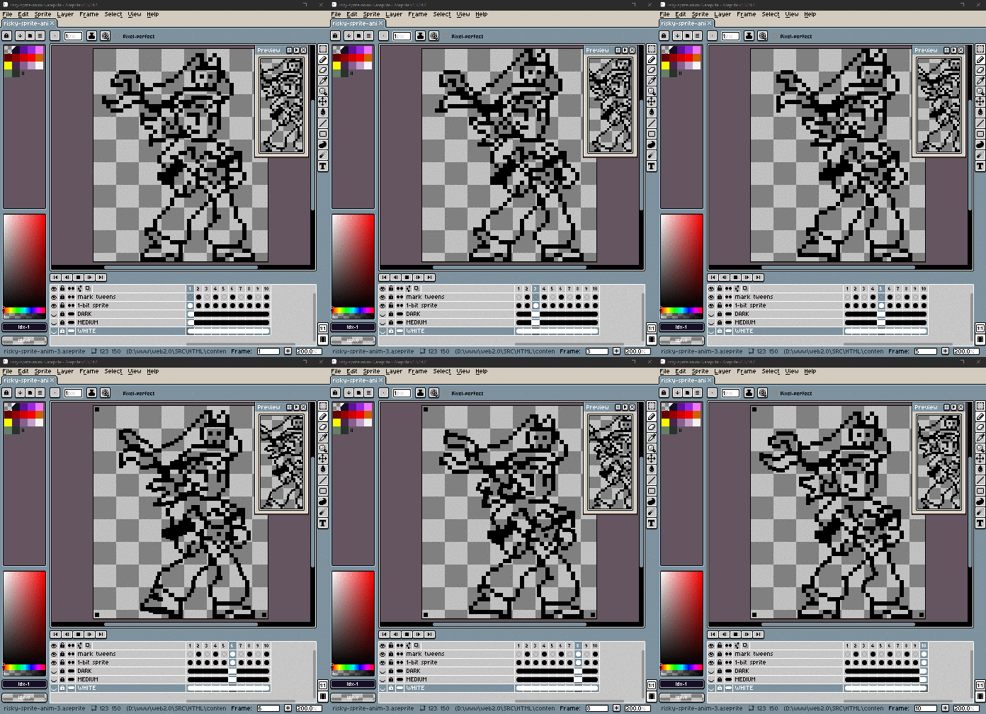
# Okay, that only took about 2 hours. Now to do it again in full color! I’ll start with the flat colors. It’s tempting to try scaling down this flat version to see how the anti-aliasing looks with the outlines, but screw that, let’s just go ALL THE WAY!
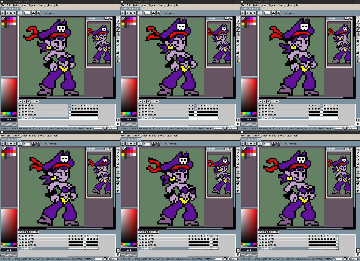
# Four… hours! It took 4 goddamn hours to do all this tweening by hand! Let’s hope the results are halfway decent.
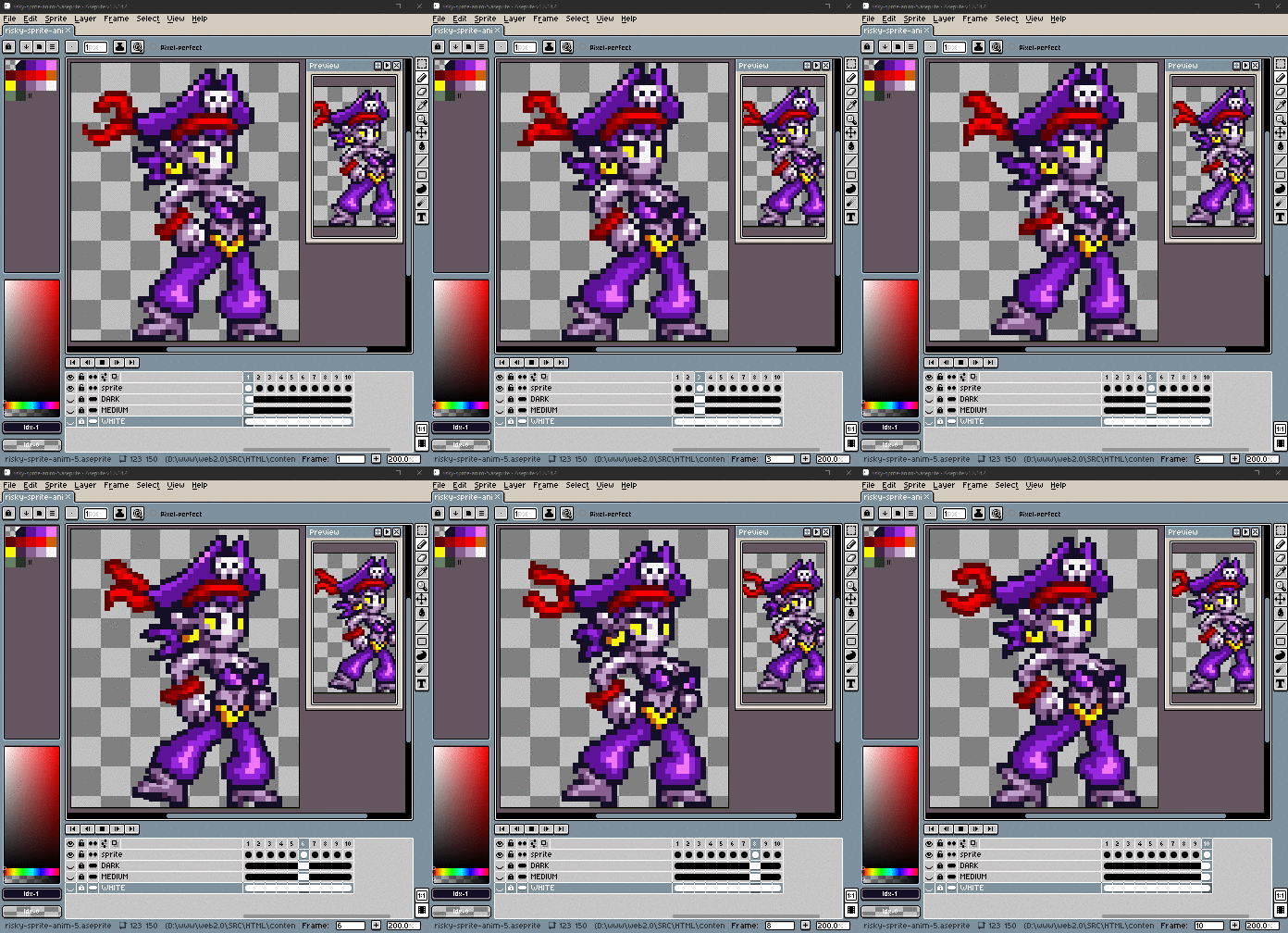
# At triple size, the interpolated animation looks like this.
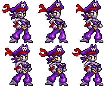
# Now let’s scale it down by 1/3 with bilinear scaling, and force it to use the same color palette.
# Here is how the sprite looks after scaling down to its intended size. The results aren’t quite as nice as I had hoped. A few parts have some unnecessary blurring. Some highlights flicker in and out. Some outlines change color, and sometimes grey pixels get added into the purple areas as an in-between shade, even though it’s the wrong color.

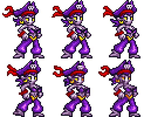
# But let’s clean this up and see how good it can look.
#The Result
#
 Here is the finished sprite, looking as good as I can make it. I spent an hour and a half manually fixing every problem I could find.
#
 Here is the Shantae game’s Rottytops animation to compare the quality. I still think this animation is way more clever.
#
 And this is what Risky Boots originally looked like in the game. I think I actually managed to out-do this sprite! … But the effort it took was ridiculous!
#
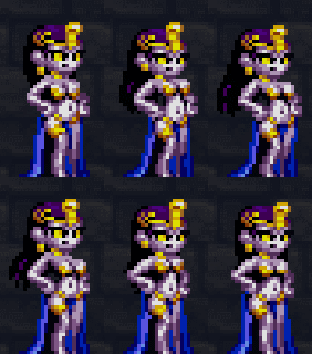 Of course the later Shantae games became even better at it, so there is no shortage of inspiration!
#Conclusions
# So what are my conclusions of this experiment?
#
 This scaling process wasn’t as helpful as I had hoped, but doing it was useful because it showed me multiple examples of the exact ways that image scaling can fail at anti-aliasing, and fixing those problems helped me figure out what should happen instead.
# In other words: I just learned some new techniques!
#New Techniques
#When details barely move, make them dance in place
# Make details change shape while they move instead of blurring.
# The strategy is to make the details “dance” in place when they are barely moving to make it look like motion is still happening.
# It’s kind of like how scribble animation looks animated even when when something “holds still”, or like how the Shantae games make the stationary interactive objects shimmer.
#
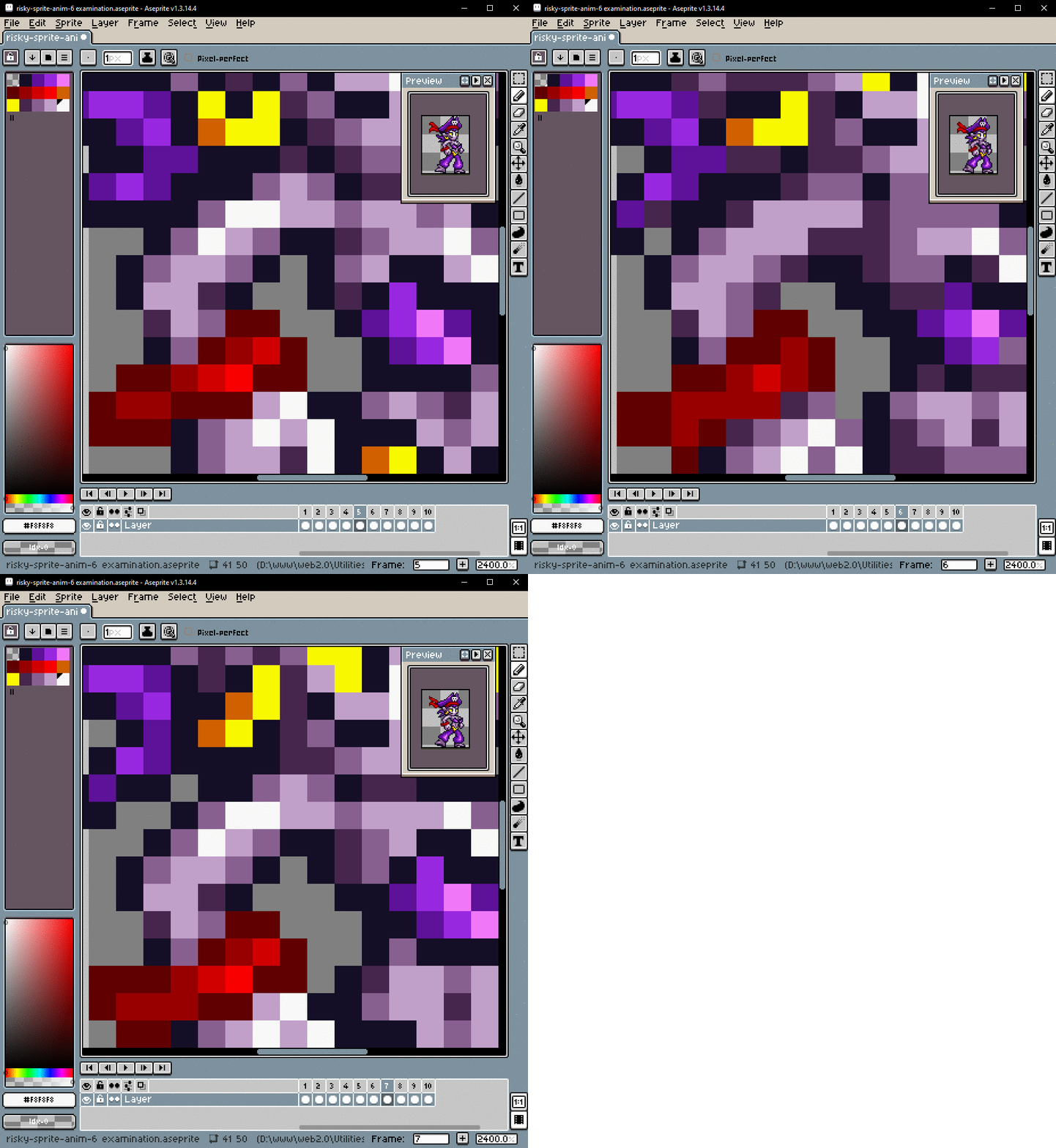 BAD: Highlight flickers
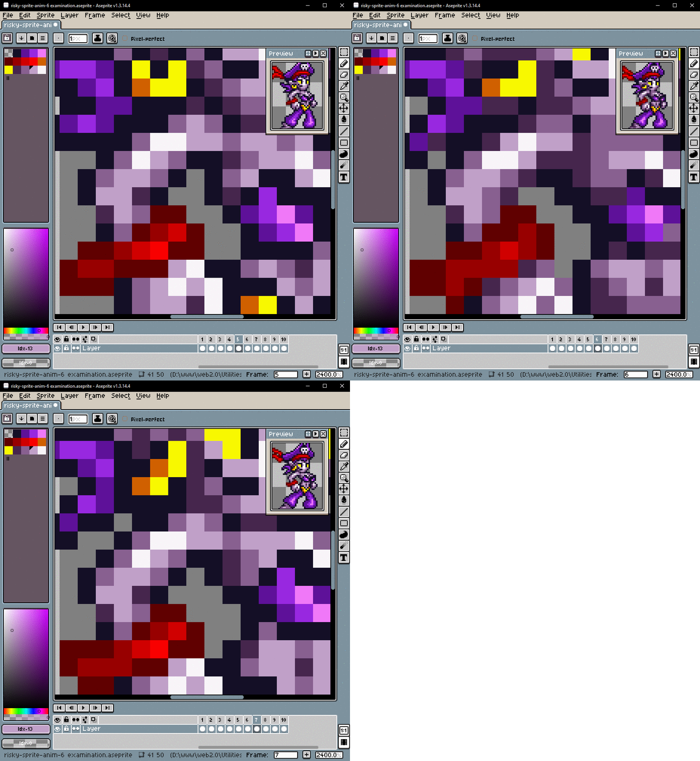 GOOD: Highlight changes shape while moving

#Extend small motions with staggering
# If multiple things only need to move 1 pixel, you can spread out the animation by moving them at different times.
# This actually reminds me of another trick I discovered a few years ago. If you have two slower animations, you can offset one of them so they don’t happen at the same time, which results in the individual pixels looking like they’re constantly moving.
#
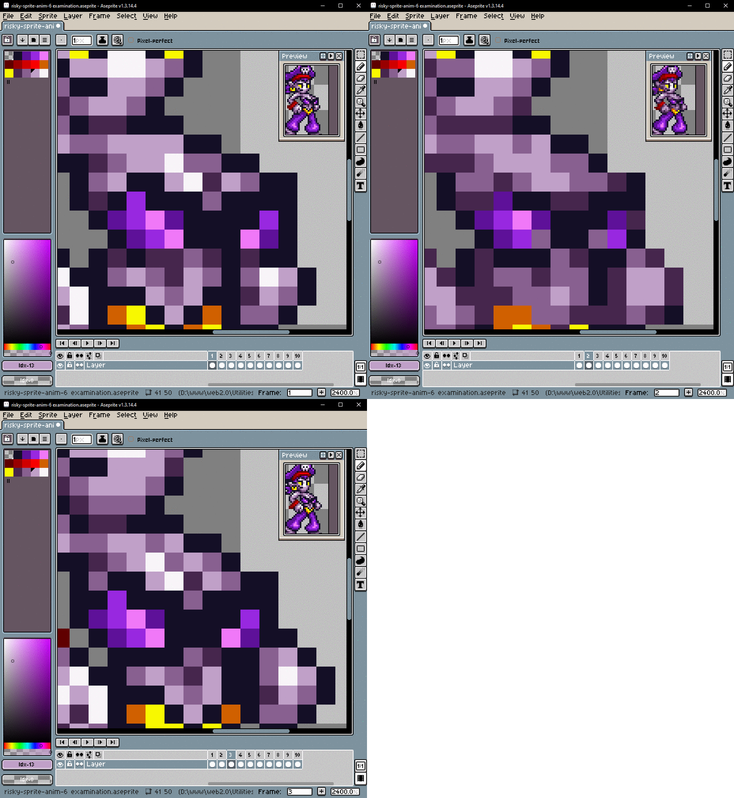 BAD: Details vanish while moving
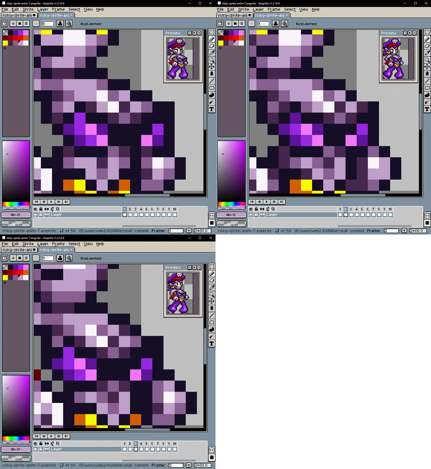 GOOD: Different parts move at different times
#Stretch and deform
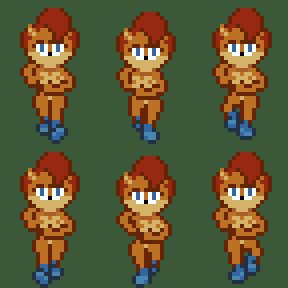
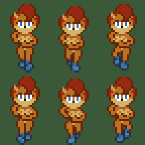
# This one was tricky to solve. When “motion blur” looks way too intense, try using squash and stretch instead. In this case I let the blurring stretch out the hair above her eyes, and I deformed the shape of her boobs while they moved. If stretching looked too weird, I just moved the object by a full pixel instead. Clear details are usually more important than smeared motion.
#
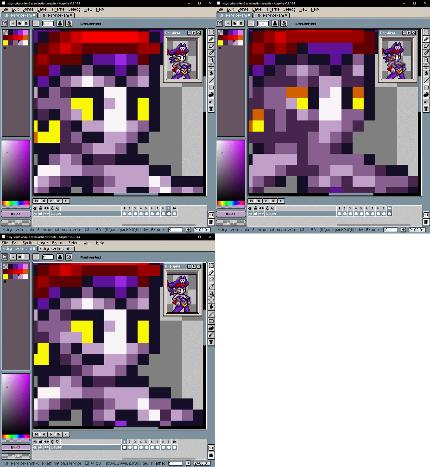 BAD: Details blur too much while moving
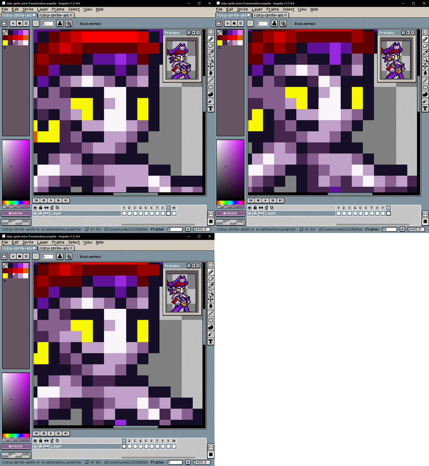 GOOD: Shapes stretch and deform while moving
# And now I realize that there is a fundamental difference between scaling and anti-aliasing. They have different goals. They follow different rules.
-
# Good anti-aliasing is applied selectively for the purpose adding more detail.
-
# Careless image scaling accomplishes the exact opposite. Its blurring will destroy small details.
# Scaling blends entire lines between positions, so it tends to look like extreme motion-blur. I’ll keep that in mind if I ever need to make something look like it’s moving extremely fast.
#
 One part of this technique that did work was the “bias” created by the 3x3 grid. Most of the outlines generally ended up in the correct places. They just happened to be the wrong color sometimes. This wasn’t particularly useful because placing solid outlines is not hard to begin with. Why should I use a tedious technique to help me do the part that’s already easy?


# This experiment did… eventually… result in a good sprite, but I still had to do a lot of manual clean-up afterwards to fix all the things that it got wrong.
# I probably could have just animated on a 2x2 grid and then turned it into a 3x3 grid afterwards. With RockTheBull’s Rouge sprite I was able to scale it up from 2x2 to 6x6, and then down to 3x3, and then finally shrink it down by 1/3 to its intended size using bilinear anti-aliasing. Animating the in-between frames on a 2x2 grid would have taken a little less time.
# This process was NOT a time-saver! Just the opposite. It was the sprite-animation equivalent of doing long-division. I did eventually get useful results, but I was basically brute-forcing it every step of the way. And in the end I still end up doing a bunch of manual anti-aliasing and adjustments by hand to clean up the messy results.
# I always seem to end up adjusting everything by hand in the end.
# Maybe I should just animate sprites directly at their native size and use the new techniques I just learned?
#
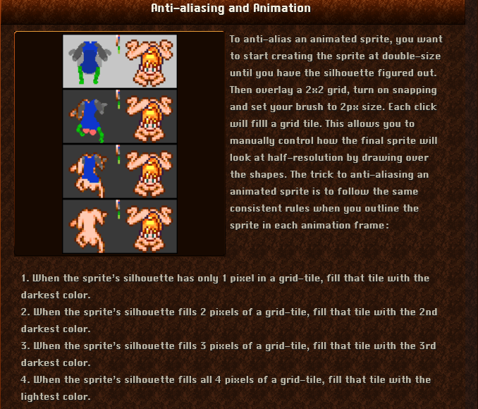 And if I have trouble figuring out the animated anti-aliasing, I can still use my old pixel-counting technique. After all it lets me make the manual adjustments right away while I’m tracing out the low-resolution version of the sprite.
#
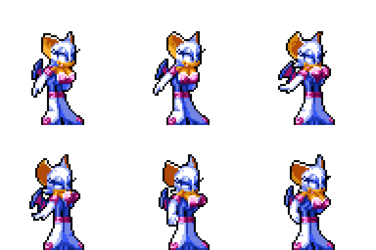 Incidentally, RockTheBull’s Rouge sprite is the same height as my Risky Sprite. It looks like I still have a ways to go before I can animate boobs like this!