#Why Make a New Website?
2/11/2023, 5:31 PM
# I gotta admire NeoCities, encouraging people to make their own personal websites, with all the creativity and jank that comes with. Custom cursors. GIF pets. Experimental navigation. It warms the heart.
# https://denden.world/@kiophen

2/11/2023, 5:34 PM
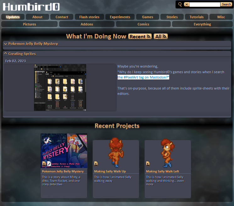
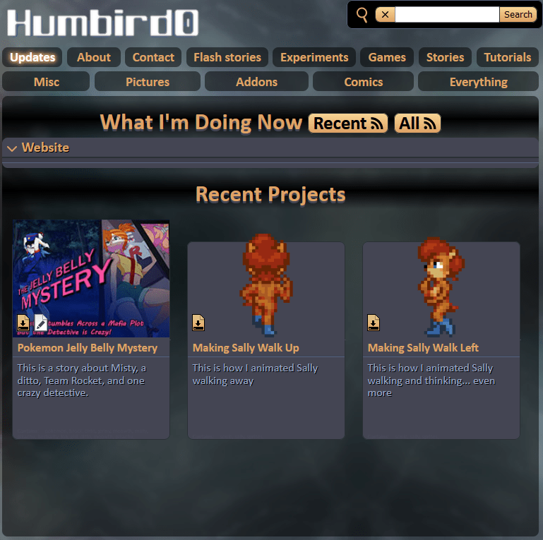
# It has me thinking that my website’s kind of boring. Nice navigation. But not much to look at… besides the porn.
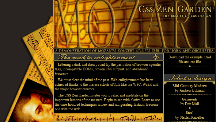
# Sure it’s not a generic wordpress white rectangle-fest. But it’s no NeoCities either. I miss cool-looking websites.
# 🔗 https://web.archive.org/web/20221228130344/https://humbird0.com/content/show.htm
2/11/2023, 5:43 PM
# It’s not just the boring flat colors that are bugging me. It’s a big complicated single-page JavaScript blob. And it doesn’t really need to be.
# The irony is that this is technically a static website. No database. Everything is stored in the HTML itself.
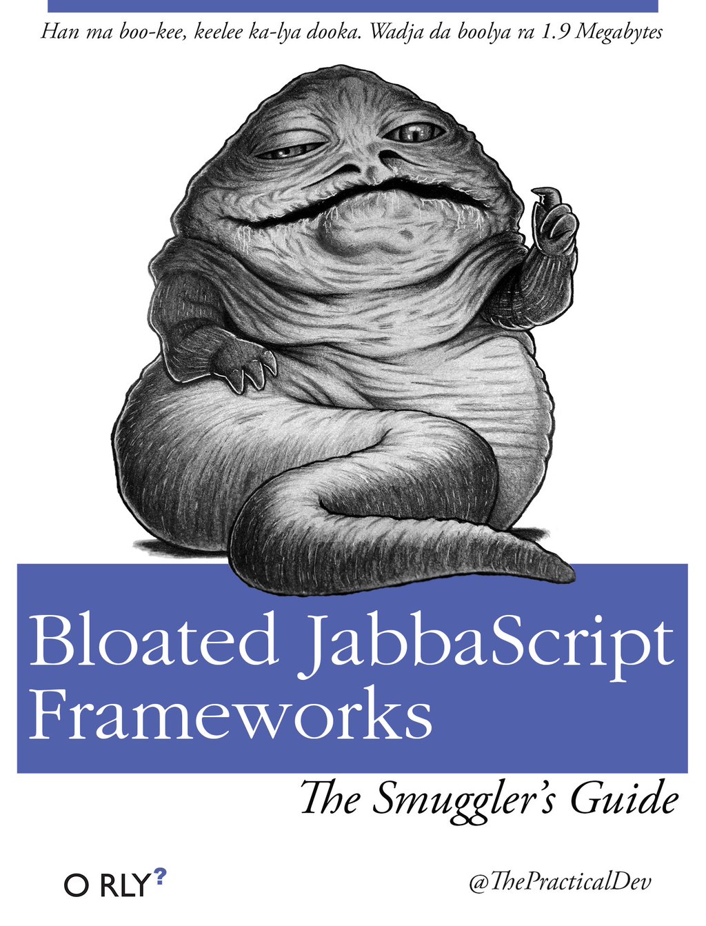
# Thank god I never fell into the trap of using a JavaScript FrameWork.
2/11/2023, 5:47 PM
#
So how did it end up this way?
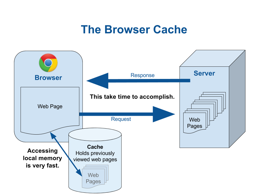
The original plan was to store everything in a JSON file and let the browser cache everything else, so you only load the parts that change, theoretically making the site super fast and efficient.
2/11/2023, 5:49 PM
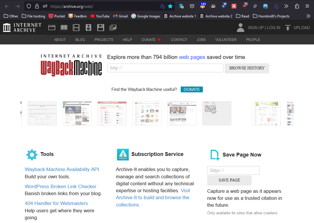
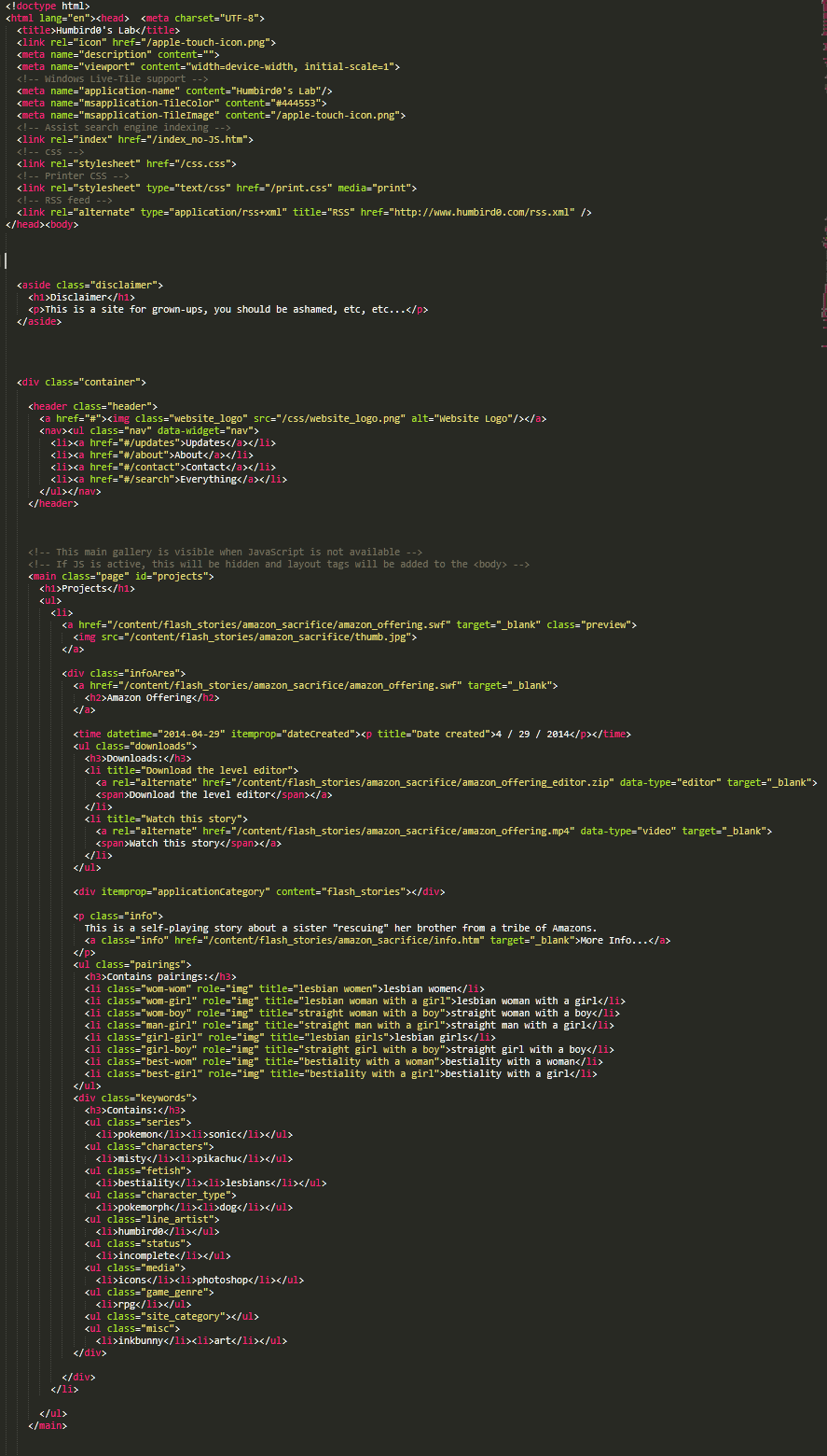
# Then I discovered the Internet WayBack Machine and changed my mind. I wanted my website to be easy to archive, so I started storing all the information in the HTML itself with standard markup instead of using a weird custom JSON file that only I understand. That way when you save my site on the Wayback Machine, it can grab all the stuff.

2/11/2023, 5:50 PM
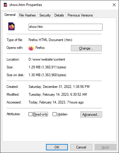
# Which means that the main HTML file is pretty huge and every time I add a project, the entire thing needs to get downloaded all over again. And that one file is over a MegaByte! So much for efficient caching.
2/11/2023, 5:54 PM
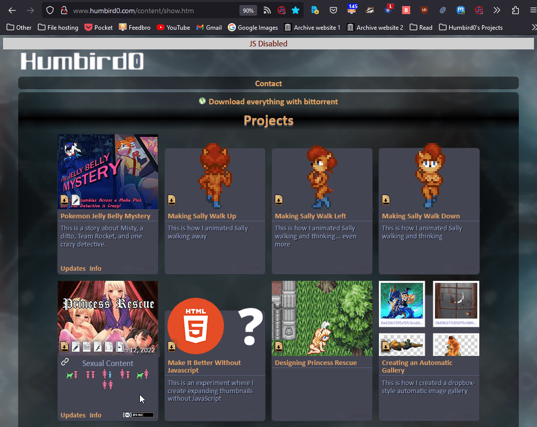
# I was so proud when I made the JavaScript optional by making the HTML data display as a nice looking gallery when JavaScript is turned off. It looks nice, but browsing the site is kind of janky that way. No pages, just direct links to files.
2/11/2023, 5:56 PM
# But the experience could be better. All these JavaScript-generated project pages and galleries could just be their own regular HTML pages instead. Hell each project already loads an extra HTML page just to display its “about” info, so that might as well just be the project’s page.
#Brainstorming my Website Wishlist
2/11/2023, 6:03 PM
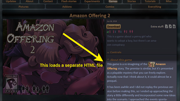
# I wanna play with border-image and decorate all the boxes to look like RPG windows.
2/11/2023, 6:15 PM
#
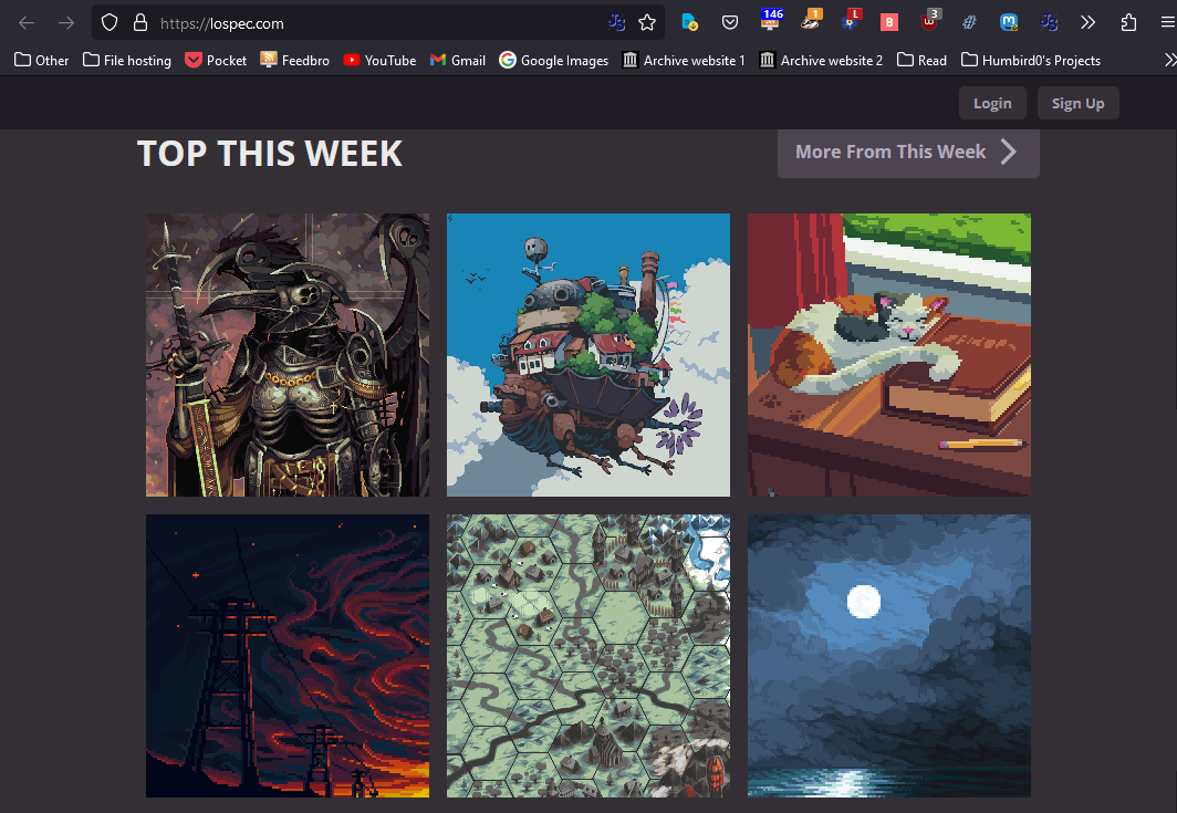
I want #PixelArt all over the place!
That’s what I’ve been making all these years. The website should reflect that.
2/11/2023, 6:17 PM
#
Hmm… ideas.
What should the website’s theme be? “Pixels” isn’t a theme, it’s an art style. But my games tend to have themes. Certain recurring situations, kinks, characters and places. Maybe these cliches can guide the design somehow?
2/11/2023, 6:17 PM
# Maybe I could have pixel girls sitting on the windows, like Kawa’s Window-Sitters.
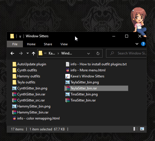
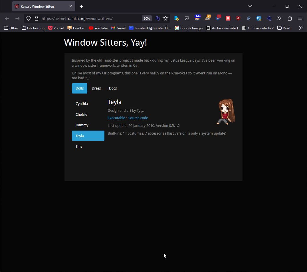
2/11/2023, 6:18 PM
# The website’s background could be a forest or an RPG map.

2/11/2023, 6:25 PM
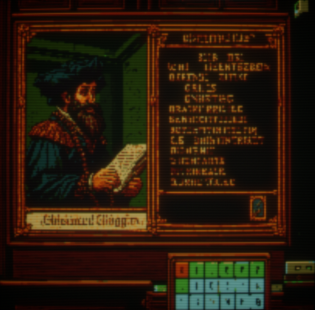
# Ooh, I REALLY like these warm colors! Dark green and brown with wood textures are a very cozy style.
2/11/2023, 6:23 PM
#
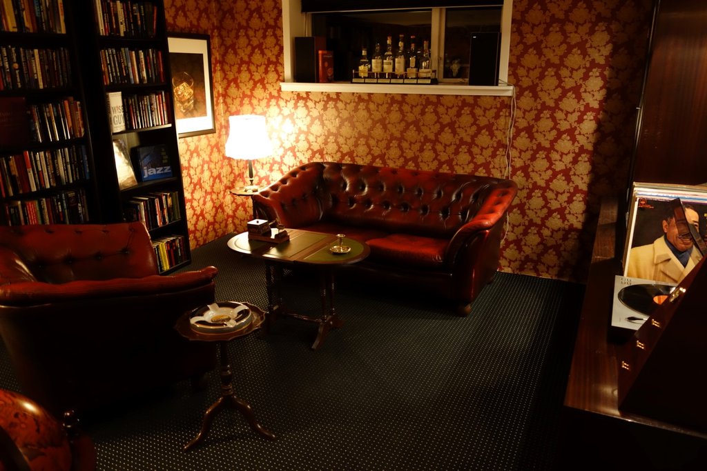
I’m such a sucker for the whole “book study” personal library aesthetic.
Is it something you see in my porn games? No.
Will I ever afford anything remotely like this? Hell no.
Relevent to my website? … no. 😢
# But… I can use the colors.
2/11/2023, 6:22 PM
# Oh, and I gotta use the Chrono Trigger font!

#RPG Style Windows
2/11/2023, 6:23 PM
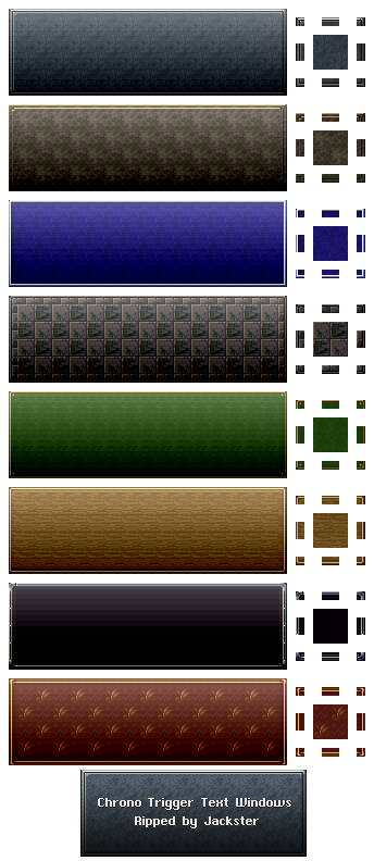
# In fact, maybe I should just use Chrono Trigger’s text windows.
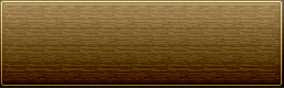
# But its wood window is too plain for my tastes, and copying is boring anyway, so I’ll use those rich colors and make my own chrono-like window. I was always preferred the fancy borders of the game’s 2nd window style anyway.

2/11/2023, 6:33 PM
# There we go! Sure it’s a “stone” texture but the rich colors feel like cozy wood.

2/11/2023, 6:34 PM
# Hmm… if I nudge this “inner” border down, I could put title text in between them. I’ll have to try some CSS experiments to figure out how I can manage this.

2/11/2023, 10:31 PM
# Looks like this will be easy. The only quirk is that the window’s gradient is drawn behind the borders, so I have to use Photoshop to manually add a gradient to the border images to create the illusion that they’re getting affected by the shading.

2/14/2023, 3:46 PM
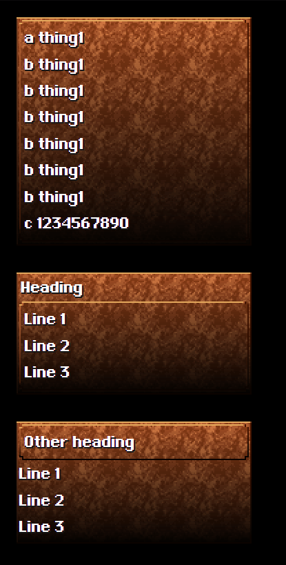
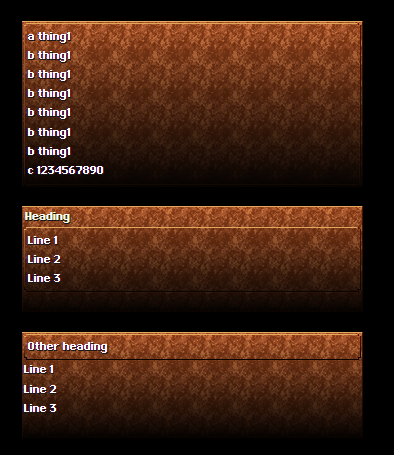
# I’m debating whether or not to use chunky pixels. If everything on the page looked like then it wouldn’t look out-of-place to draw my decorations and pixel girls in low resolution.
2/14/2023, 4:13 PM
# I gotta go with my gut on this one. Small native resolution looks better to my eyes. One of the most impressive things about #PixelArt is how it packs so much detail into a small space.
2/14/2023, 4:18 PM
#
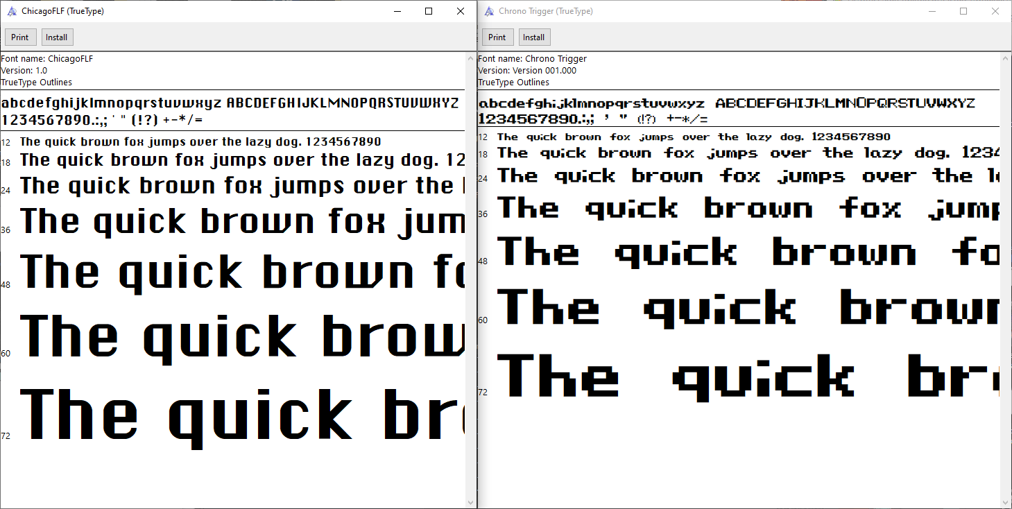
Also, the #ChronoTrigger in-game font is not Chicago. It has some changes.
But I decided to go with a slightly different #font by LockeZ instead of either of those, because it renders sharper pixels in a web browser and has nice chunky punctuation.
#
=============
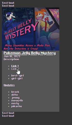
I’ll start with almost raw HTML. Just to figure out what information is going to be on the page. After I know what a thing contains, then I can figure out how it looks.
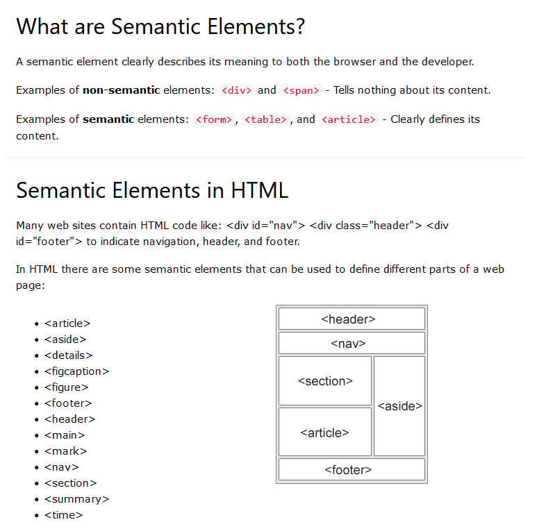
# You can invent your own HTML tags and they’ll be treated as SPAN tags, it’s just XML, but you should use existing HTML tags whenever possible if they have a specific meaning.

#The Color Scheme
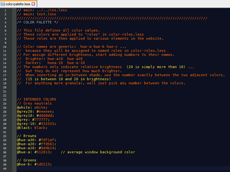
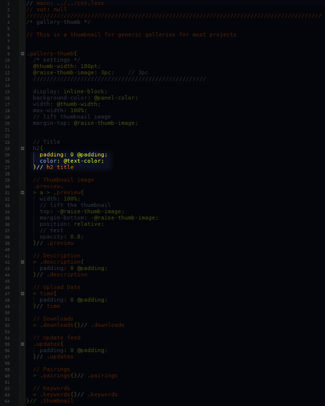
# Before I get too carried away with adding other things, I should figure out my website’s overall color scheme. I usually use 2 colors in multiple shades, and neutral greys.
#
Gonna try something:
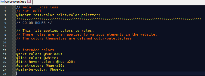
I’ll define basic hues. (Greys, Browns, Greens)
Then assign them to color-roles. (text, clickables, foreground, background)
Then apply those roles to individual things in the HTML that fit those roles. (Buttons and Links are both things you click)
They’re just variables, but I decide what they mean.
#
=============
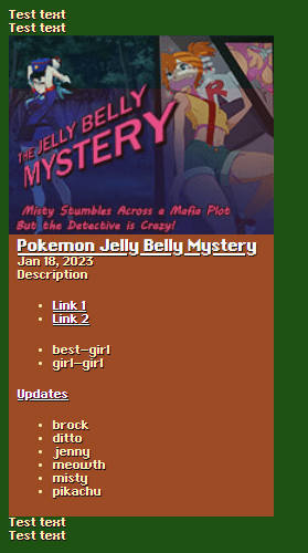
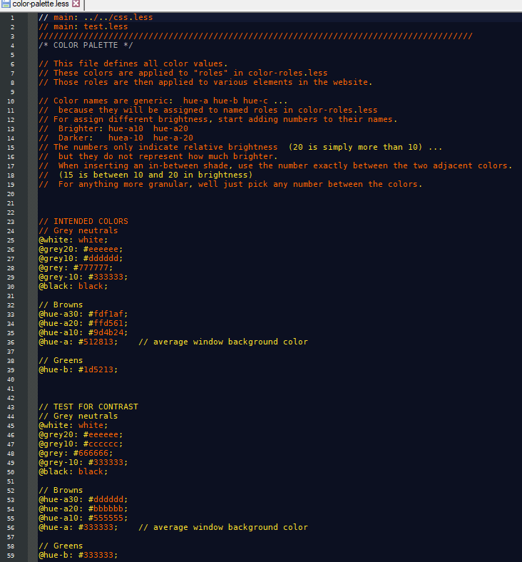
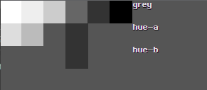
Next I’ll check if things have enough contrast by temporarily setting all the colors to shades of grey. To test this the only thing I need to change is the hue-palette, the roles update automatically, and everything that uses those roles updates too.
# Then I’ll adjust the shades until they contrast against each other better, and check the thumbnail to see if links stand out next to text and if text stands out against the backgrounds.
#
=============
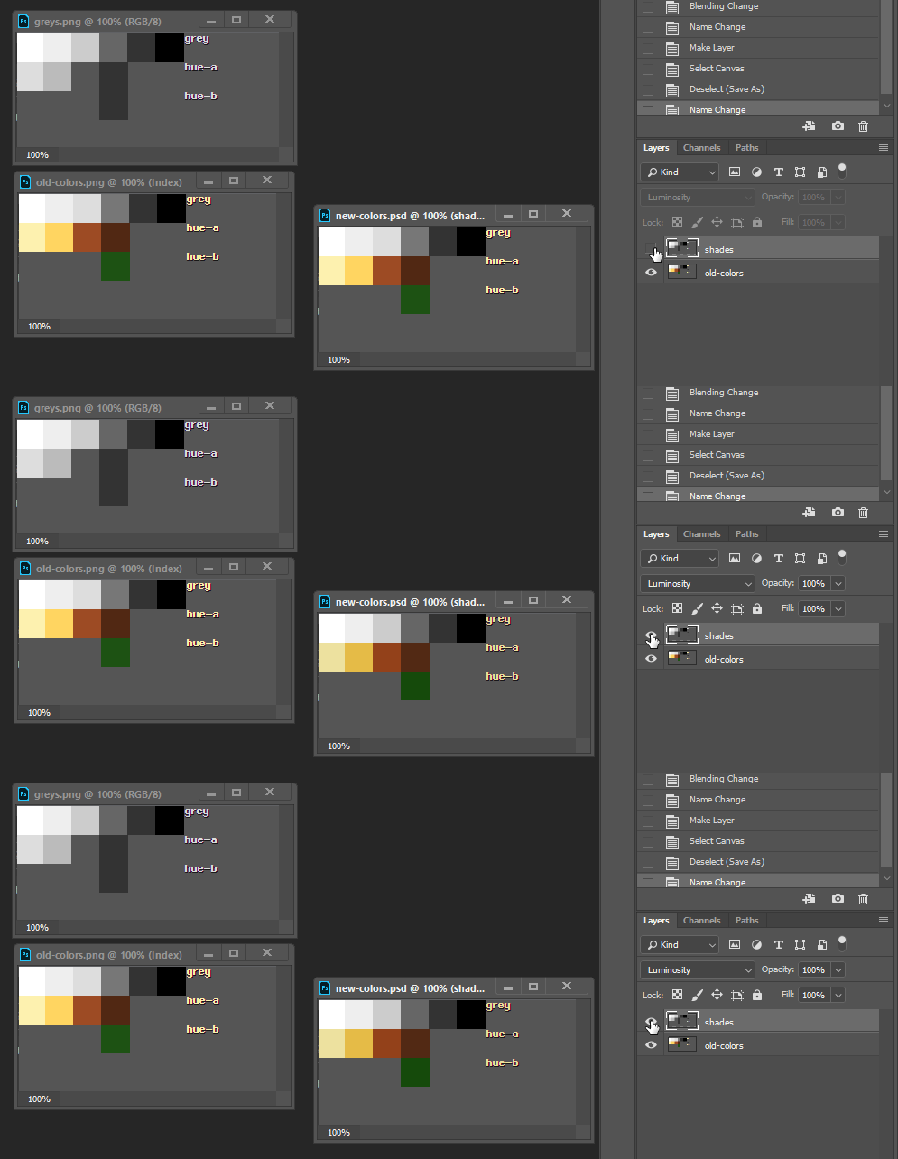
I took screenshots of the old color palette and the new shades of gray. In Photoshop I can overlap the greys on top of the colors and set the blend mode to ‘Luminosity’ to change the brightness of the colors. Now I have a set of colors that contrast better. I’ll just use the eye-dropper to get their color values and paste them into my CSS color-palette file.
#
=============
And sure enough, everything has better contrast now. I’ve actually never tried this technique before. Apparently it works.
2/14/2023, 12:16 PM
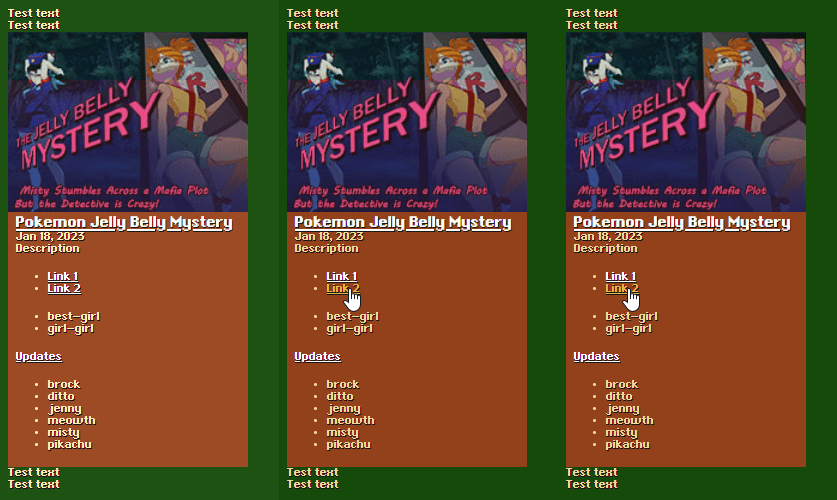
# Well that’s interesting. Framesets naturally collapse down to navigation icons. That might actually be desirable. Although I personally think hiding labels is always a bad idea. You could add tooltips, but smart phones don’t have those.
#Static Site Generators
2/16/2023, 2:02 PM
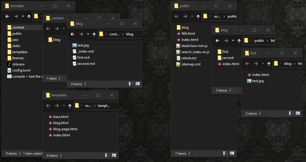
# So I tried out a static-site generator called Zola. It could theoretically re-create my site as separate HTML files. The idea is that I would write all my stuff as MarkDown files and Zola creates folders and HTML based on the templates I give it.
2/16/2023, 2:06 PM
# My only gripes with it are that the settings seem kind of limited. It always names the files index.html which makes it harder for me to let people browse the files in the project folders. And it doesn’t do live updates.
2/16/2023, 3:42 PM
# I think I’ll try out another generator called Hugo. It’s very similar but it might give me more options.
#Planning the HTML Code
2/16/2023, 7:47 PM
# But before I jump into any HTML generators, I should figure out what I want that HTML to be.
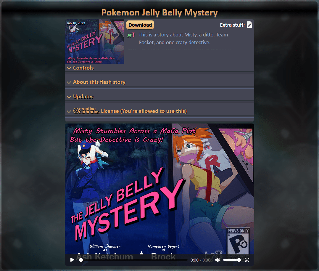
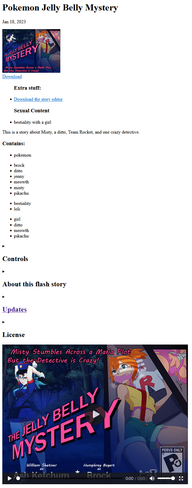
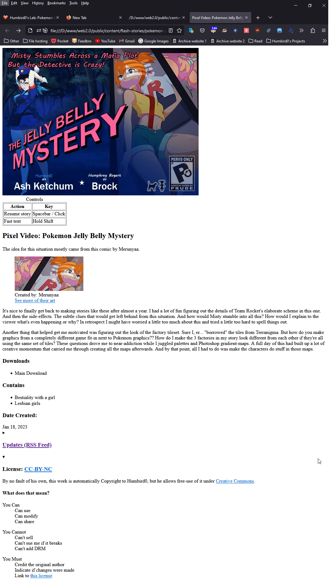
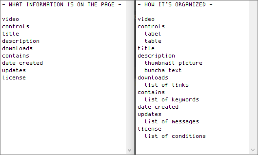
# For example, if I take my old project page, and remove all the CSS, the result is basically a list of what’s on that page.
# I feel like that old HTML code is kind of bloated, so instead of copying everything I’ll rewrite it. Same contents only simpler.
2/16/2023, 7:51 PM
# I was gonna go off on this whole tangent about HTML structure, but that’s probably boring to everyone who isn’t a huge #WebDev nerd like me, so… imma post it anyway! But I’ll dump it all into a single long post so you guys can ignore it faster.

#
2/16/2023, 7:52 PM
# “Semantic” HTML is about using HTML tags that represent the information well, so that machines like search engines can understand it. Ironically the trick to writing this way is to pretend a person is viewing this raw page. Would they understand it? Is everything labeled and visible?
# Don’t worry about how ugly it looks. That is 100% the job of CSS. HTML’s job is to be raw data. Because when you separate appearance and data, it becomes easy to modify one without needing to modify the other.
 CSS Zen Garden
# That used to be a lie. For 20 years the order of things in HTML used to affect how it got displayed. CSS “grid” recently changed that. Now you can freely rearrange everything on the page no matter where it is in the HTML.
2/17/2023, 6:21 AM
# Where was I? Oh yeah, making a porno website.

#More Color and Pattern Experiments
2/17/2023, 6:22 AM
#
… so let’s talk about menus instead!
One of my favorite things in Chrono Trigger is the way the menus slide around in the equip screen. Maybe I’ll do something like with the thumbnails when you hover over them.
2/17/2023, 8:06 PM
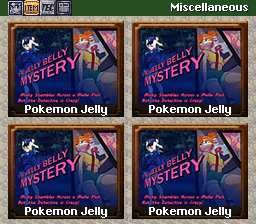
# They say you should design websites for the smallest device first and then build up from there. So as a silly thought experiment, I thought I’d throw together a rough mock-up in Photoshop of what my website might look like on a Super Nintendo. You’ll never find a smart phone smaller than this!
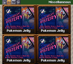 Photoshop doesn't do 9-slice scaling, so I just stretched the borders. It gets the general idea across.
2/17/2023, 8:12 PM
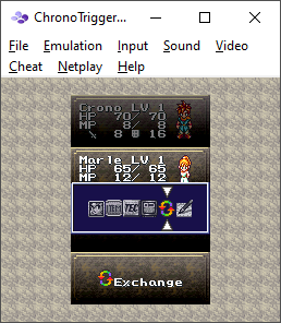
# Chrono Trigger loves to cram all its windows right next to each other with no margin except on the outside. And when the player picks between menus, each section is just an unlabeled icon. We can do better.
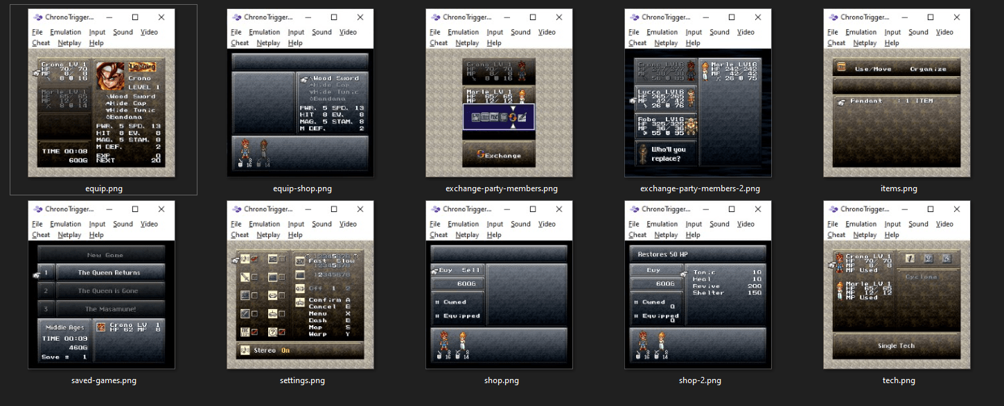 To be fair, they didn't have tools like Photoshop
2/17/2023, 8:22 PM
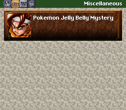
# This looks better to my eyes. Also, I LOVE that soothing “beige cloud” background the game uses.
2/17/2023, 8:36 PM
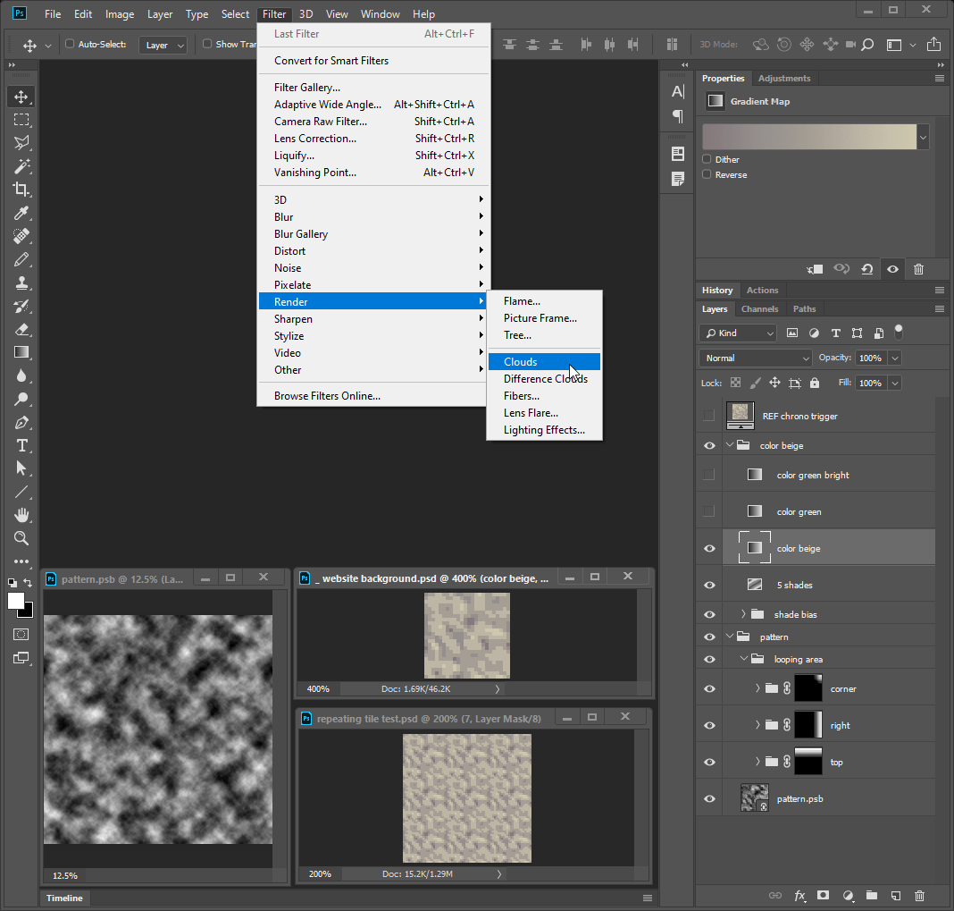
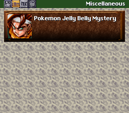
# Okay… so I just spent like, 5 hours creating a whole elaborate system for generating beige looping patterns.
In Photoshop, I generate clouds inside a smart object, stretch and shrink it, adjust the levels, reduce the colors, then apply a gradient map. Oh and I cross-fade the edges to make it loop seamlessly.

2/17/2023, 8:39 PM
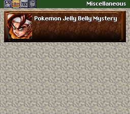
# This one’s my favorite. I call it “blunt leaves.” Hmm… what if I made them green?
2/17/2023, 8:41 PM
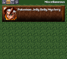
# Nice! I can’t decide if I want to fill the web browser with this dark green leaf pattern or use the soothing beige one. Dark backgrounds are easier on the eyes, but using the neutral beige for the background lets me use the green color for something else.
2/17/2023, 8:46 PM
# Then again, what else would I even use the green color for? My current website only needs the secondary color for links and text. Beige might work for links, but it might not contrast against regular white text.
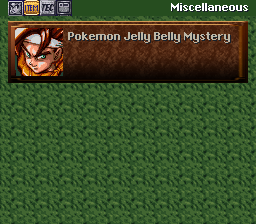
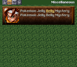
# … So what if I reverse the text colors? Beige for normal text and white for links? I have to admit, I like how soothing the beige text looks.
2/17/2023, 9:06 PM
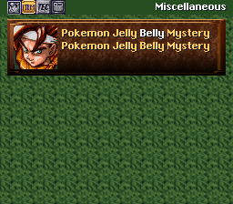
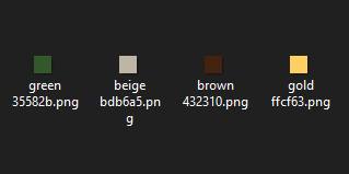
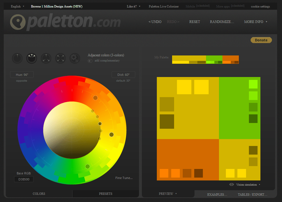
# Hmm… that gold “items” icon at the top contrasts very nicely against the green. What if I used that color? It’s not as bright as white, but it could work for links if I keep them underlined. The gold also looks good as a title color. In fact, it looks great against both colors. I guess my website has a 4th color now.
2/17/2023, 9:07 PM
# No wonder that gold color looks so good. It’s an “analogous” color, which means it’s near both of those other colors on the color-wheel. Therefore it looks good next to both of them.
2/18/2023, 2:26 AM
2/18/2023, 3:59 PM
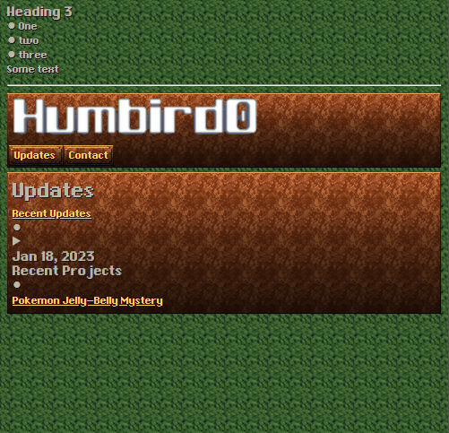
# I plan to organize the CSS by having each file represent individual things on the page, but not the page itself. So any page with a gallery on it will link to the gallery CSS and the thumbnail CSS. But most of the website’s appearance is the same everywhere, so most of the details are in the website’s global CSS file. The seperate files are mostly just minor adjustments. That’s the key using CSS. Keep the design consistent and only load what you need.
2/18/2023, 7:22 PM
# Some people are sensitive to too much motion. You can change that setting in the operating system itself and the website can detect it.
2/19/2023, 5:39 PM
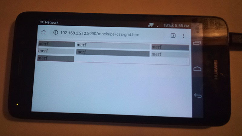
# As a rule of thumb, I try to make my website backward compatible with older web browsers instead of just the newest (and expensive) devices. I still have a 10 year old phone kicking around that runs Android 4. The phone still works perfectly, so I’ll test it against that.
# Ooh nice! Google Chrome for Android 4 can handle CSS Grid. That was the only potential compatibility issue I was worried about. I guess I can just make my site however I want.
2/20/2023, 2:08 AM
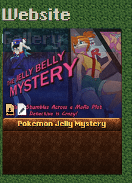
# I decided to switch to a vector font after all, because the pixel font’s native size was too small to read comfortably, and increasing the size made it blurry. At that point I’m better off using a vector font.
2/20/2023, 5:15 AM
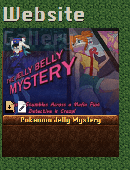
# I’m having tons of fun re-creating my fancy thumbnails with the new style, but… it’s 5:00 in the morning. Maaaaybe I should consider eating or sleeping.
#Website Navigation Menu
2/21/2023, 12:53 AM
# So I’m figuring out the navigation links at the top of the website, and trying to figure out if I could seamlessly turn them into a side-bar when the website gets wide enough.
# After messing around with Flexbox and CSS Grid for awhile, I remembered something. Floats! They make text to flow around pictures. But since anything that’s “inline” will flow like text, I could make the navigation links “flow” around the entire website.
# … I can’t decide if this is really clever or really stupid.
2/21/2023, 12:59 AM
#
I’m leaning toward… “stupid”
The website’s width normally changes instantly whenever you tilt your phone to landscape mode, so I don’t actually need a transition. I could just use a breakpoint. Besides that would give me more control over the appearance.
# But I also have another idea…

2/21/2023, 12:57 PM
# I could break the navigation into 2 lists and have the “extra” list appear on wide screens. But that means phones would see fewer links for the sake of a cleaner layout.
2/21/2023, 4:03 PM
# Nothing motivates me like adjusting things. Writing the CSS for this website is getting dangerously addicting. I’ve stayed up til 5:00 in the morning more than once now.
2/22/2023, 12:20 AM
# God damn I love animation!
2/22/2023, 5:59 PM
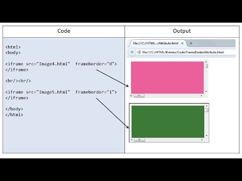
# Even with a page-generator, I don’t want it to just paste the navigation onto every single page. If I change the navigation I’d have to replace ALL the pages and reupload them. Instead I think I’ll just put iframes on every page. Links inside them should be able to change the parent page by using target="_top"
# Now the question is whether I can make them look seamless. Can iframes have transparent backgrounds? I don’t remember.
2/22/2023, 11:53 PM
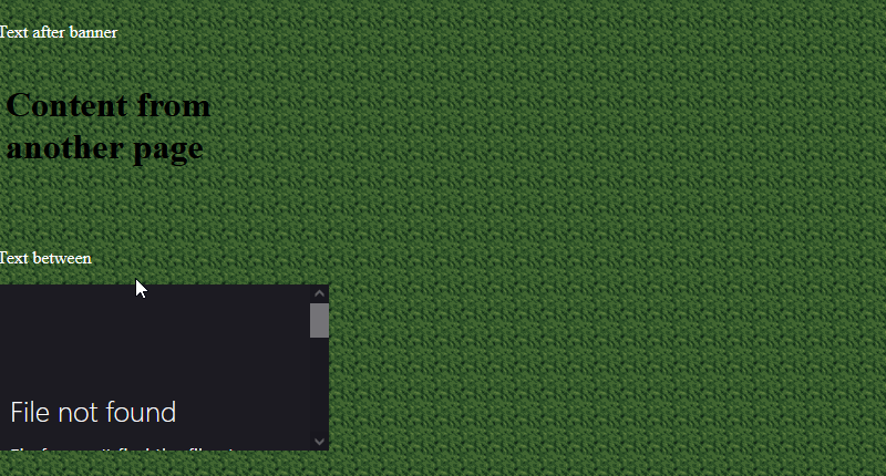
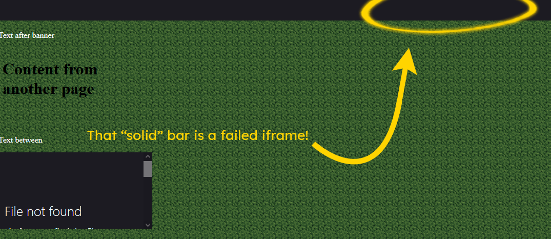
# Apparently they’re already transparent by default… but only IF the page loads successfully. Failing to load a page displays a browser-generated error page with a solid color.
# Hmm… it doesn’t look like there’s any way for CSS to hide iframes that fail. I thought I could be clever and detect a default inside the iframe tags, but that only displays on VERY OLD browsers that don’t support iframes. And I don’t want to rely on JavaScript.
2/22/2023, 11:53 PM
#
But maybe there’s a design solution.
Many websites have banners, colored rectangles stretching across the entire page.
A failed iframe looks like a solid background color with error text in the middle.
But what if you could not see the middle?
A narrow iframe with no scrolling, would just show the solid color at the top.
Just like a banner.
I can disguise failed iframes as banners!
2/23/2023, 12:47 AM
# It seems to be a lot simpler to lay out 2 iframes than to have the actual header and navigation links all on the same page. Then again, maybe that’s just because this is my 2nd time doing this and the technique is still fresh in my mind?
#
A CSS grid puts them in the basic positions.
How they look if they fail to load their files.
When they succeed, you can’t even tell they’re separate pages!

2/23/2023, 12:47 AM
# Hmm… somehow the new website looks “flat” compared to the old one. The old website’s blurry background helps the stuff in the foreground stand-out but it also creates a sense of depth.
# Sure enough, adding a slight blur to the new website’s background makes the buttons and things “pop” forward just a bit.
#
A sharp background makes the website look flat.
A blurry background creates “depth” because it contrasts against the sharp content on the page.
That looks better.


2/23/2023, 10:34 AM
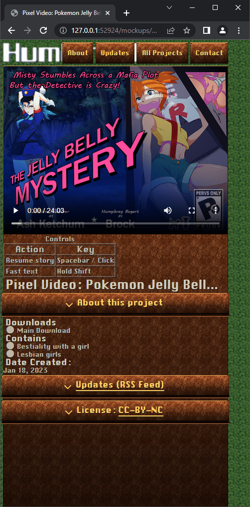
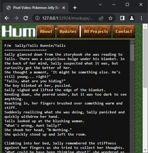
# See that space on the right? That gives touchscreen users a spot to drag their thumb to scroll the page. You need that if other parts of the page can scroll too, such as textboxes with stories in them.
#Designing the Pages
2/23/2023, 11:50 PM
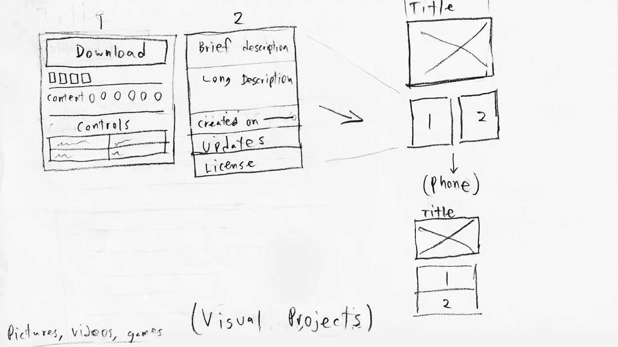
# Now to figure out how the project pages will look. Games, pictures, tutorials, stories. Some of these can share the same layout, but some are different. When I’m trying to come up with ideas, messing around with tools tends to distract me. I think better with pencil and paper.
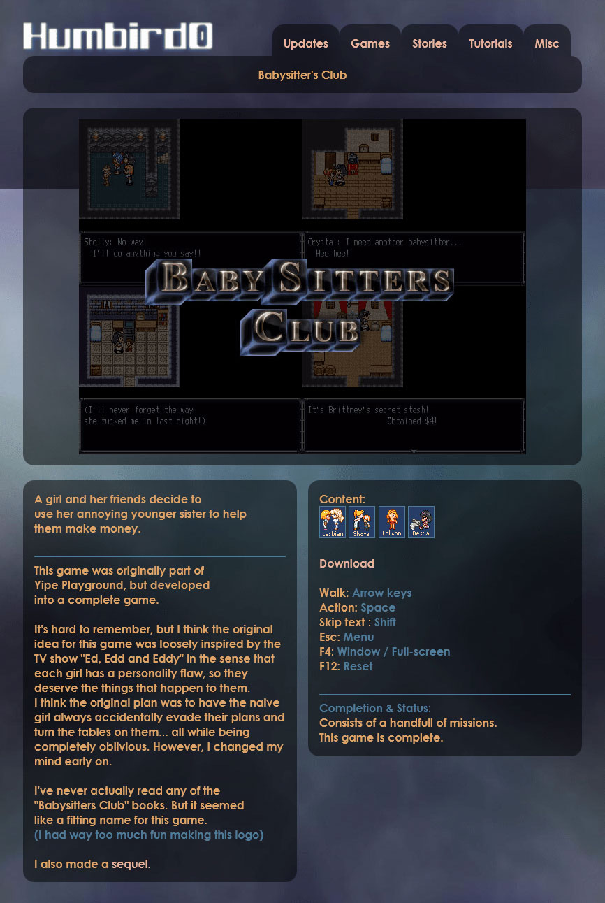
# I was looking at a picture of my old website from 2012. This old 2-panel layout might not me practical on smart phones, but I always liked the way it looked. Maybe I’ll try something like this again for large screens.
2/24/2023, 12:01 AM
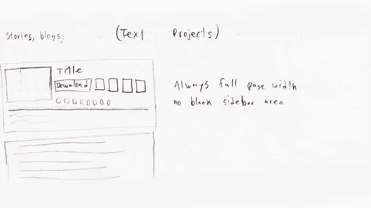
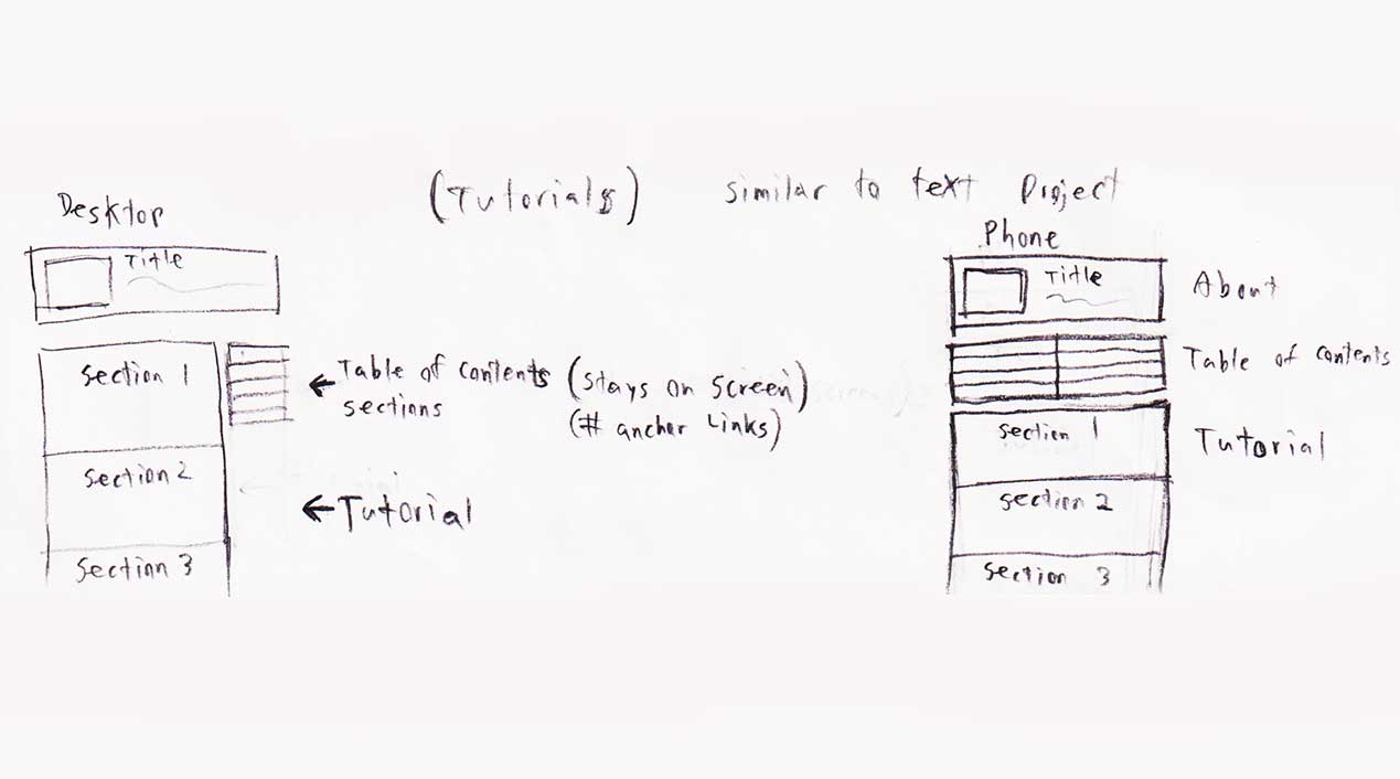
# These ugly sketches are the most important work I’ve done on this site. They’re plans. All the tools in the world won’t help if you don’t know what you want to make.
# I think I have a good idea of what I want to do now. Putting information underneath a picture tends to look nicer, but a text story should have the information at the top so you can scroll the page normally to see the entire story. Tutorials would work in a similar way.
2/24/2023, 12:06 AM
# The website I currently have online puts the information on the side when possible, but that leaves this big gap on the side when you’re reading. I want to avoid that.

#Project Metadata
2/24/2023, 12:10 AM
# Alright, I did the basic layout for a “visual” project. I still need to add styles to some of the informaiton itself like the controls, pairings, updates, license, etc…
# It turns out that CSS Grid isn’t quite the silver bullet I expected. I still had to wrap the information to create these 3 parts. But the rest was all CSS.

2/24/2023, 12:16 AM
# The reason why those Download icons on my site are so far apart is because I set a minimum touch-size for all the buttons so you can easily tap them on a touch-screen. There’s a rule-of-thumb that buttons on a touch-screen should be at least 0.4" inches in size to make it easy to tap. It looks slightly bloated on the screen, but I tested this on my phone and it seems to be true. I definitely wouldn’t want to go smaller.
# https://adrianroselli.com/2019/06/target-size-and-2-5-5.html

# Some of my projects have a lot of downloads. There’s no guarantee that all of them will comfortably fit inside a thumbnail. But that’s not a problem. Just display one, and reveal the rest when you hover over it.
# Maybe I should animate the rest of them flying out to the right, from the single icon.
# I’ve sorted out the game controls, pairings, and license.
# I even figured out a CSS trick to recolor the background images for the license permissions. The trick is to give something multiple background images. Set those images to be a gradient and a grayscale image. Then set the “background-blend-mode” so that the gradient has “color” blending and the grayscale image can be “normal”. The gradient overlaps the grayscale image, which means the color of the gradient gets applied to the image behind it.
# Text projects don’t give you anything visual to look at, so I display the thumbnail image next to the main information. Of course, on smaller screens showing it is not a priority. But on wide screens there’s room to fit things next to each other, so I added a few CSS breakpoints. And if you want to test a website on REALLY tiny screens, just open Chrome’s “Reading List” sidebar and shrink the window. It will probably look ugly, but the important thing is that it’s still useable.
#Backgrounds
2/26/2023, 12:31 PM
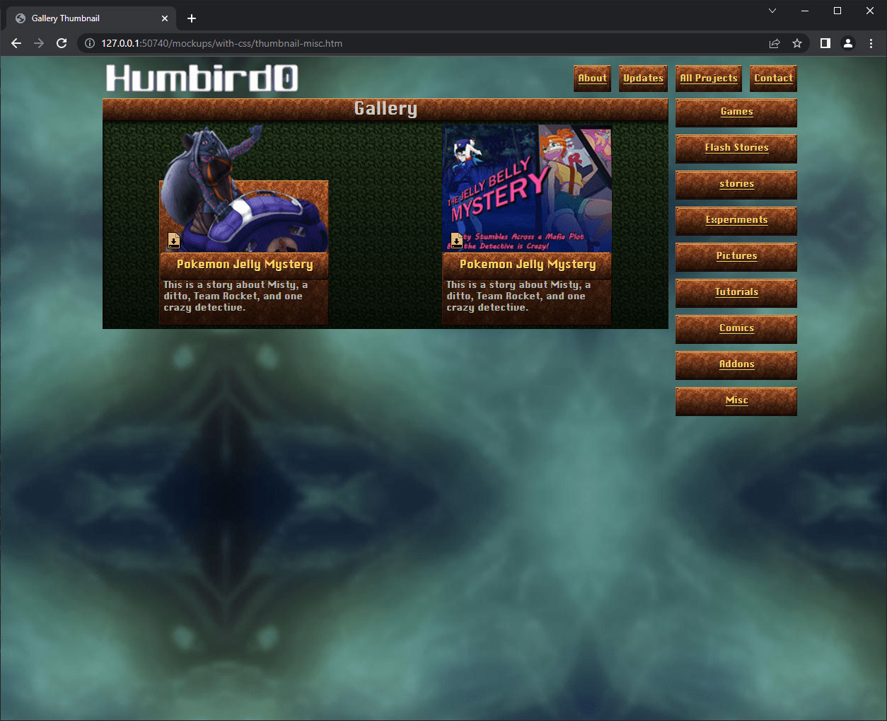
# Hmm… my thumbnail gallery needs a background. I can’t just have them floating against nothing.
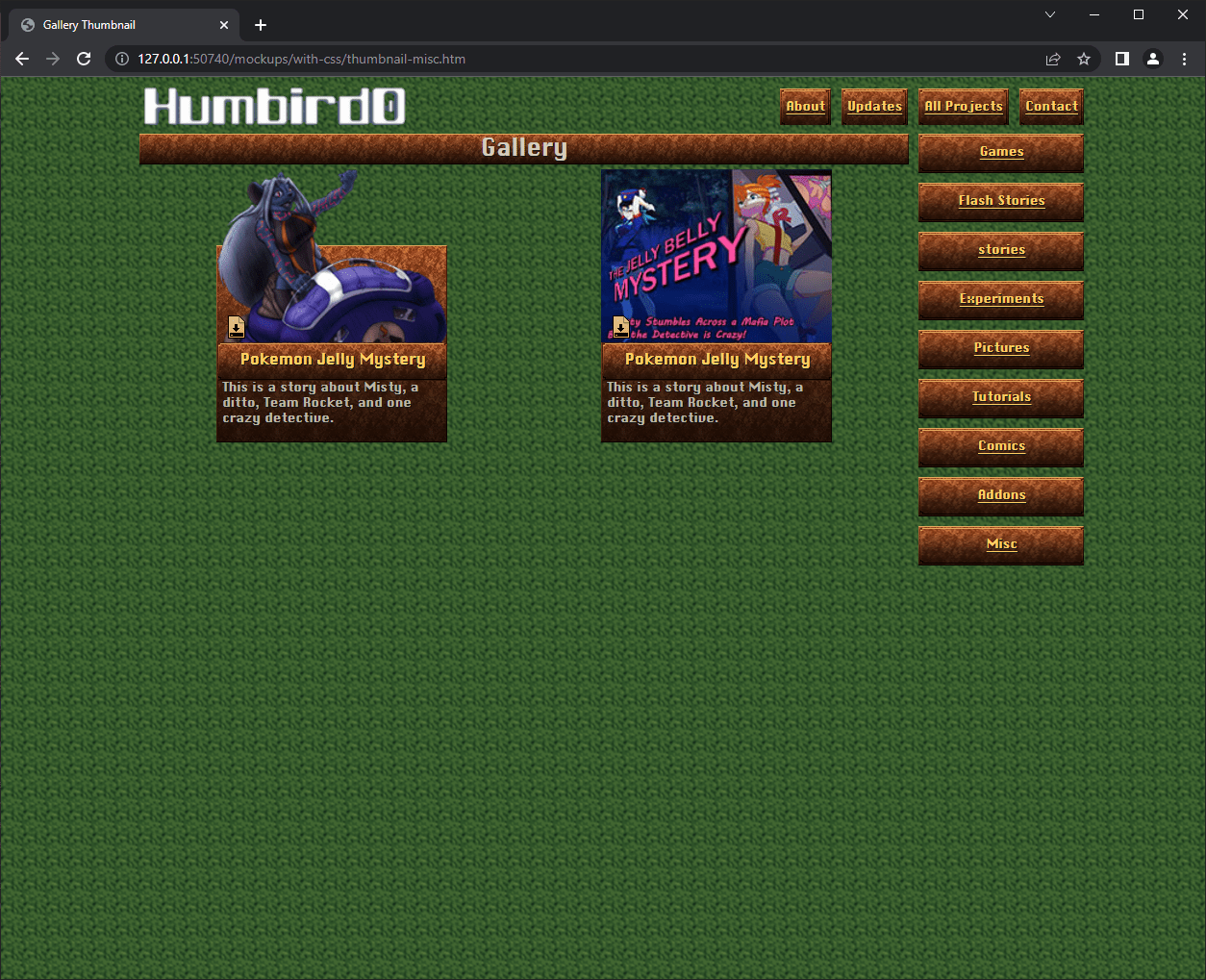
2/26/2023, 12:32 PM
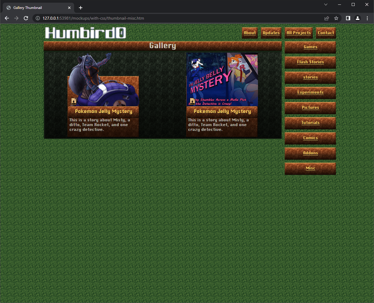
# This dark emerald looks really nice, but it doesn’t match anything.
2/26/2023, 12:23 PM
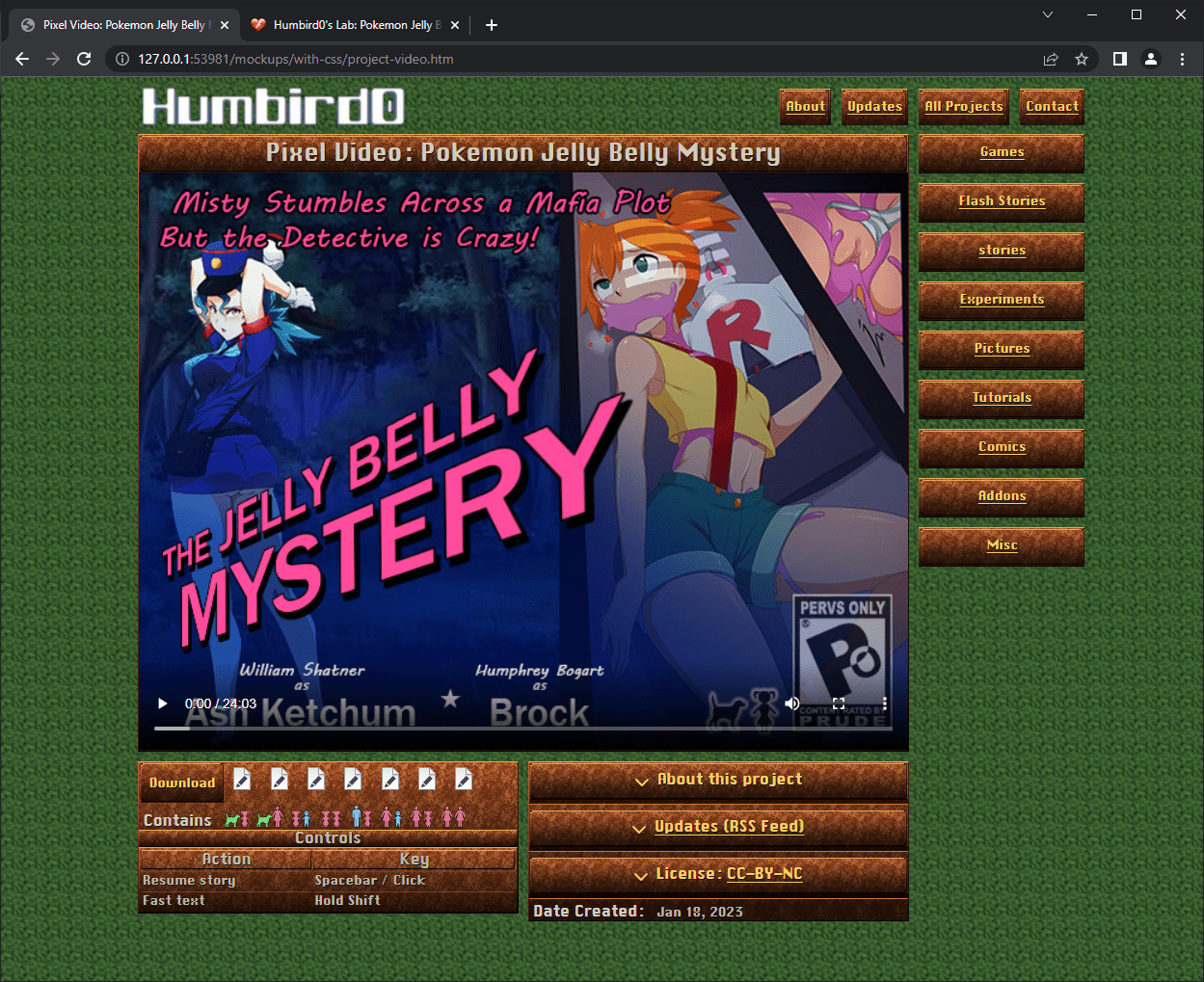
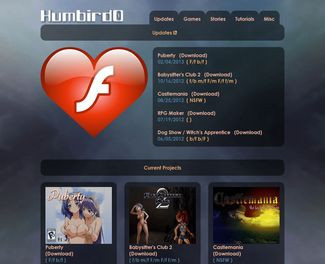
# I just can’t ignore it. The new website STILL looks flat. There’s just something excellent about the old website’s background. It’s not just blurry, but also large. There’s a reason why I kept using it for the past 3 versions of my website over the decades.
2/26/2023, 12:24 PM
# If this background is so great, where did it come from? Well that’s kind of a funny story. I saw some awesome artwork, but I didn’t want to steal it, so I kinda… derived it into something super abstract.
2/26/2023, 12:27 PM
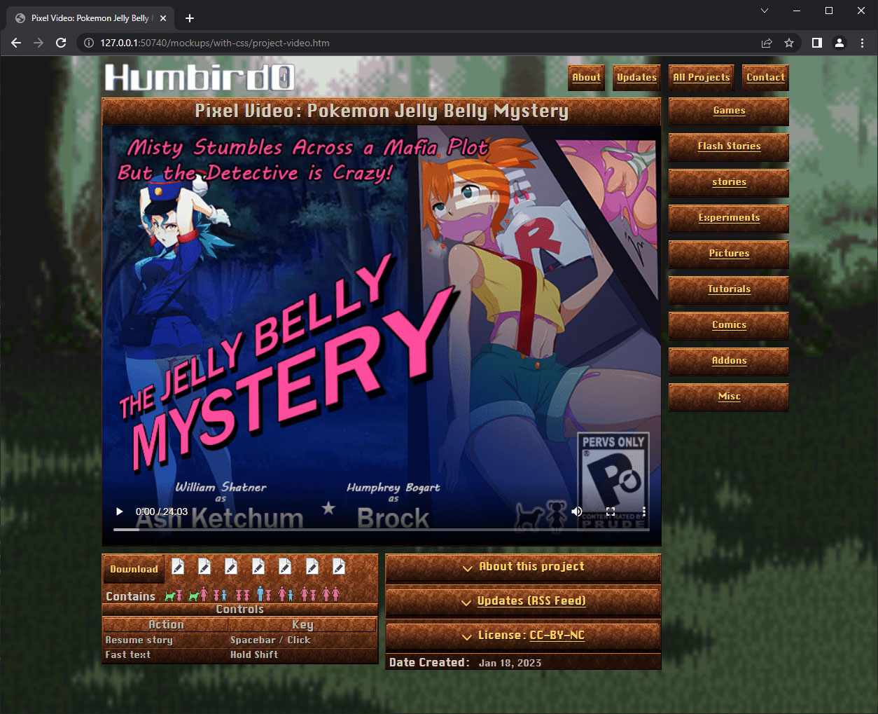
# But part of me wants to use pixel-art everywhere. As a test let’s try a background from Final Fantasy 6. Normally you want to avoid ever blurring pixel-art, but as a background it does create the right contrast. But the blurry pixels look tacky.
2/26/2023, 12:28 PM
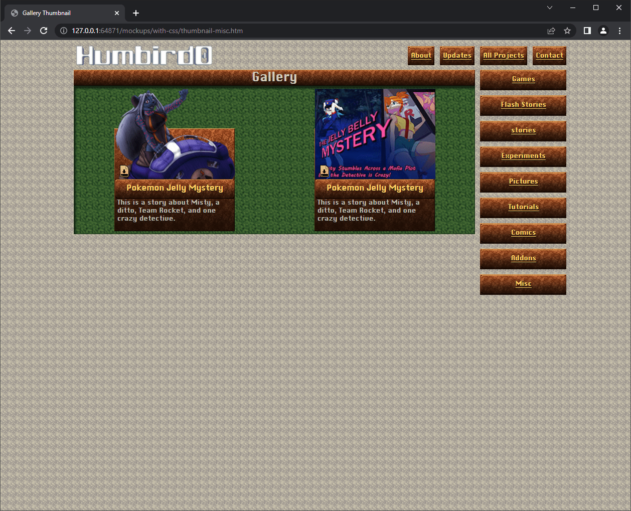
# If I’m changing the background anyway, maybe I can just use the old one for the thumbnails.
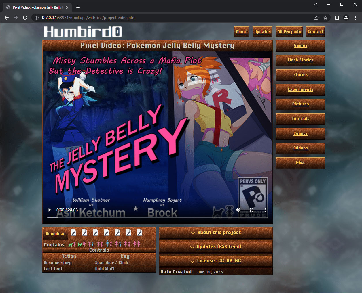
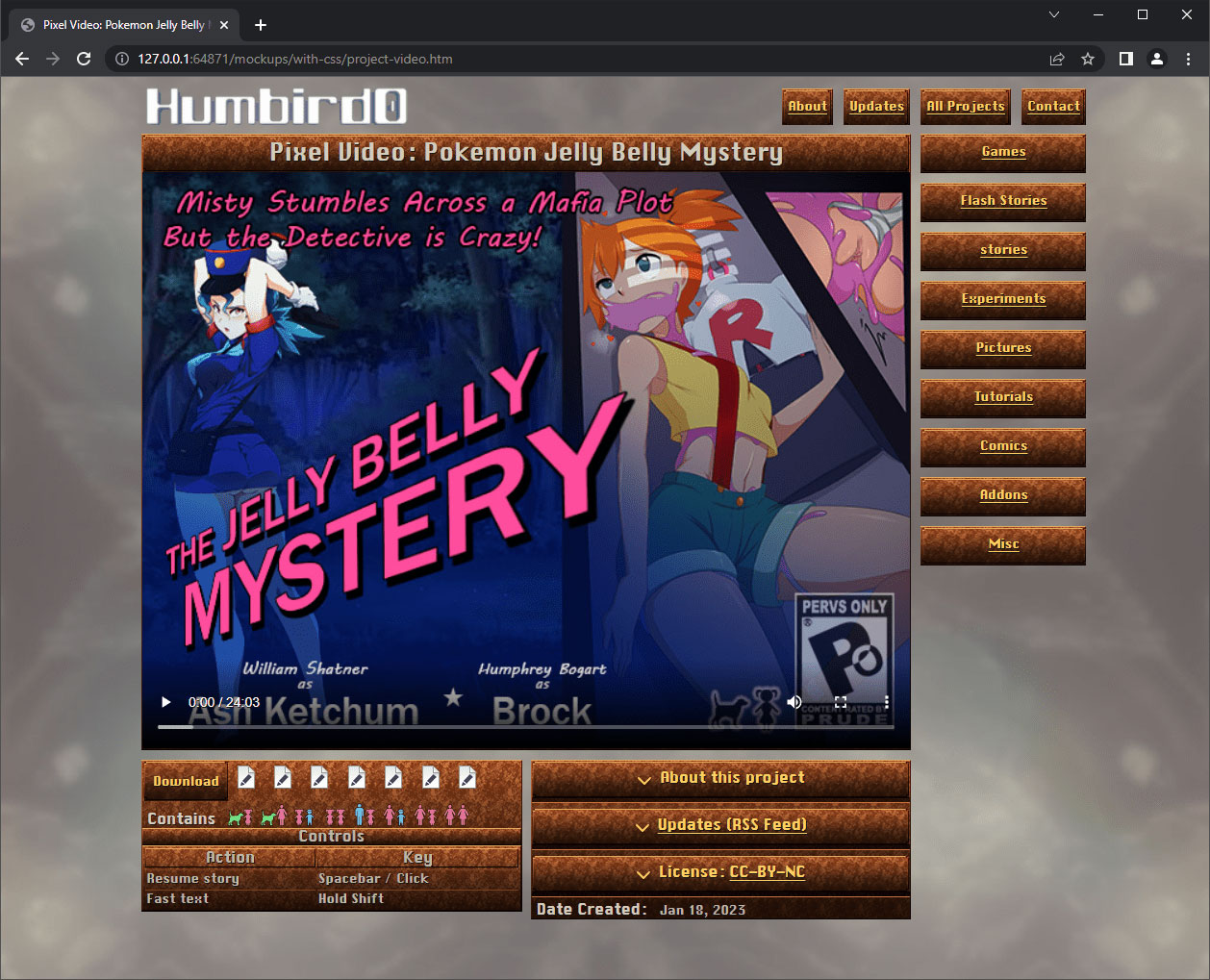
# Let’s try adapting the old background to the new color scheme. Hmm… adding the Chrono Trigger beige colors to the whisp pattern makes it look like a sea of jizz. I don’t like it. Red and green are still a better color combination.
2/26/2023, 12:44 PM
# Pure green looks too… artificial. But I want to avoid yellow-green because that only looks good on plants.
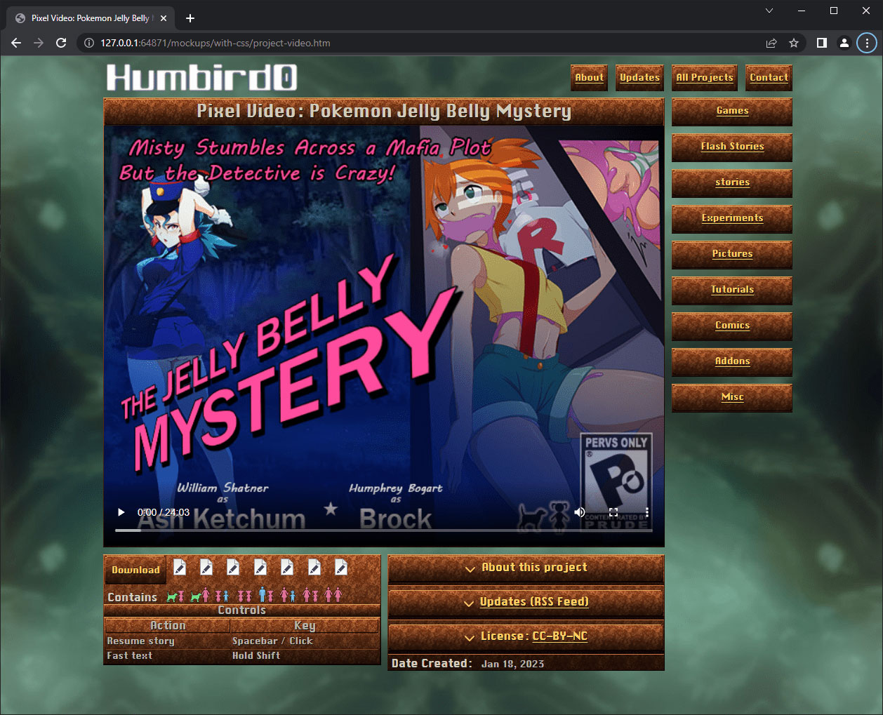
2/26/2023, 12:47 PM
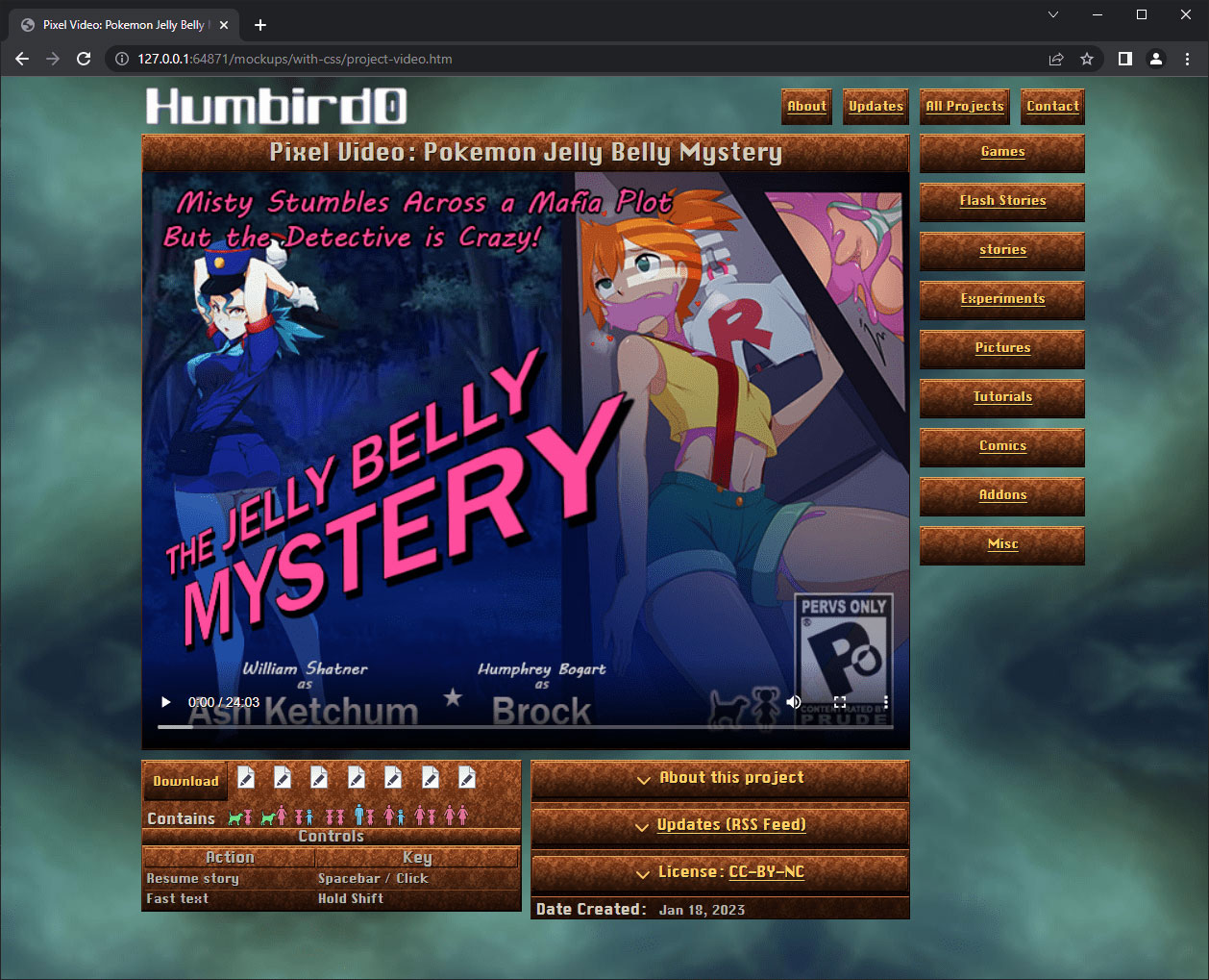
# So let’s shift the colors in the other direction toward blue. Yes! This looks very nice against the reddish-browns. I think this finally looks like an improvement over the old site. It’s hard to compete against myself. That guy had a 10 year head-start!
#Comics
2/26/2023, 1:00 PM
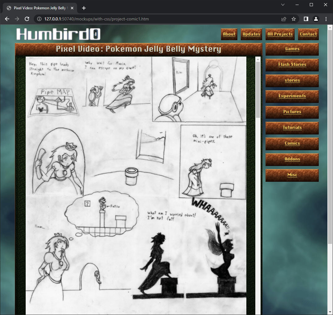
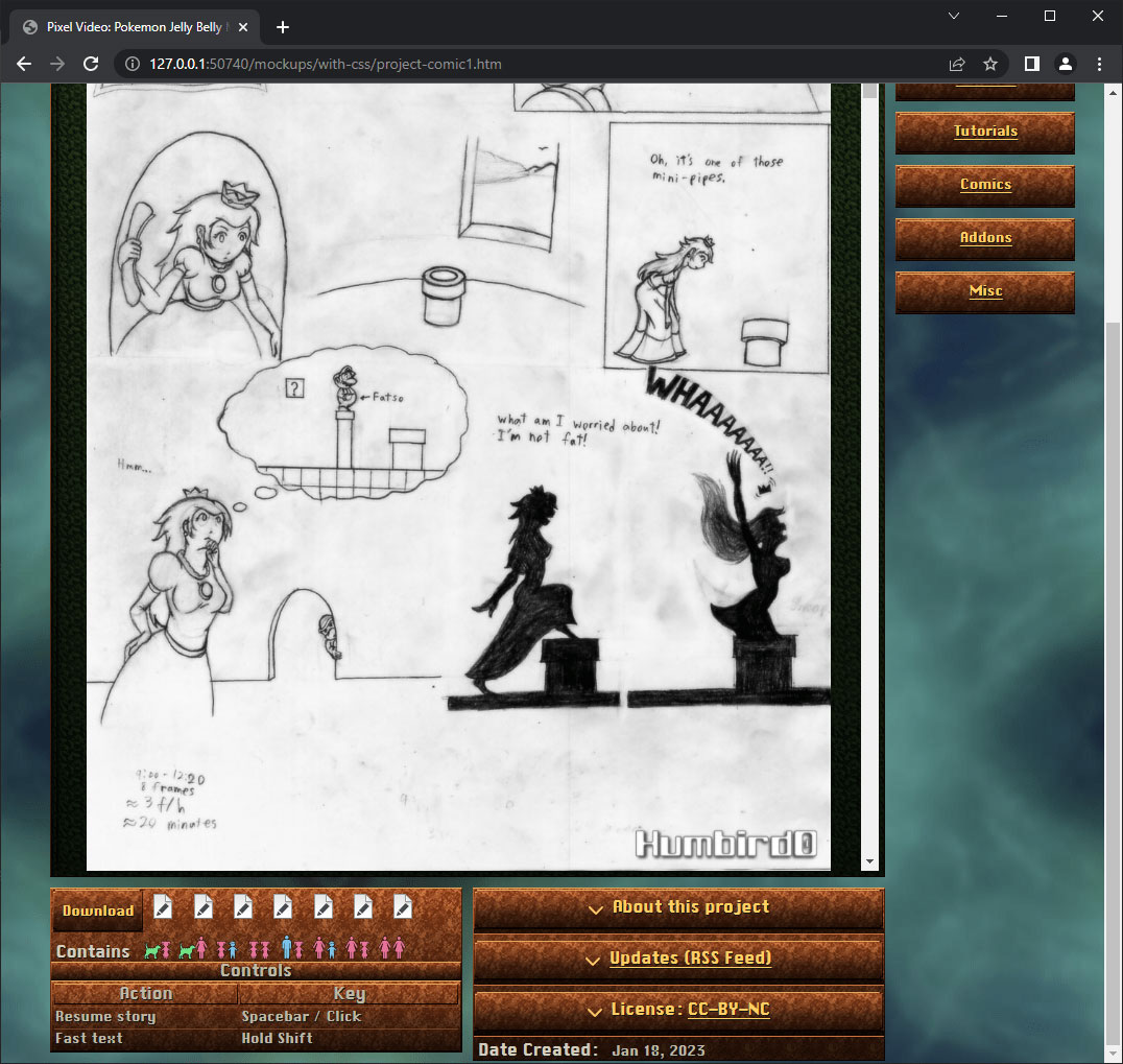
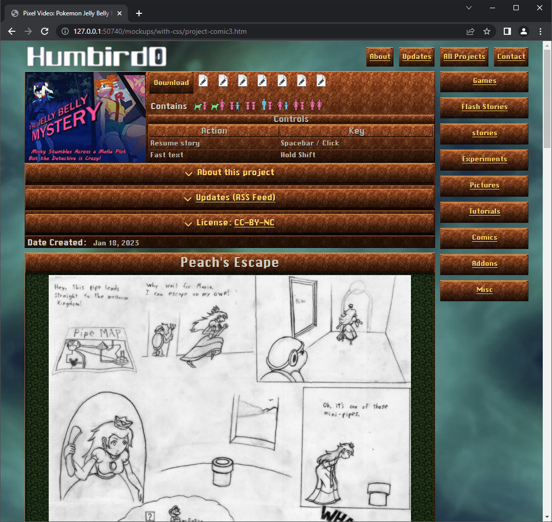
# So I had this whole clever thing going with the comic pages displaying inside an iframe, autosizing the images to fit, with anthor links to advance the page by just clicking on them. But I figured I still needed to add proper navigation links to each page.
2/26/2023, 1:02 PM
# But then I realized something obvious. Just put everything on the SAME PAGE. You don’t need navigation links if you can just scroll. After all, if it works for text stories it will work for comics. This isn’t a “text” layout, it’s a “scrolling” layout.
# It would be different if the comics had hundreds of pages.
#Update Feeds for Each Project
# I do use iframes for RSS feeds. I did that on my old website too. Originally it was because I was storing all the update announcements on Twitter and my old website was pulling them in and displaying them. Later I switched to using RSS Feeds so I wasn’t relying on any external websites that might go down later. An iframe gives me a lot of flexibility. I tend to add updates independently from the projects themselves.
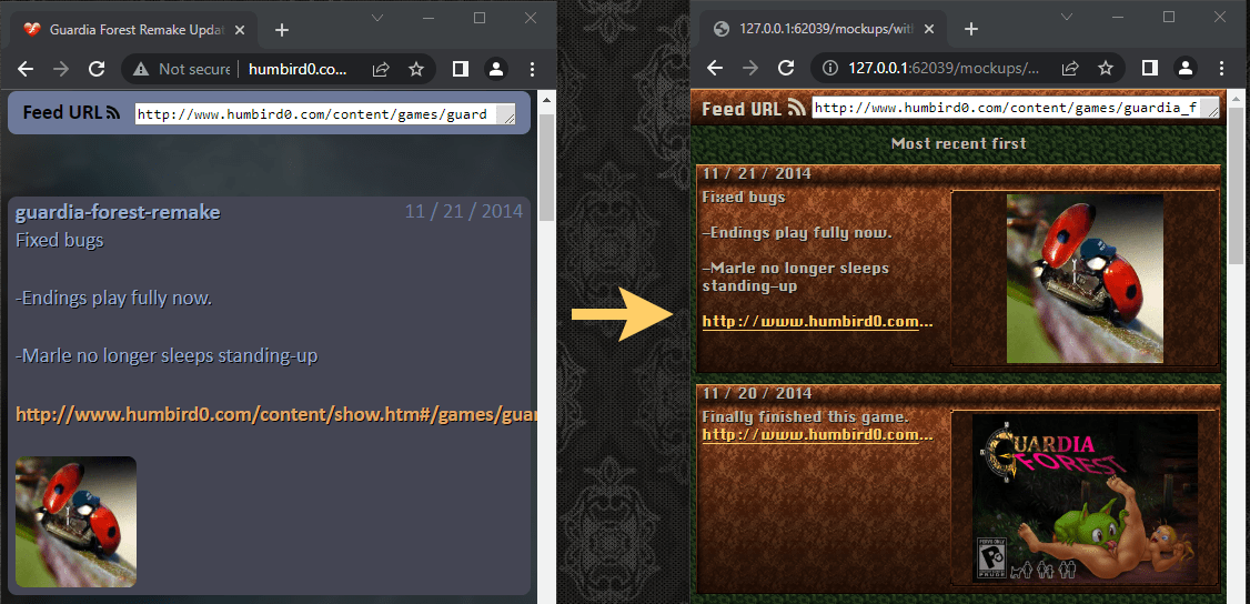
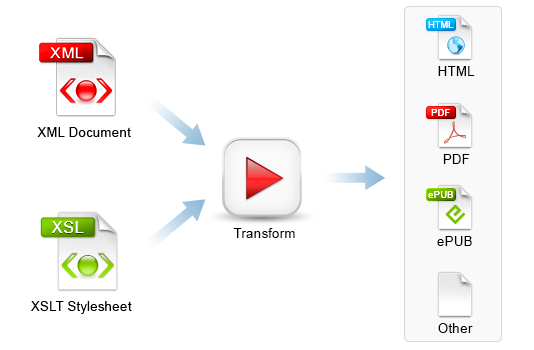
# Another reason why I store my website’s project updates as RSS feeds is because it’s a standard format. Anything can read it. Not just my website. There’s also a clever trick you can use to make a browser display a feed like a webpage instead of a bunch of text. Use an XSLT stylesheet. It’s basically a real-time templating language that everybody has forgotten about. Every browser already supports it.
#Anchor Links
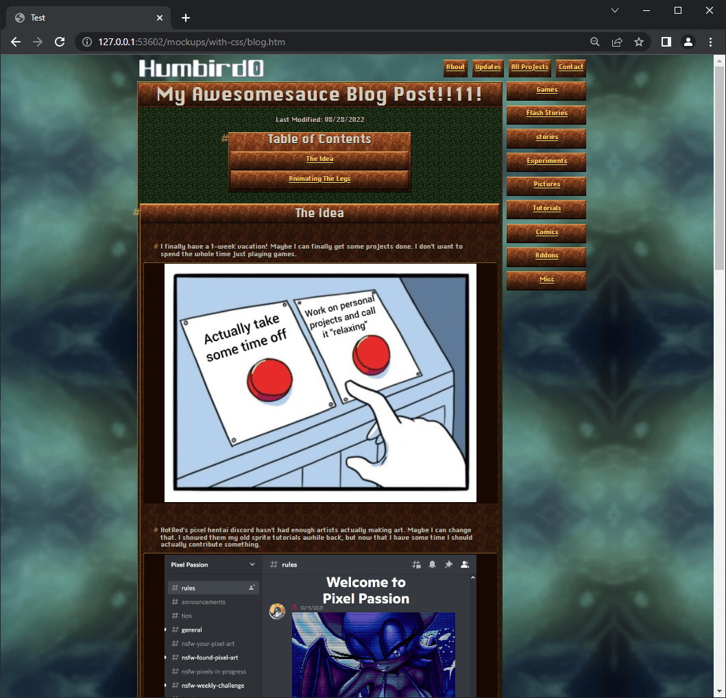
# This new blog design for my site is looking classy. Same old pages with a new coat of paint.
# Those Hash marks are anchor links. You can right-click them to get a link that will jump to that exact spot on the page. My old site has them too. Normally each one is only visible when you hover over a heading or paragraph. I got the idea from GitHub. Later on I’ll change these to use little “linked chain” icons.
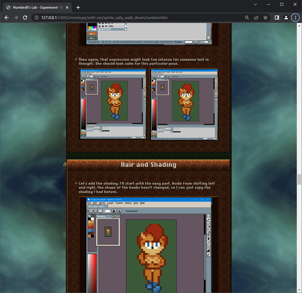
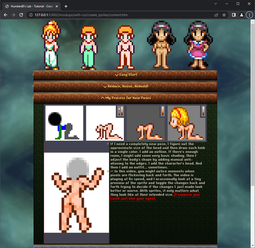
# I’m also starting to design CSS for my old tutorials. I have intentionally tried to keep their HTML simple over the years in order to make redesigns like this easier. But I still occassionally threw in a few unique tags here and there. For now I’ll just make them bright red and figure out how I want them to look later.
# One of the reasons I want to try a static site generator is so I can write these things easily using MarkDown and the generator will convert it into HTML for me. One way to ensure the HTML stays simple is to have something else write it for you.
#Thumbnails
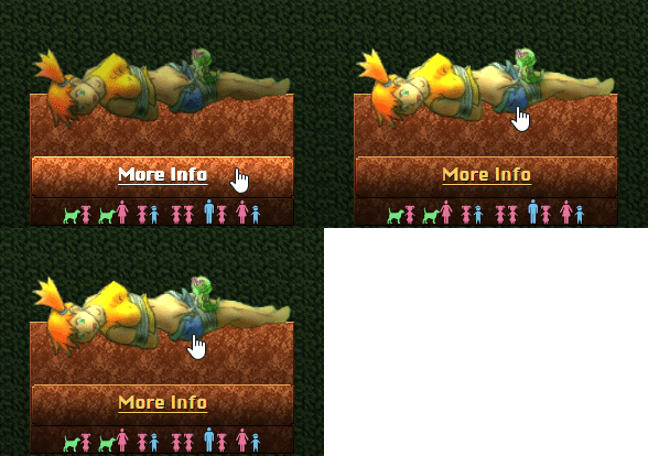
# I plan to give the thumbnails 2 clickable areas. Clicking the image just displays the picture directly, and the “more Info” button takes you to a page talking about the picture. People might naturally click on the picture, but it might not be obvious that these are 2 different links. One way to show what’s clickable is to highlight things when you hover over them.
# Not gonna lie. I’m starting to feel a little burned out from working on this thing for 2 weeks straight. It’s fun, but another project might be a good change of pace.

#Window Sitters
# After way too many failed attempts I finally figured out how I want to handle random window sitters. Making a picture sit on top of a window is easy, but the “random” part took hours to figure out.
# CSS does not do “random”. Not even a little bit. But it CAN do staggered rules, which sometimes overwrite parts of one pattern with another pattern, breaking it up enough to look convincingly random. I might throw in some optional JavaScript to randomize the –seed CSS variable to make every page look different. The idea is that I’ll still have a convincing effect if JavaScript fails to run.
# I just realized I could have used separate images. The CSS Sprite trick I’m using is completely uneccessary. All of the “randomness” actually comes from those nth-child() selectors. Nothing else.
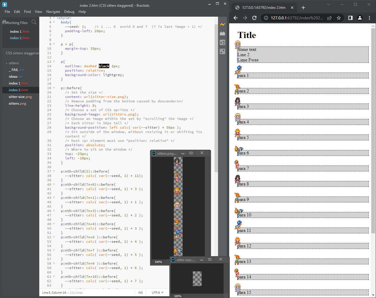
# I finished adding the window sitters. Making little scenes looks much more interesting than having individual characters just sitting there. Sometimes it looks a little too busy when a tutorial has all of its steps collapsed, but most of the time they’re spaced apart well. I decided to use a CSS sprite after all because that lets me shuffle them all using a single CSS variable and a tiny amount of JavaScript. I kept them tame because I want the spicy stuff to have content labels to warn people before they see anything.
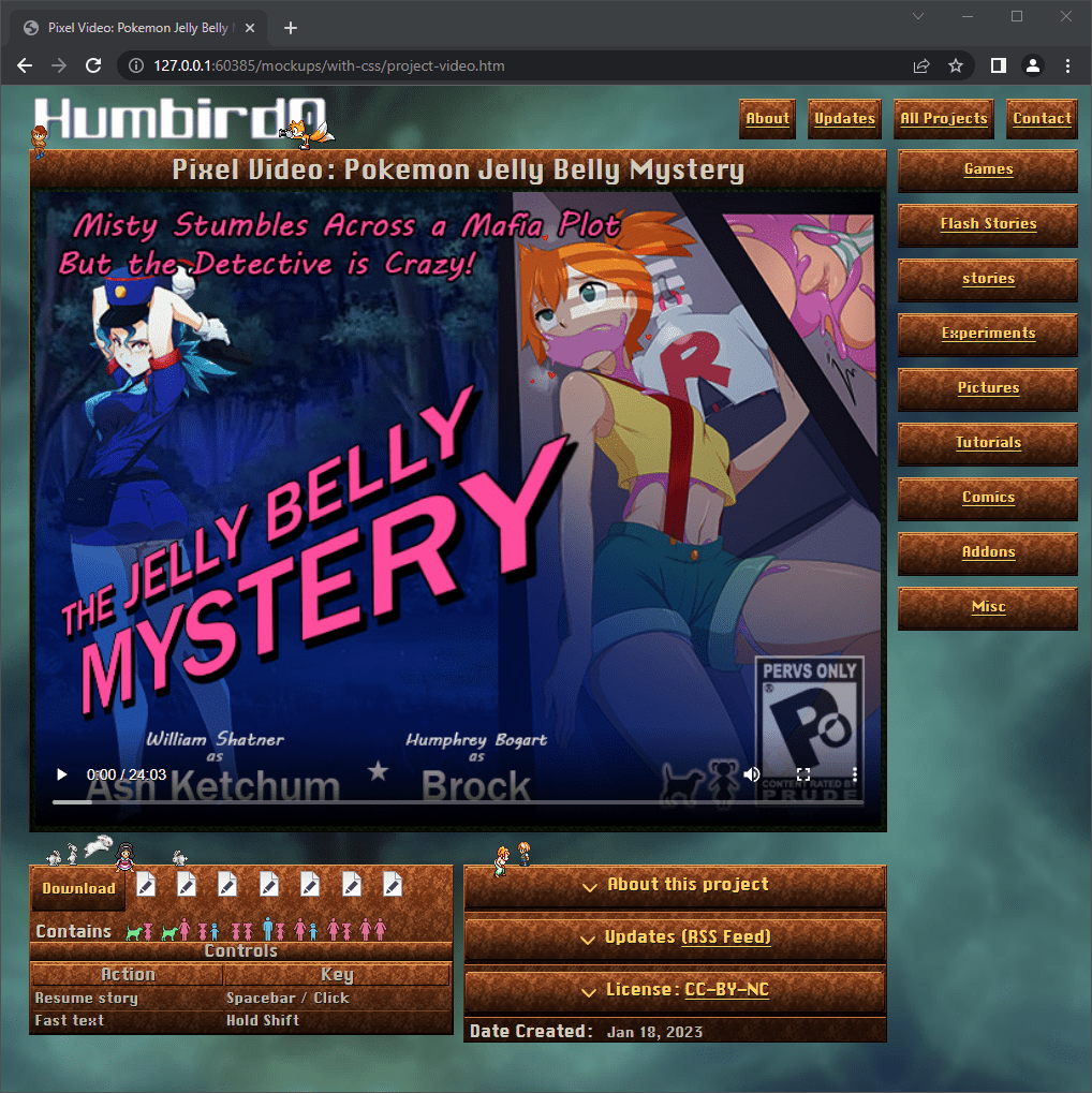
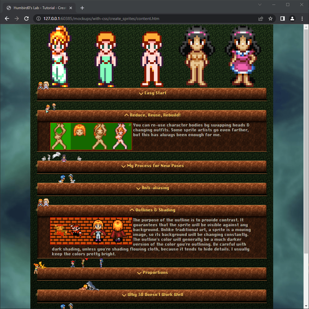
#Adding a Disclaimer
# I decided to figure out the disclaimer. The behavior is similar to my old website. Push the page down, and disappear when you click on it. The difference is that this is 100% CSS. I might add some optional JavaScript later to prevent displaying it if you’ve already seen it.
# The trick is to overlap it with an invisible checkbox. When you click the checkbox, CSS hides the iFrame next to it… and also the checkbox itself.
#
The + selector allows CSS to detect things that are next to each other. For example…
.checkbox:checked + .disclaimer{}
This will affect the disclaimer when the checkbox is ON
# As for the design… it’s counter-intiutive, but it’s actually less annoying to push the entire website down, than to overlap anything. Overlapping is basically a pop-up, which is annoying because it gets in the way of seeing or clicking things. Since a disclaimer can’t realistically filter visitors anyway, just make it noticeable but unobtrusive. It’s just a heads-up warning.
# But I don’t want it there permenently “polluting” the page’s design either, so clicking gets rid of it. CSS has no way of detecting repeat visits, so I’d need JavaScript to keep it from showing up again next time. But the worst case is if JavaScript can’t run, the disclaimer just displays normally. Nothing breaks.

#Why Markdown?
# I might have gotten ahead of myself. Although I was able to make my existing blog posts and tutorials look good on the new website, I completely forgot that I wanted to use MarkDown to create these. That’s part of the reason why I’m making my new website this way. Hugo will automatically convert MarkDown files into HTML when it generates a website.
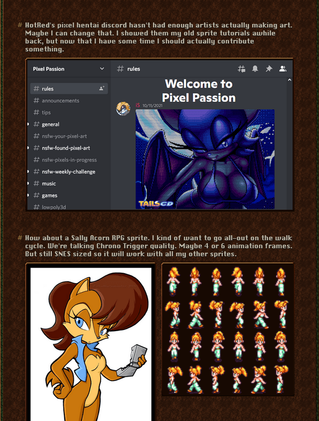
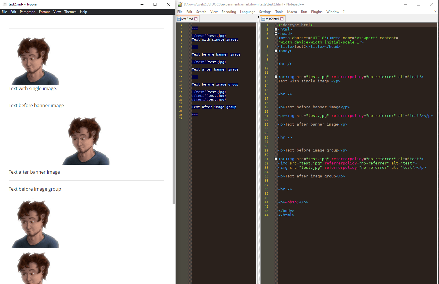
# MarkDown generates much simpler HTML. It puts everything inside paragraph tags, even images. I don’t get to wrap things in span tags with special class names (without making the MarkDown very ugly.) Is it possible for me to create equally nice results with what MarkDown creates?
#What’s Left?
# Well let’s see what I need to accomplish.
- Headers
- Text by itself
- Images next to text
- Full-width images
- Sets of images
#Laying Out Sets of Images
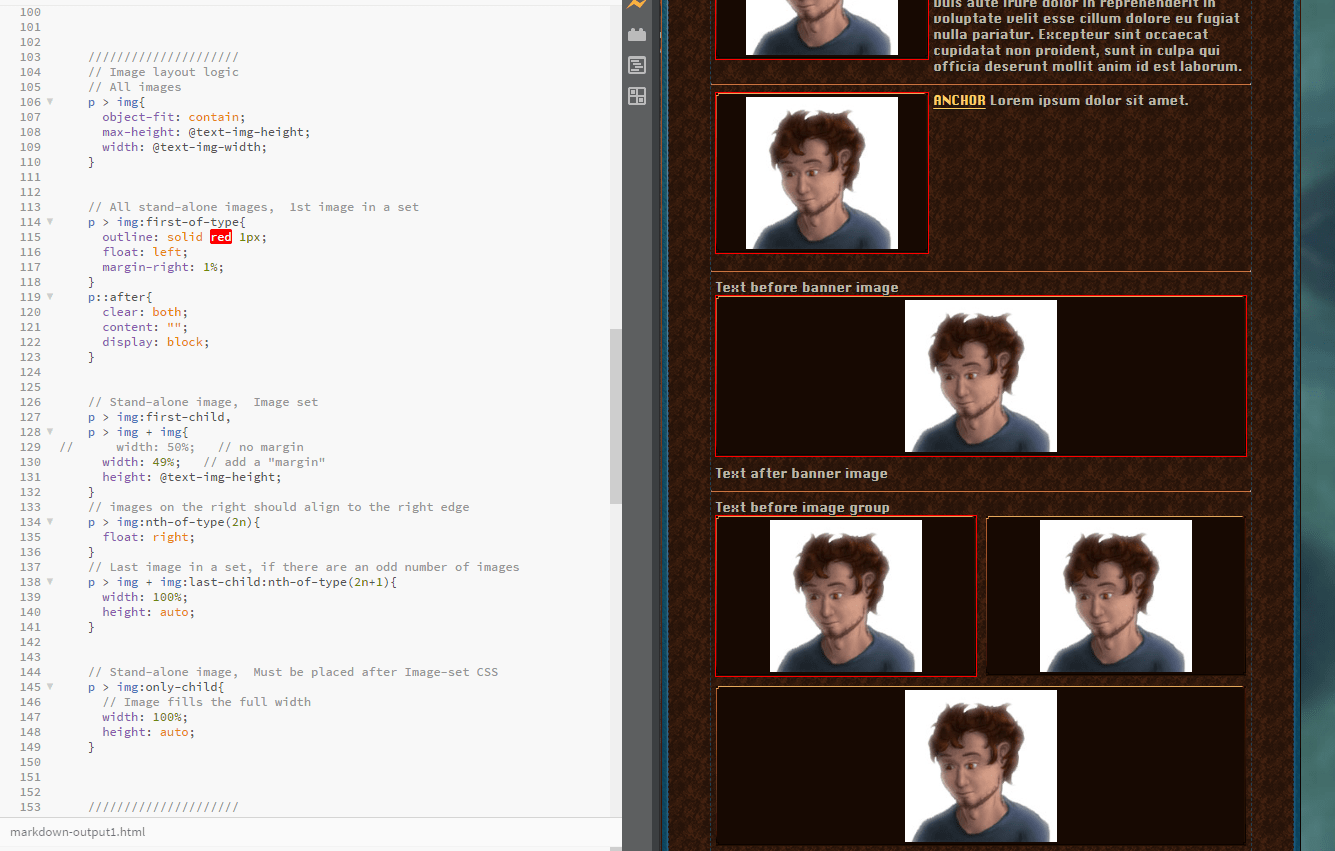
# Making sets of images automatically arrange themselves like Twitter is tricky. When there’s an odd amount of pictures I want the last one to fill the width. But at the same time I don’t want images to expand when they’re next to text. The hard part is that CSS can’t detect the text as a separate thing if it’s not wrapped separately. But using some weird flexbox wrapping logic I somehow made it work anyway. There’s just one problem… this only works on the latest versions of Google Chrome and completely breaks on Firefox.
# The problem is that the :has() keyword in CSS is still too new and experimental.
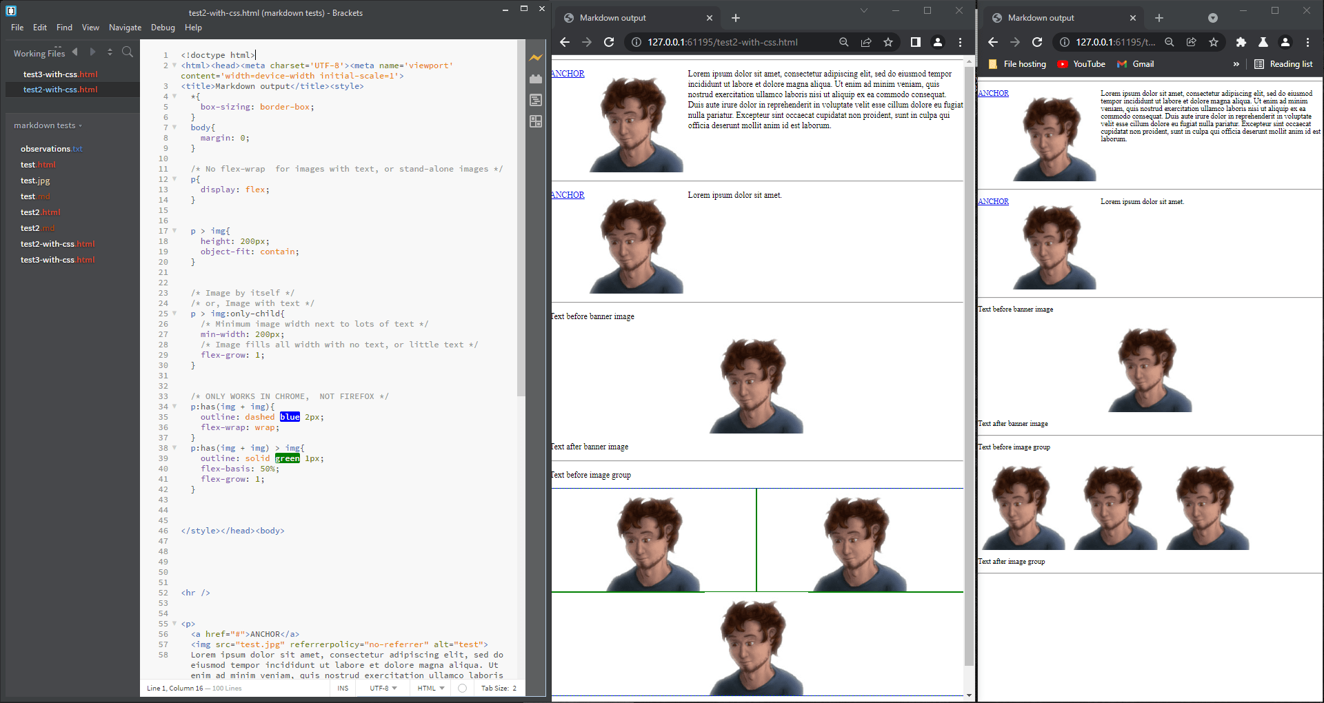
# Unacceptable!

#
We’re floatin baby!
I got it to work using floats and even weirder CSS logic. This will work in browsers from 2 years ago. If I wasn’t relying on that :not() keyword, this would work in browsers from 10 years ago. Even so I count myself lucky that I got it working at all. This is the price I pay for using MarkDown.
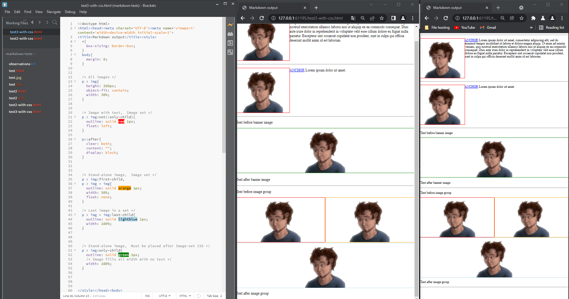
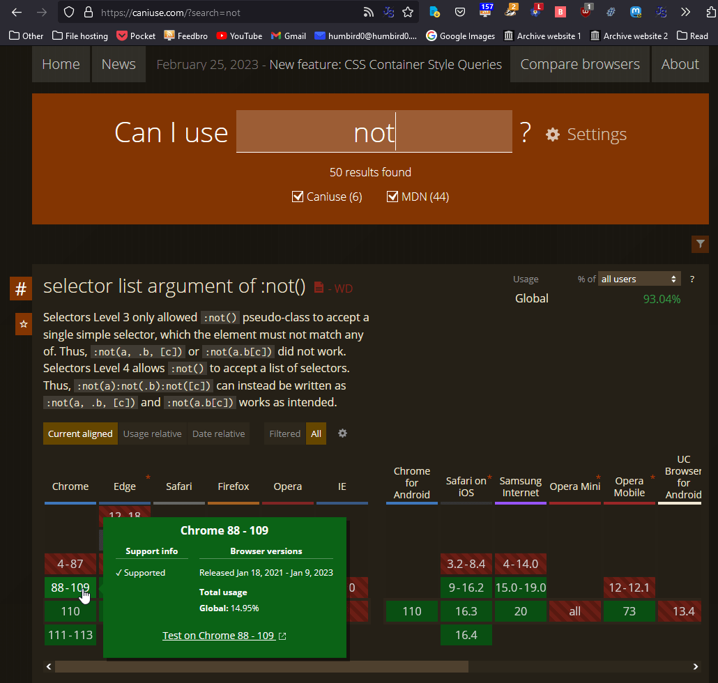
# I will also have to be very careful with image margins or the pictures will wrap.
# It should be fine.
# Do the other websites do it this way? Fuck no. They wrap their tags inside tags with even more tags, burying things 50 layers deep. I’m not even exaggerating.
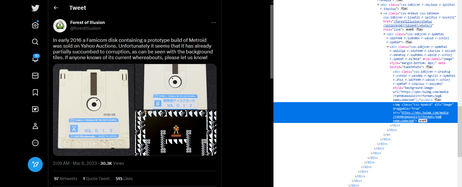
# Porting over the new CSS was easier than I thought. And you can still give them a fake “margin” if you make their width less than 50% and float the odd-images to the right. This works reliably at all window sizes.

# Okay, so apparently I CAN skip the :not() CSS selector because it doesn’t matter if some additional images are also floating left. They end up in the same place anyway.
# Which means… this suddenly works with browsers from 10 years ago. Epic compatibility achieved!
# Let’s try rewriting one of my old tutorials in MarkDown and see if it comes out right.
# On the left is the original tutorial. In the middle is rewritten markdown. On the right is a simple MarkDown preview.
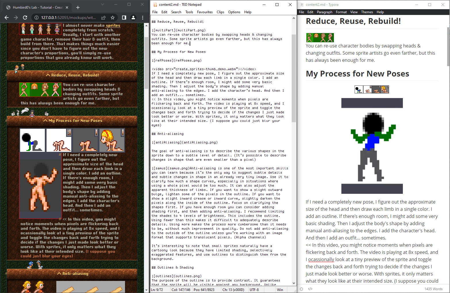
# … Not quite. Huh, why isn’t the picture sitting next to the text? It worked in my tests.
# On the left is original tutorial on my old website. In the middle is a preview of the tutorial rewritten in MarkDown. On the right is the HTML result generated from the MarkDown.
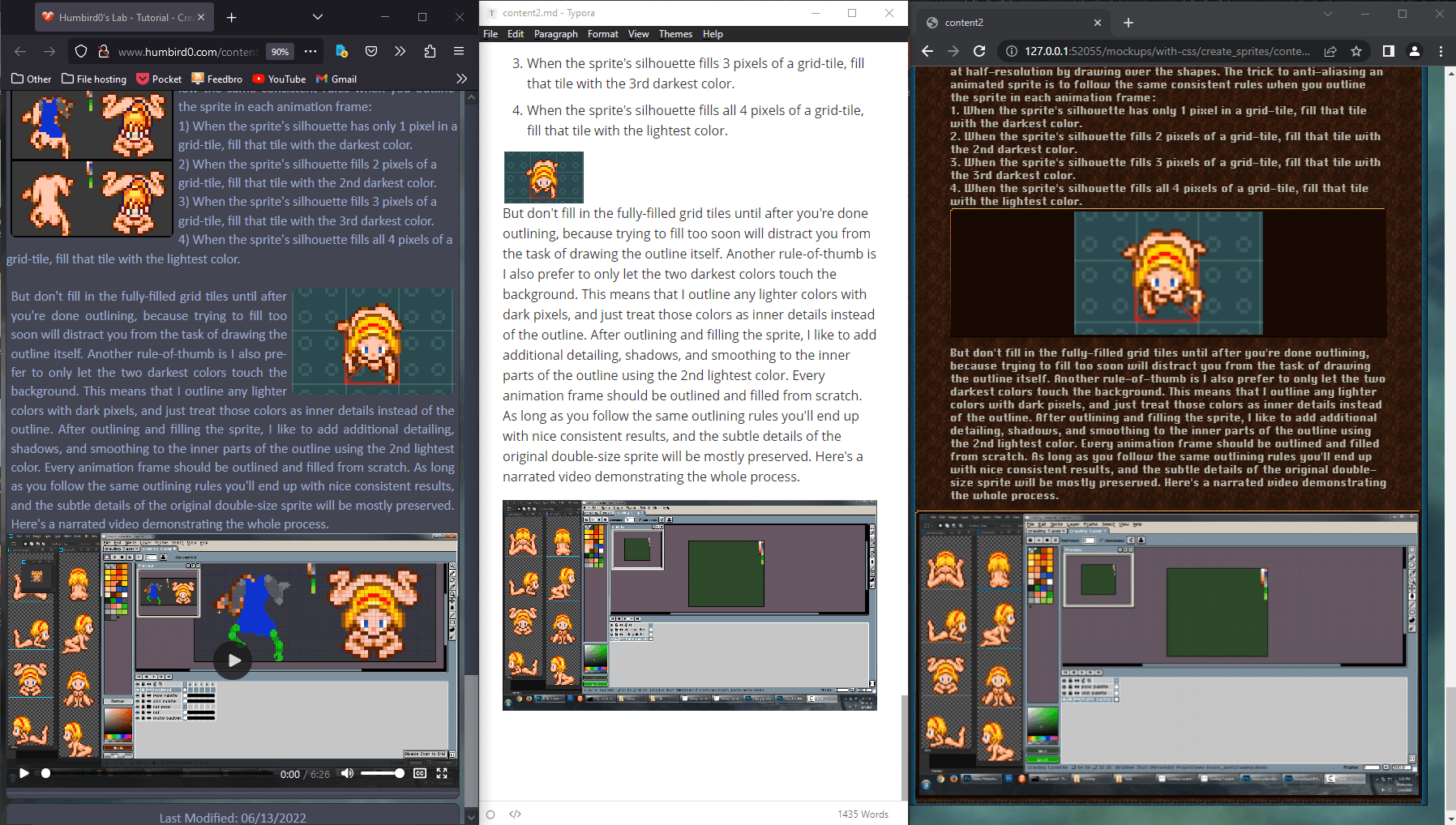
# Oh wait… I added an anchor link in my tests. The CSS was detecting it. That’s how it knew the image was not by itself. The CSS was not detecting the text. It was detecting the tag of the anchor link.
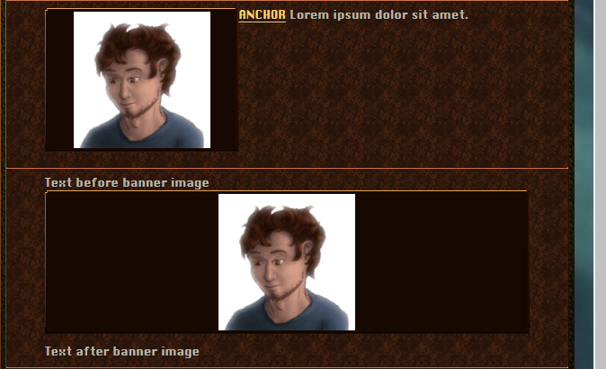
# I could add extra tags to my markdown by just italicizing a period or something. Kind of a hack, but easy to do.
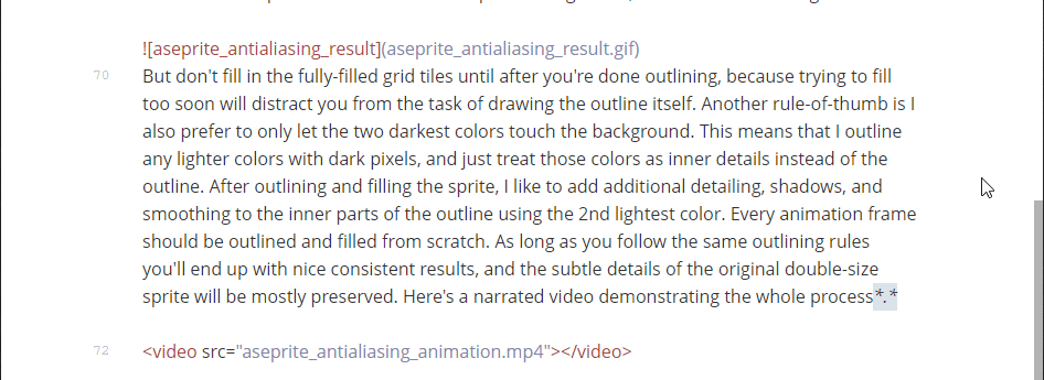
# And sure enough. That works.
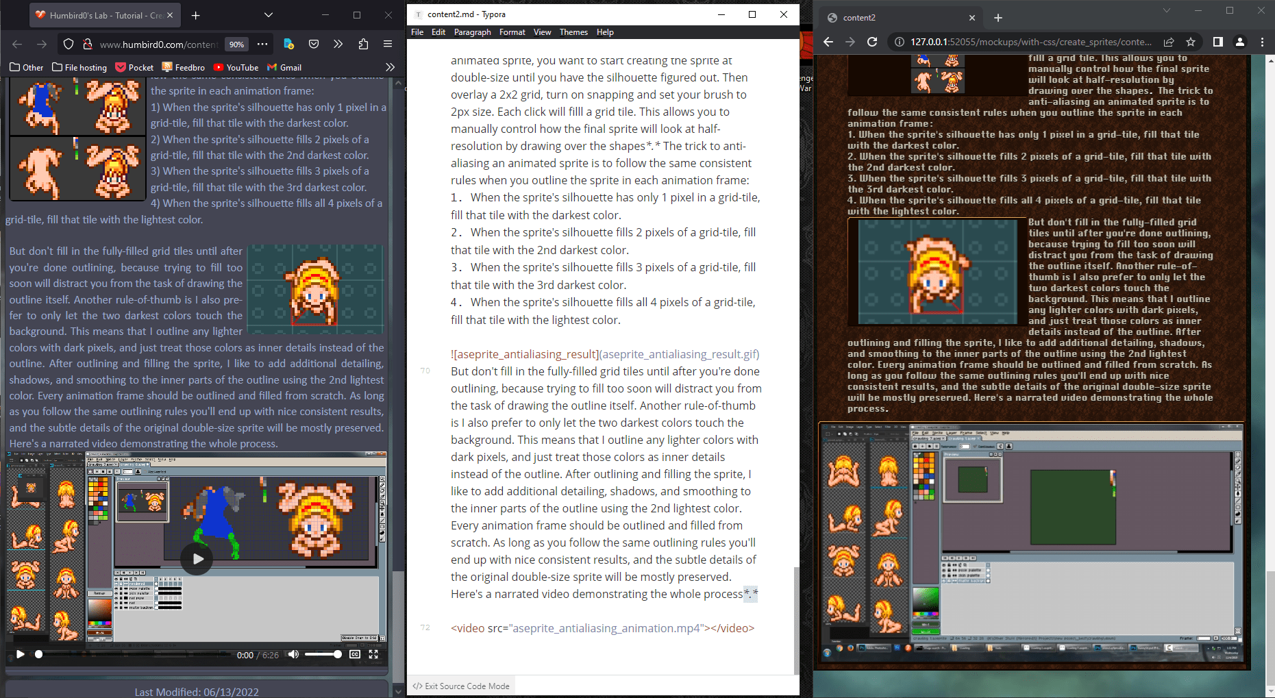
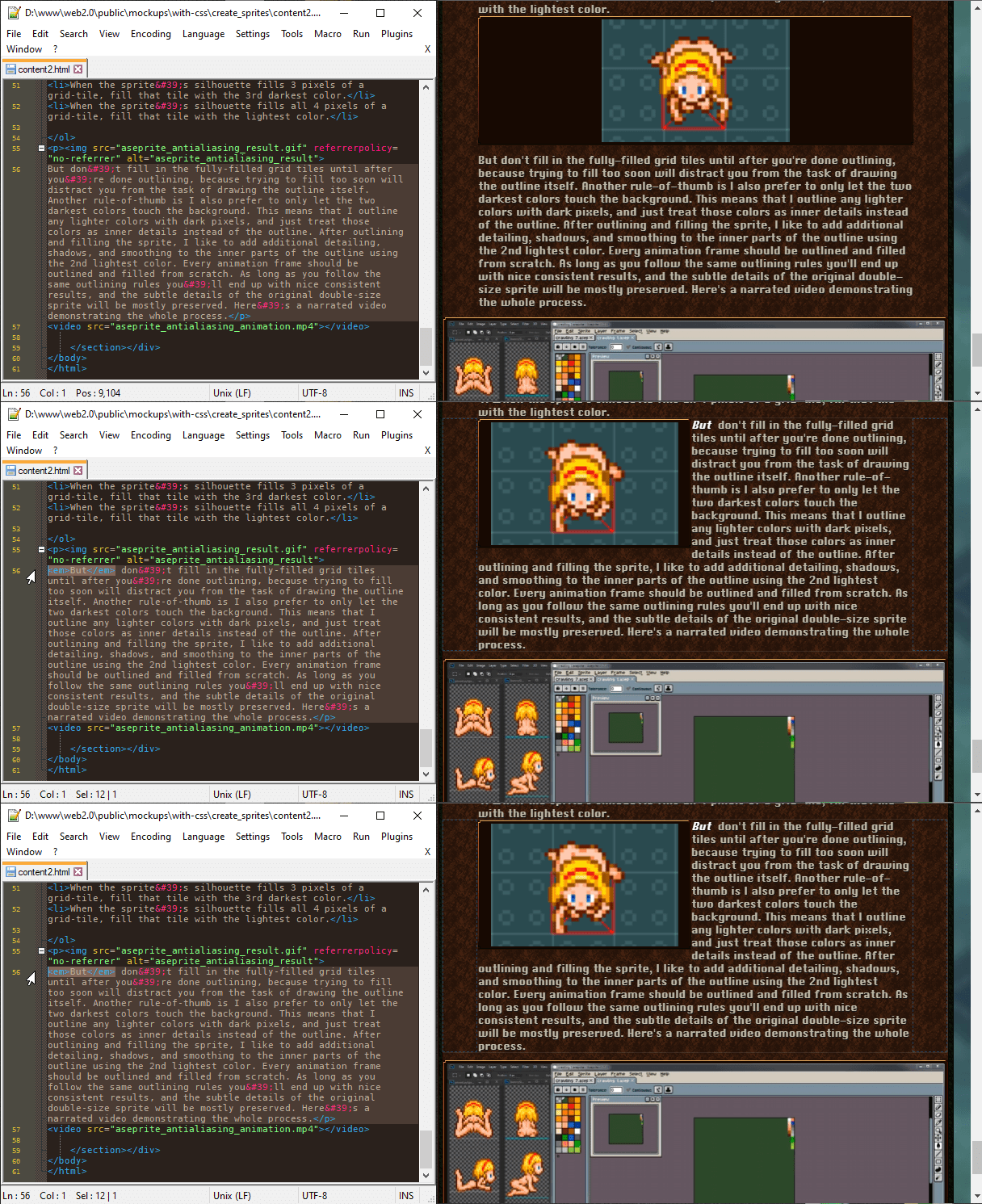
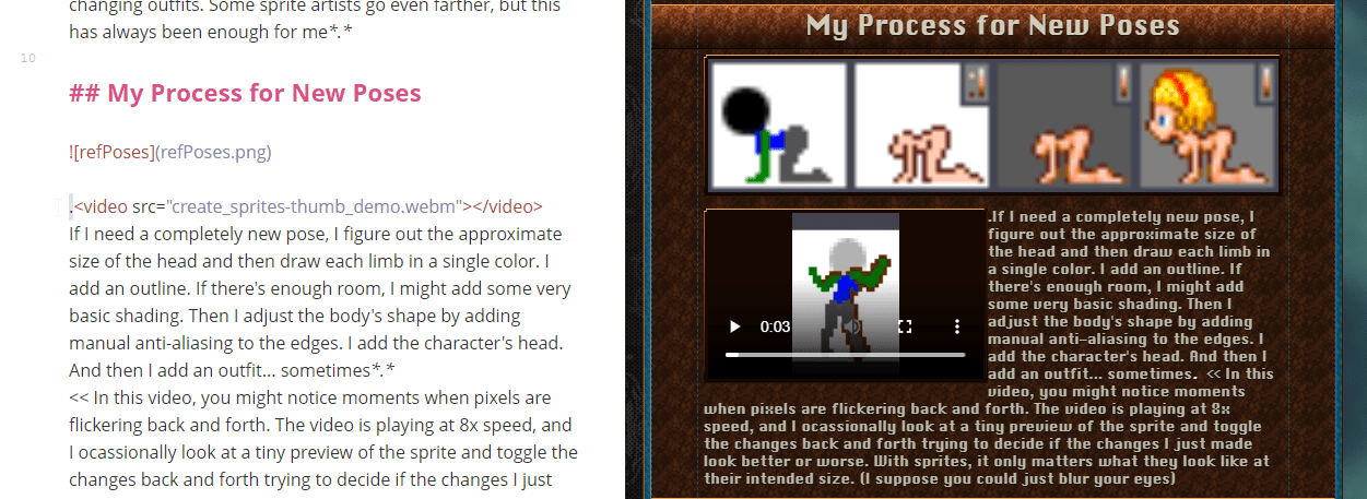
# … Aaaaaaand this part doesn’t. Apparently MarkDown doesn’t wrap everything inside paragraph tags. Any HTML you add manually such as videos are just included as-is without being wrapped.

# Okay, I can coerce MarkDown to put the video inside the paragraph tag with the text by putting text just before the video. Such as a stray period. Another slightly ugly hack. From there my CSS can treat it just like an image.
# Actually, if I want to be extra-sneaky, I could use a non-breaking-space instead of a period. But somehow the space actually looks more noticeable… at least to me.
#Writing Things in Markdown is FAST!!
# So maybe you’re wondering why I’m going to all this trouble just to use MarkDown. What so great about it? Well… look at this video. This is how fast you can throw together a page with MarkDown!
# That video was literally one minute long, and I already had half of the page done! … And here’s the result after instantly exporting it to HTML. It looks pretty good, doesn’t it?
# Okay, okay… I did add ONE line to the HTML afterwards. To import the CSS file. But Hugo can automate that.
#Decorating Code Textboxes
# My old site displays code like this. It might look nice, but behind the scenes it’s a messy clusterfuck of separate SVG images added as multiple backgrounds and positioned using finicky percentages. I wanna re-create this… but not like that.
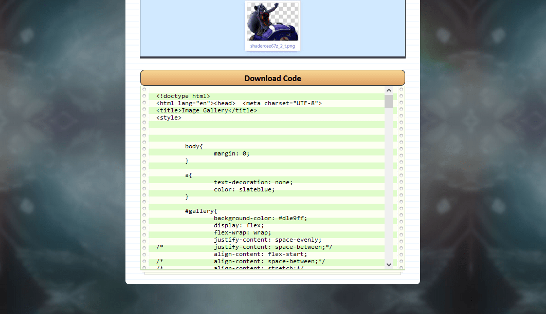
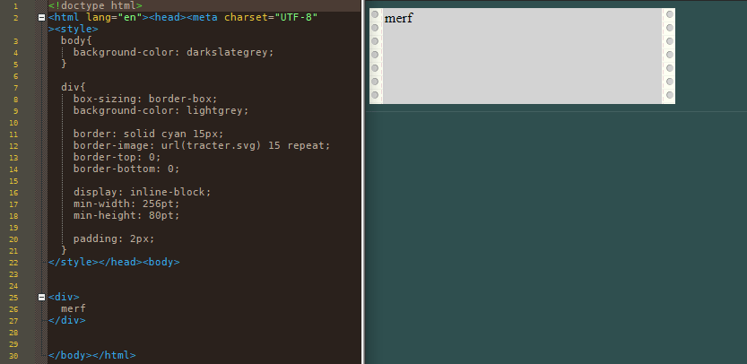
# Wait… couldn’t I just use a border-image? I could combine the SVG parts into a single image, duplicate it, and leave the top bottom and middle blank, so it only draws the border on the left and right edges.

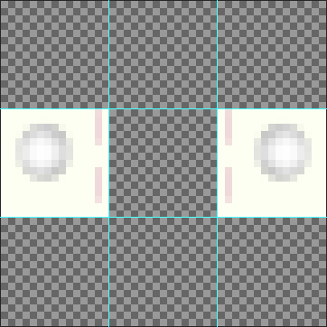
# Now let’s create an SVG image like that. Why? Because vector images have infinite detail and ridiculously tiny filesizes. We’re talkin’ 1KB. They’re so small you could fit a thousand of these on an old floppy disk. Even a dial-up modem wouldn’t break a sweat loading this.
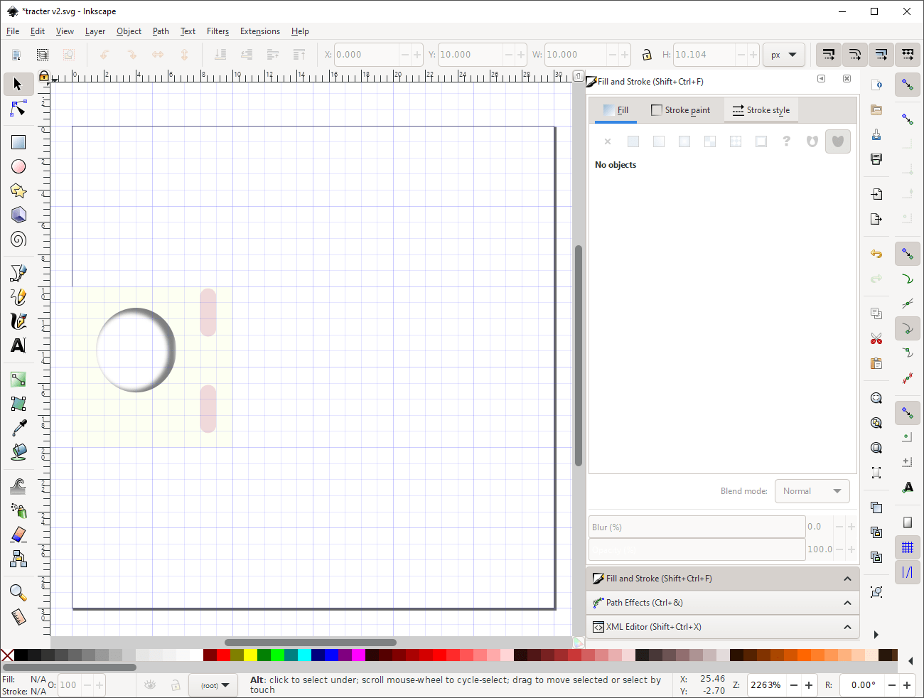
# I could copy and paste everything, but if I want to edit it later, I’d have to go in and modify the copy too. But it turns out SVG has the ability to mirror things without pasting the same thing twice. This is also super-efficient.

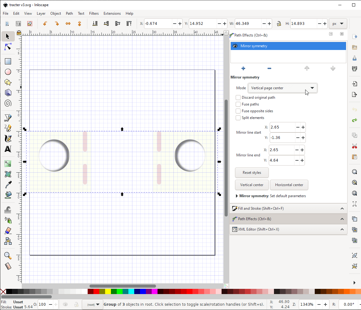
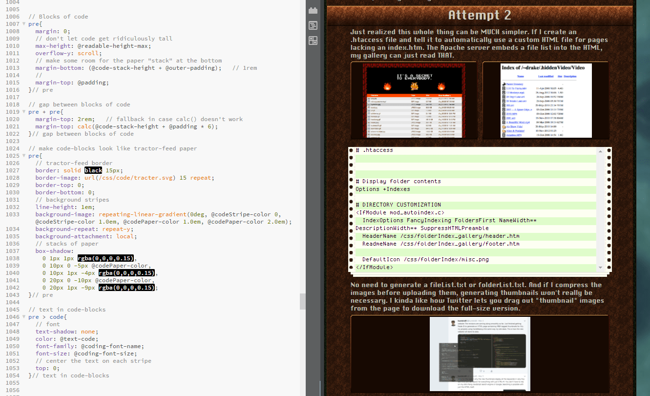
# Holy crap, this CSS border-image is so much easier! And I can easily add the background stripes with a single background gradient.
# Now to add the background stripes, the paper “stack”, and a programming font so you can tell Zeros apart for the letter O
#Table of Contents
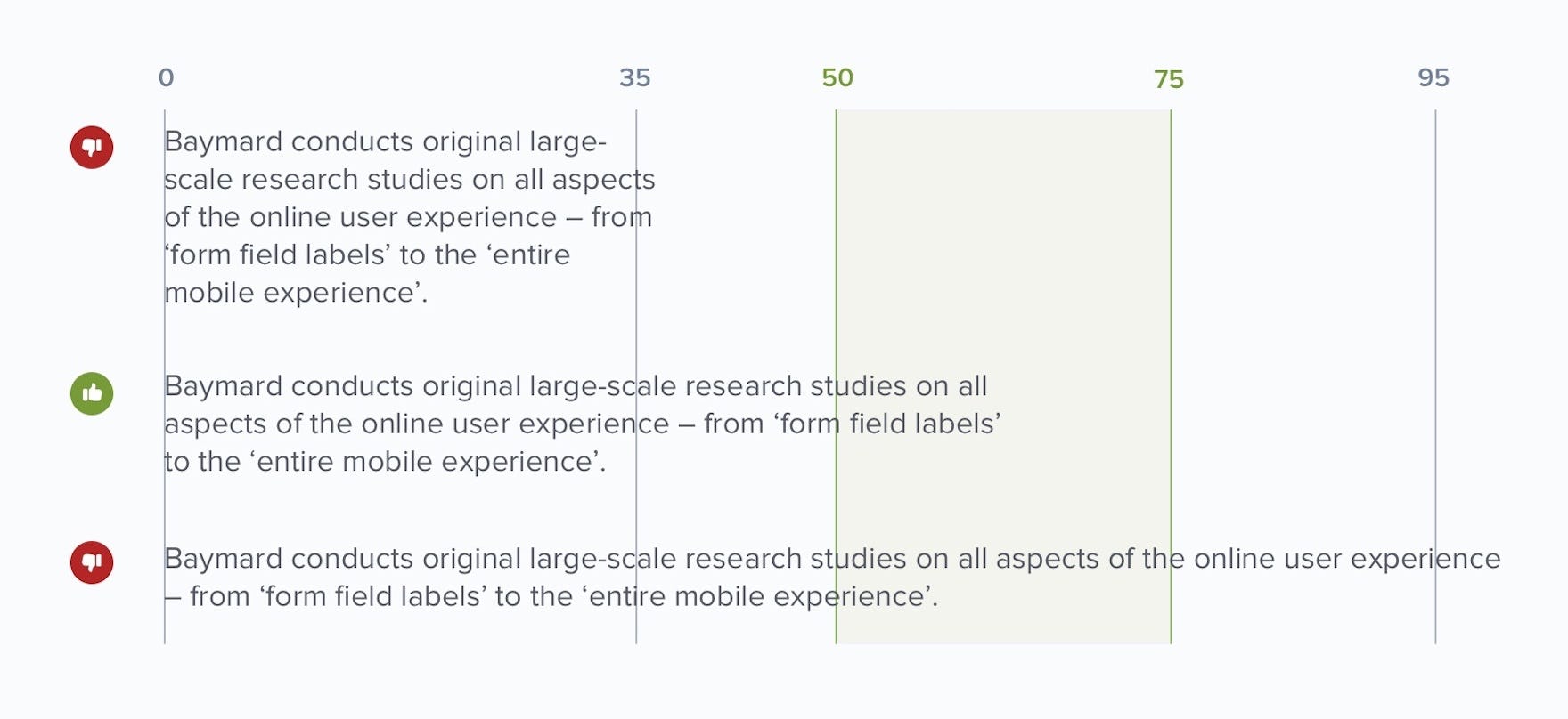
# Hugo can automatically generate a table of contents for a page. I’ve always wanted to do that thing where it sticks to the side and follows you down when you scroll. Stretching the tutorial to the full width of the page would make the paragraphs uncomfortably wide anyway, so I might as well limit its width and use the extra space for the table of contents.
# Supposedly, studies say that the ideal width for paragraphs of text is somewhere between 50 and 70 letters wide.
# https://baymard.com/blog/line-length-readability
#Adding Some Sprinkles
# I’m mostly done figuring out my new website. At this point I’m just adding little optional JavaScript quality-of-life extras.
# Such as image zoom. This isn’t Lightbox. It’s just a [tiny little thing www.humbird0.com] I made, but it’s very nice to have. Basically any picture inside of a link to a picture becomes clickable.
#Search Menu
# All that’s left is polishing up the search menu and figuring out how I’ll program my tools to add content to this website.
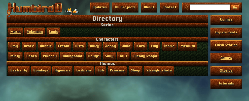
# For people not using JavaScript, my website’s search just displays a directory page with all the search terms and Hugo pre-generates the results for each of them. You can only “search” for one thing at a time this way, but that covers most situations anyway.
# For people who do use JavaScript, I can do a proper search with multiple words. So I can re-purpose the directory page as a list of keywords. Same HTML, but JavaScript changes its behavior to work as toggle-buttons.
# Both approaches are touch-friendly and fully keyboard accessible.
# But… as cleverly elegant as it seems to repurpose the HTML of the directory page, I think I should use proper radio buttons instead for the keywords window. They represent what’s actually happening better, and it will also look better too. My old website already does this. It styles the radio buttons to look like 3-state buttons that touch-screen users can use to include or exclude things from a search. But because they’re actually radio buttons they behave the way keyboard users expect so you can use arrow keys to switch between their states.
#Re-thinking the Navigation
# I just saw the most amazing website design! This is NENRIKIDO. There are a ton of great design ideas here.
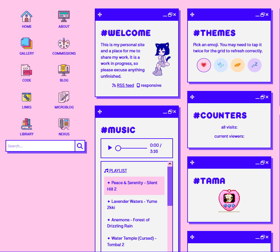
# But one thing in particular really impressed me. The navigation icons. Because when you visit the site on a phone the links look like… the home screen of a phone. And it looks fantastic!
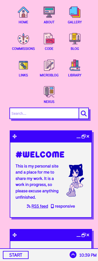
# And here I was thinking I was so clever trying to compromise and squeeze down only the most essential links into as little space as possible. But in the end they still get cut-off on a phone screen.
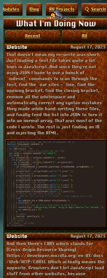
# Ironically my old website actually handled this better. It simply let the links stack on top of each other. I thought it looked kind of messy but at least it was fully functional. Nothing was hidden.
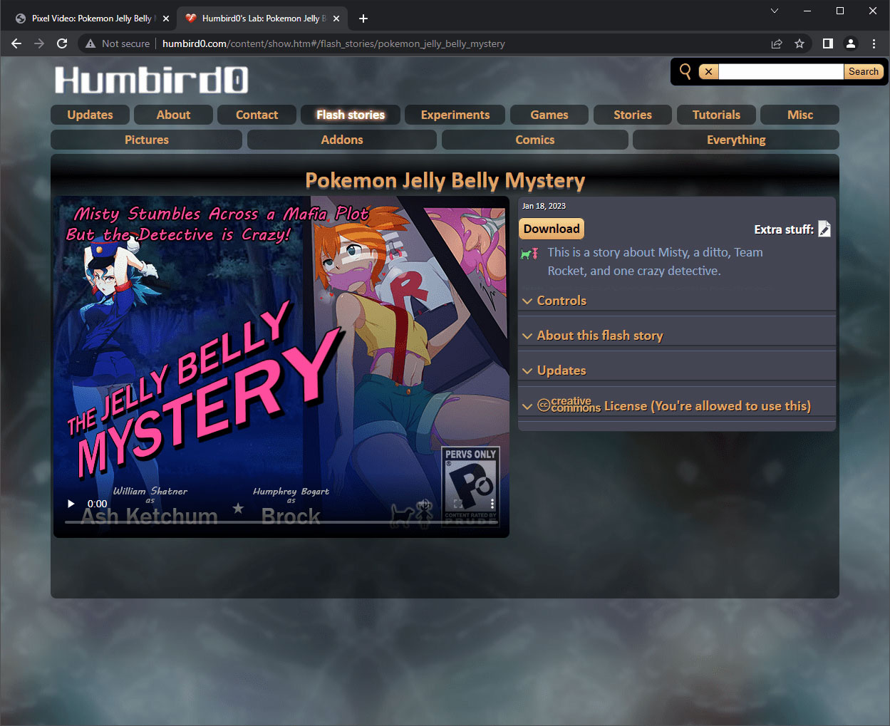
# If you think about it, icons are just stacked links with pictures added. This layout also feels a lot more inviting when you first arrive. Everything the website is about is just laid out for you. You decide where to go… then look at the pages.
# So let’s re-think my navigation. I’ll use a similar idea, but I’ll let the icons run across the top of the page on large screens.

# … and wrap around into a “launcher” on phone screens.
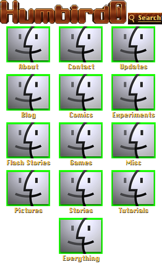
# These icons might look big of chunky but we’re not worrying about saving space anymore. Besides, icons tend to look a lot better when they’re wider than their text. Ideally the width of the icons and text would match making a “square” shape, but the icons themselves have the biggest impact on the perceived “shape.”
# So with that in mind, I plan to make the icons slightly rectangular so that the height of their text turns the entire thing into a nice cohesive “square”
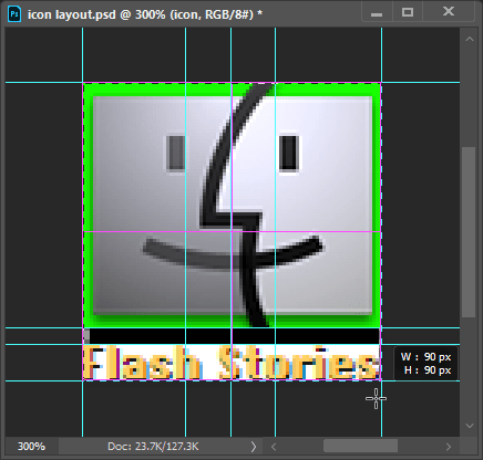
# Welp, that’s the idea anyway. Now for the tricky part. Sure, it’s not hard to use a flexbox to arrange the links in this way… on ONE page. But my website has over 400 pages. So do I…
# a) Copy and paste these links onto EVERY SINGLE PAGE and then re-upload EVERY SINGLE PAGE whenever a link changes?
# b) Rely on JavaScript to automatically paste the links each time a page is displayed, ensuring that people without JavaScript always have a crappy experience?
# c) Somehow make an iFrame change size even though it has no way of knowing how big its content is?

# Well I’m a stubborn fool, so Imma do C!
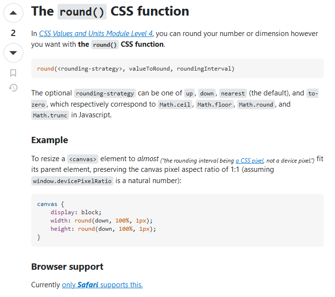
# Well… I wanted to use CSS calc() to do this, but somehow all the web browser programmers forgot to add the ability to round numbers. I kinda need that to count icons and figure out how many rows there are.
# I mean, Apple’s Safari browser supports rounding.
# https://stackoverflow.com/questions/37754542/css-calc-round-down-with-two-decimal-cases#answer-74605447
#
… and there’s supposedly this hack you can do using @property to force a CSS variable to be an integer which causes rounding as a side-effect… but that was only just added to Chrome browsers in 2020 (and no current version of Firefox), so… not exactly compatible with older devices.
# https://css-tricks.com/using-absolute-value-sign-rounding-and-modulo-in-css-today/
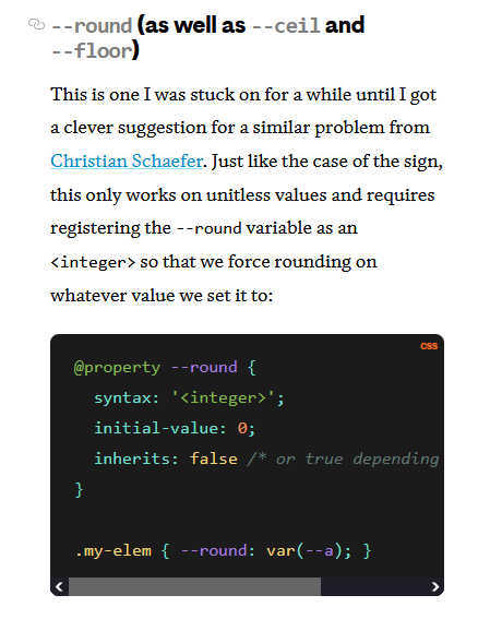
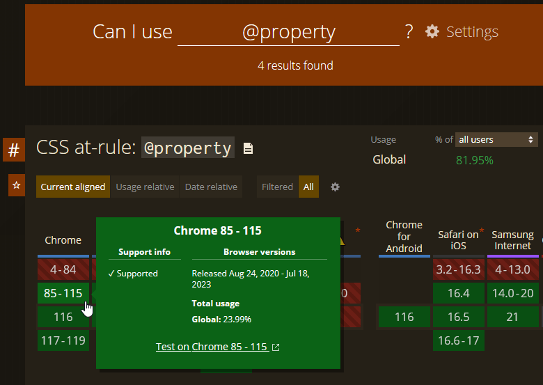
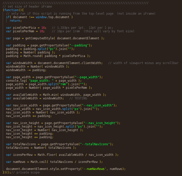
# So I suppose the most compatible way is to use JavaScript to resize it. Which I can totally do.
#
Just feed the LESS variables to it by storing them in CSS variables. Create a CSS variable called numNavRows that controls how tall the iFrame is…
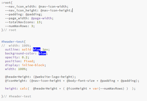
#
… and let JavaScript set the value of the numNavRows variable. And just let non-JavaScript users live with whatever default value I set it to, which could be either a nice looking but incomplete header, or a too-large but fully functional header. The second option is probably the better idea.
# … or… OR!!
# … I could just use break points… dozens of ’em!

# No really… That might actually be the best way to do this.
# This is literally all the CSS I needed to pull this off without any JavaScript. But it did require some fine-tuning to dial-in the exact break-points and adjust the heights.
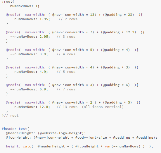
# But my website isn’t quite wide enough to show them all on a desktop, so I get this giant ugly gap with just one icon in it. If only there was a way to stack the icons on top of each other as they go across.
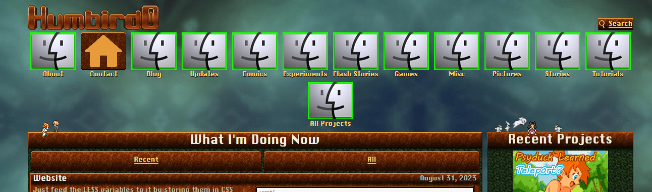
# Well it turns out there is! Just tell the flexbox to flow downward and the icons will “wrap” to the right when they run out of vertical space.
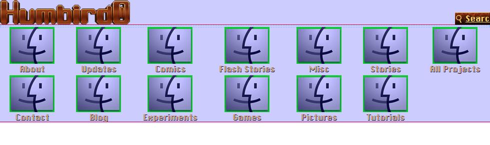
# This does require me to manually set the height of the icon area, but I was already doing that with the iFrame anyway, so I’ll just add the CSS variable I already have to the height calculation.
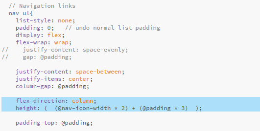
# And now the iFrame looks like this.
#Revise the Download Buttons
(2024-07-19)
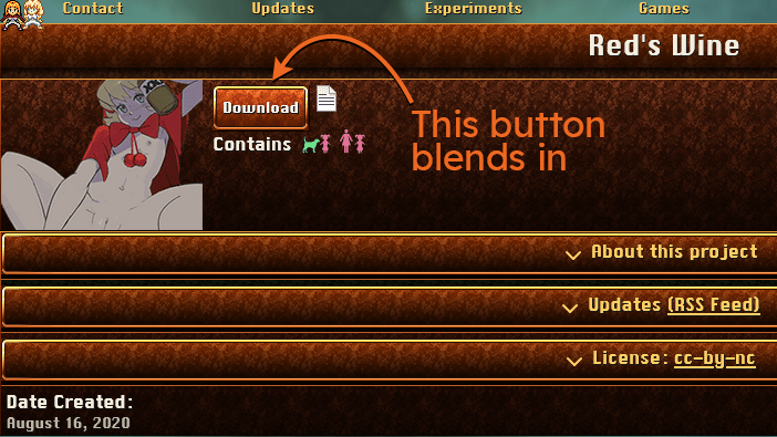
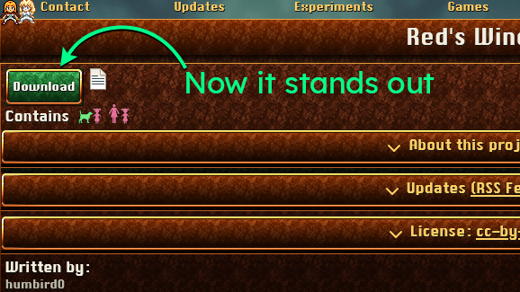
# The download button is one of the most important things on any page. You can’t play my games if you can’t get them. So it needs to be easy to find. But I gave it a color that blended into the rest of the page. Whoops! My website is brown and green, so let’s make it a bright emerald.
#Filling the Empty Space Next to the Content
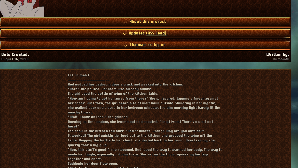
# Another design issue was that there was just way too much empty space around the sides of the text. I have already limited the width of text to make it comfortable to read and I tried filling the space by breaking up the project data into multiple sections and putting some of it next to the “about” text, but that usually wasn’t enough to fill all of the remaining space. Meanwhile the main title pictures for the games are too large and look a little blurry. Maybe the website itself just needs to be narrower?
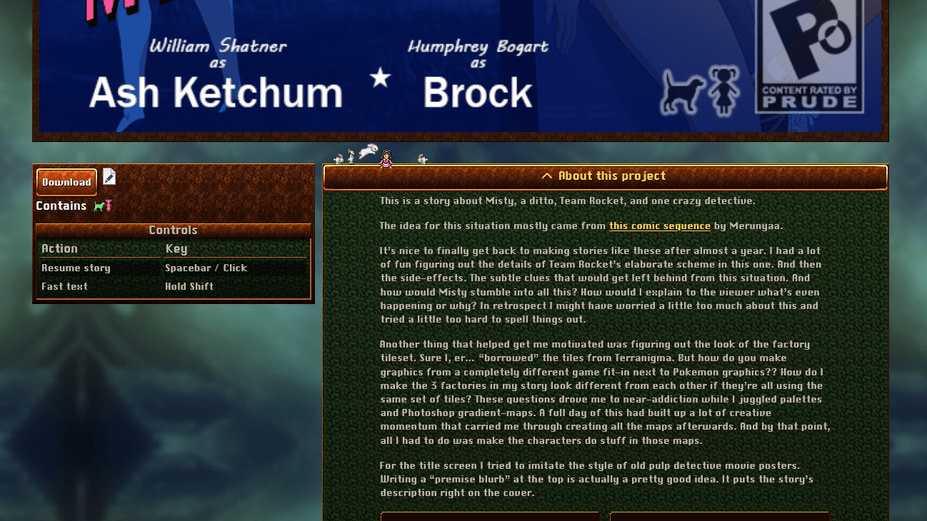
# Also, the info above the projects was really chunky! You have to scroll down half a screen just to see the main content. But I don’t want to hide it all the way at the bottom of a long article either.
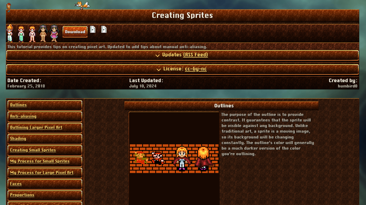
# But here’s an idea! My old website used to put the info on the SIDE when you viewed the website on a big screen. This makes a ton of sense, but… when you expanded the “More Info” text it would be REALLY tall and you ended up with a ton of wasted empty space on the left side when you scrolled down to read it.
# But what if I make the content stick to the top of the screen and FOLLOW you down the page as you scroll, like I do with the table of contents?
# … Well that’s fine if it’s just a picture, but I don’t want long blog articles permanently glued to the top of the screen with no way to scroll them.
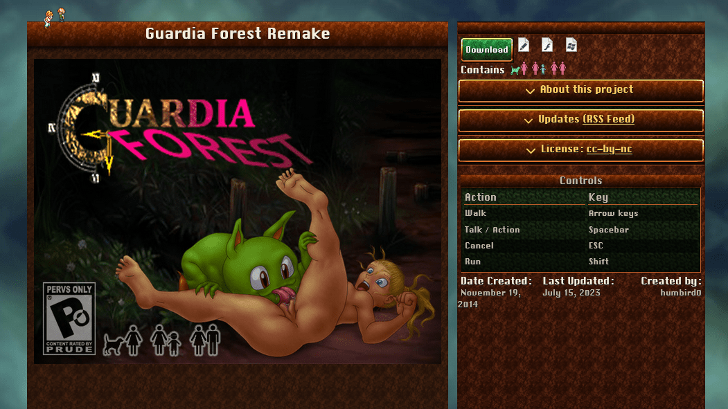
# So instead, what if I just make BOTH sections scrollable and limit them to the height of the screen? This accomplishes the same thing as having things stick to the top of the screen while you scroll down, but now you can see everything.
#Content Filters
# I’ve been meaning to add NSFW content filters to my website. After all I can’t realistically expect other people to share ALL of my interests. Even my favorite artists always have a few quirks I’m not into.
# My old website accomplished this by allowing you to save a “default search.” But I’m not sure it was obvious to anybody what it did or why anyone would want to do this.
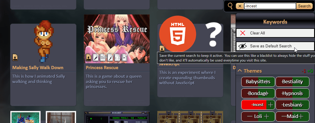
# It’s actually very easy to make a content filter using CSS. In the HTML, put classes on the body that represent the things you want to hide, and then put classes on the thumbnails that represent their content.
<body class="hide_incest hide_tentacles">

<thumb class="has_loli has_flamethrower has_tentacles">
# … and then in the CSS just use display:none to hide things.
.hide_incest .has_incest{
	display: none;
}
#
 I don’t need to add filters for every possible thing. Just major fetishes. It’s not like Princess Peach is gonna be on anybody’s squik-list.
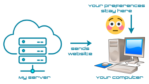
# I do need to use JavaScript to apply these filter classes because I don’t generate the pages on the server. They’re static and pre-made. In terms of privacy people shouldn’t have to broadcast their fetishes to a server. If I use LocalStorage then these settings never leave your computer. And if you have JavaScript turned off, then you just see everything. The website defaults to a more functional state.
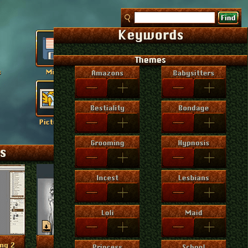
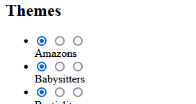
# I can quickly re-use by search keyword buttons to make toggle switches. I’ll just remove the neutral option. When a keyword is “off” then it adds an exclude filter. When a keyword is “on” then there is no filter for it.

# If I include a script tag after each button, then they become modular and self-contained. Their code does 2 things. It modifies the saved setting, and then it fires an event to announce the change so the rest of the page can update in real-time.
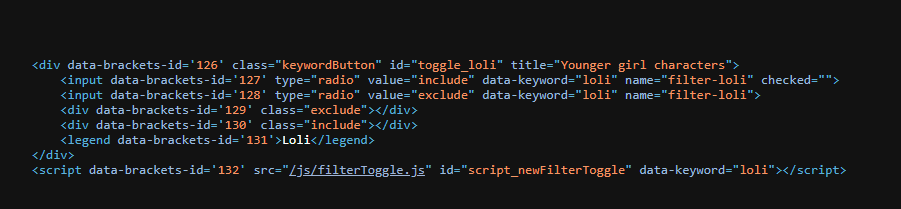
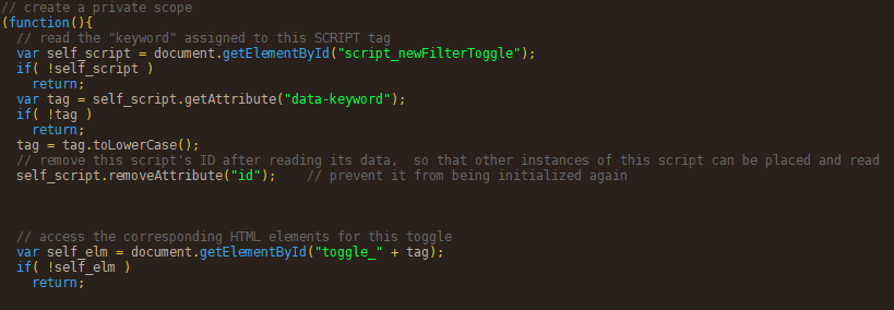
# There’s a clever way to add settings to a script tag. Add the settings as attributes. Give the tag an ID… temporarily. Make it find itself using that ID. Read the attributes attached to the script tag. And then remove the ID so you can re-use it! That way I can have multiple toggle switches on the same page.
# The thing that actually enforces the filters is a script immediately at the start of the body tag. It reads your settings and adds classes to the body tag. The location of this script is important. Script tags PAUSE the loading of a page while they load and run their JavaScript file. That’s why ad’s suck so much. You can avoid that by adding the “async” property to the tag, but in this case we WANT that pause! We want to apply the filters before displaying the rest of the page, otherwise a bunch of naughty stuff might flicker on-screen for a moment. You’re not even going to notice the pause. We’re talking milliseconds here.
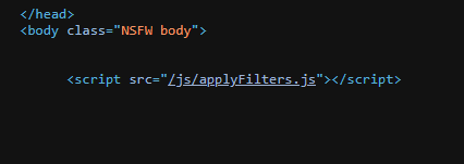
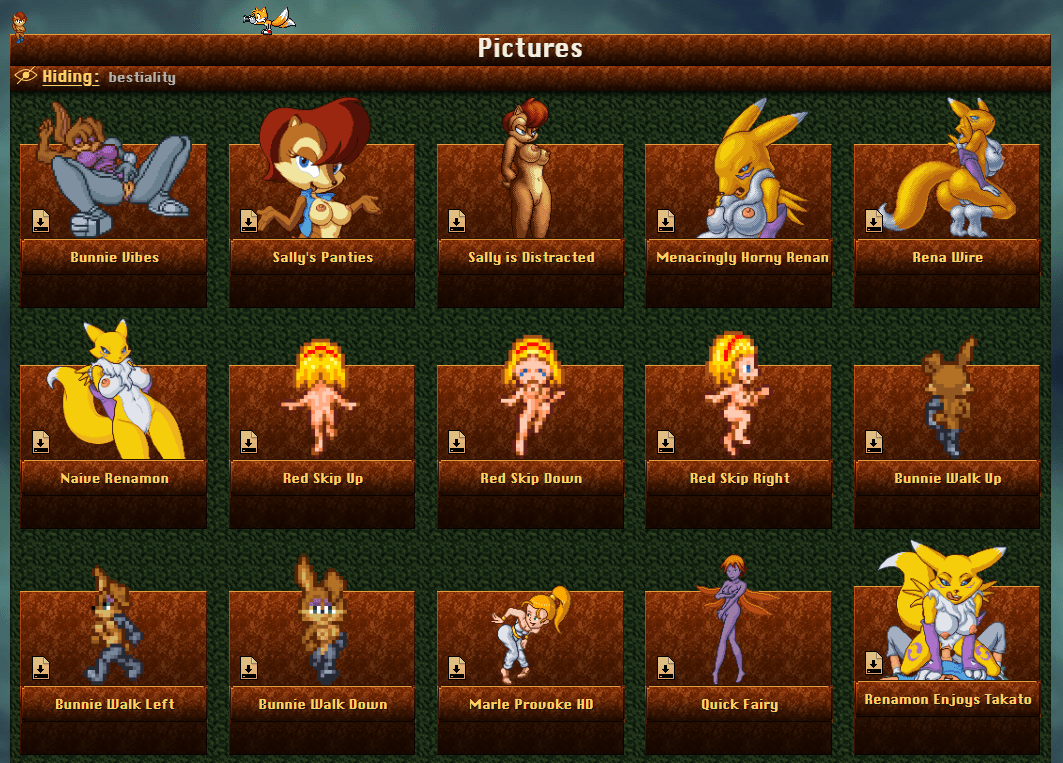
# Now I just need to make it obvious what filters are currently being applied so people don’t wonder why stuff seems to be missing.
# I also need to give people a way to access the content filter settings.
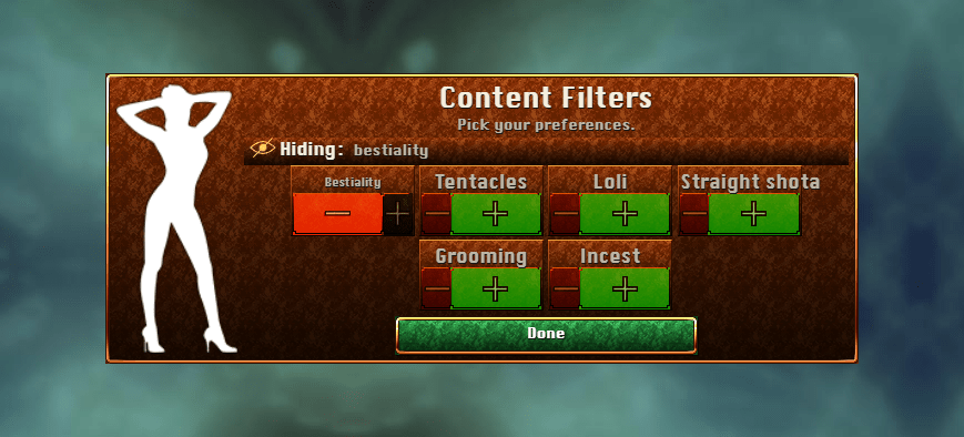
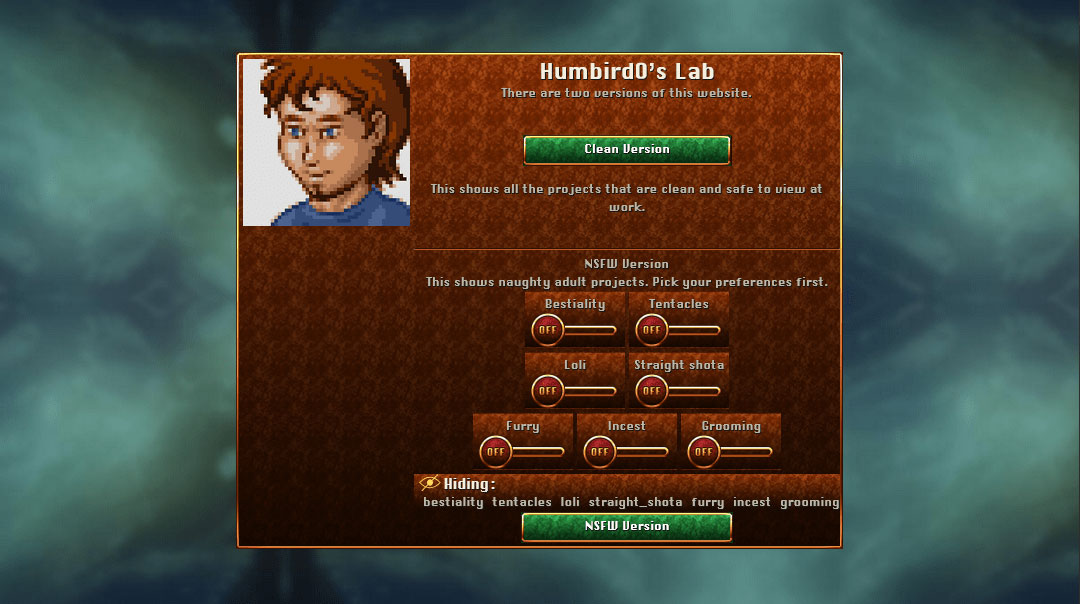
# I should also add these filter options to the website’s intro page that lets people choose between the clean and the NSFW version of the website. That way people can choose their preferences before they see anything.
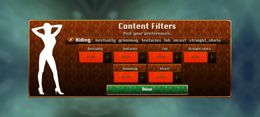
# Opt-in or Opt-out? I’m thinking… both! Visiting most pages should show everything by default and people can just decide if they want to hide anything. BUT… if the first page they visit shows the filter settings, then enable all the filters by default and let people pick the fetishes they want to see.
#
 Hmm… should “furry” be one of the filters? It could be helpful, so why not? Philosophically this is no different than hiding any of my other interests. People don’t choose their interests. They only discover them, so it’s not like I can change anybody’s mind. And there’s no need to. Let’s just add this keyword to my projects.
# Wow… for “not being a furry artist” I sure do make a lot of it! … “Casual furry” my ass. I guess you just can’t take the 90’s out of a 90’s kid.
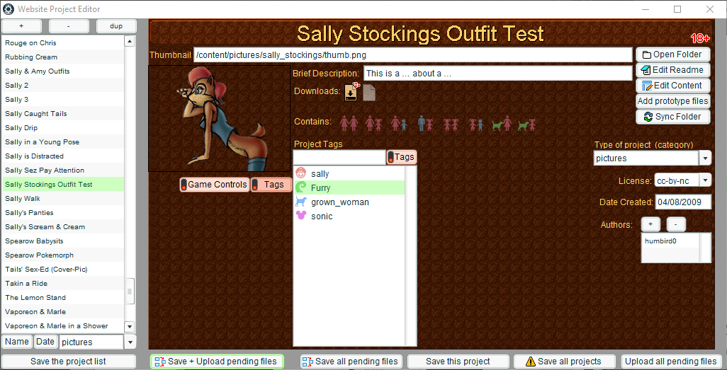

# Okay, everything is working so I’m done right? Wrong! The toggle buttons look exactly like the search keywords but these do different things. That’s confusing. Let’s fix that.

# Let’s be honest. The ancient Windows checkbox is ugly and tiny and hard to click. The Android-style slide switch was a brilliant redesign of it, so let’s start with that. What I have here is a pretty good starting place. And if I was lazy I would just stop here and call it Flat Design™… but I’m not lazy. Let’s make it look good instead.
# Classy! That’s more like it.
# Check it out!
# https://humbird0.com/intro_gateway.htm
#New Search Engine
#
 I want to replace my website’s search engine. Lunr.js only works when you type in the entire word you’re looking for.
My old website’s search worked better. Funny how that keeps happening. Maybe I should just make my own search engine again.
# Okay, so here’s how my new search engine will work. The basic idea is to find the words you type using indexOf(). To make this possible, I create a long string for each project containing it’s name and all of its keywords. To efficiently search for multiple words, each search term shrinks the list of projects and then the next search term searches within that smaller list. Of course I can also include -negative search terms, because I just can’t stand using using search engines without that ability. It’s surprising how often that feature is missing in other search engines.
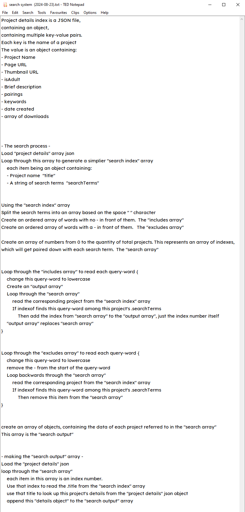

# Remember that big elaborate plan I posted? Well I turned all of that into comments! Now I just need to add code under each line to create my program.
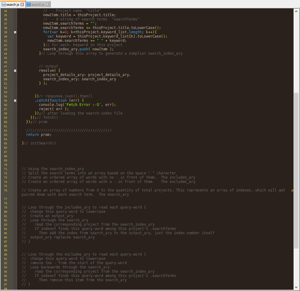

# Uh… you guys are never gonna believe this, but… all that code worked perfectly on the first try! I typed over 200 lines and it all just… worked. You gotta understand, that almost NEVER happens to programmers! Apparently planning a complex program using pseudo-code is actually a good idea.
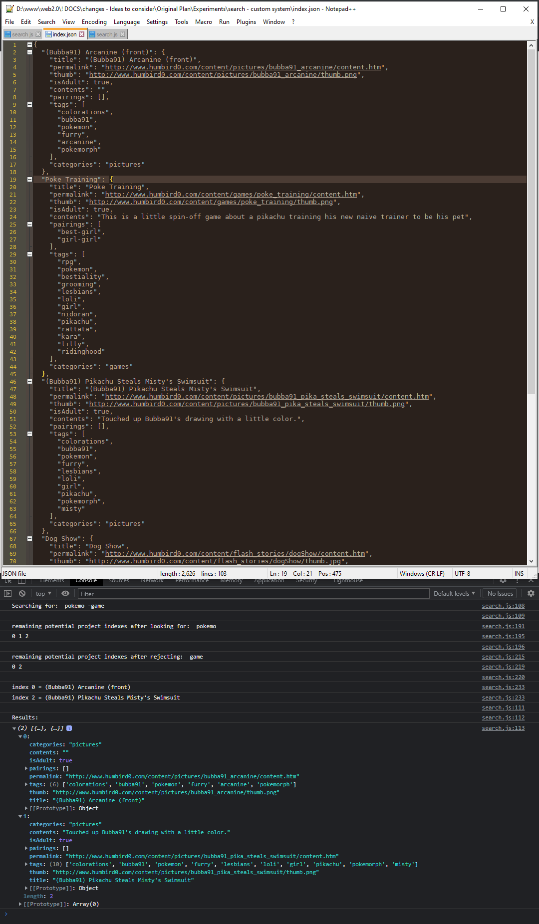

# Now I just need to wire up this new search engine to my website.
#
Code: https://humbird0.com/js/search.js
Search Index: https://humbird0.com/search/index.json
(2024-12-07)
#Favorite Artists
# The Aethy mastodon instance is going down soon, but I’m not worried about losing any pictures I uploaded. Thanks to my cross-poster, every picture I ever posted on mastodon is also on my website. Well… except for one thing.
# I have been posting artist recommendations every week on a different mastodon account that I use for conversations about adult content.
# So in the spirit of POSSE, let’s see if there’s a way to display them on my website as well.
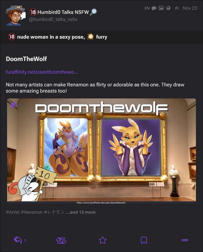
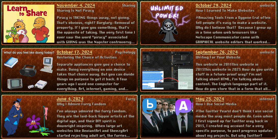
# I think I’ll present my favorite artists kind of like the thumbnails I use for my blog posts. Display the name of the artist, say some kind words, show a bunch of thumbnails, and clicking on it will take you to their website or some other art gallery with their stuff.
# The HTML would look like this.
<a href="" class="favoriteArtist">
	<h2>Artist name</h2>
	<p>Description</p>
	<p>
		<img src=""/>
		<img src=""/>
		<img src=""/>
		<img src=""/>
		<img src=""/>
		<img src=""/>
	</p>
</a>
# These days I use markdown to write the content of my website. And I can actually represent most of this using markdown.
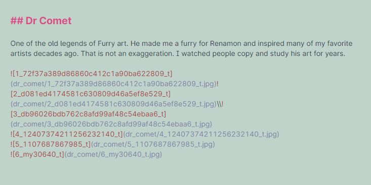
# Most of it… except for the link. And that’s kind of important. The whole point of recommending artists is to help people find more art to enjoy. Which is kind hard to do without linking to the rest of the art. The most that markdown can hope to do is wrap a link around a single picture, but even that looks ugly as hell. The whole point of markdown is to look like a simple human-readable text file when you view it directly, and this… is not that.
#
[](https://www.google.com)
# But the rest of the markdown is almost right. I just need to add a link around it to create the intended HTML. There are multiple ways I can achieve that in the HUGO static site generator.
#Just write HTML
# I could just add HTML directly in the markdown and it would work fine, but the philosophy of writing content with markdown is that it isn’t limited to being a website. It’s just text, which can be converted into anything. So I want to keep my options open.
<a href="http://www.artistWebsite.com">
## Artist Name
Description

</a>
#Wrap it with XML and turn it into links with HUGO
# Maybe something like this?
<favoriteArtist href="">
## Artist Name
Description

</favoriteArtist>
# The idea is that adding custom XML makes this semantic. This represents a favorite artist. And I’m free to display that however I want in the future.
# I usually use XML because I refuse to put proprietary HUGO shortcodes directly in my markdown. I don’t want to be tied to HUGO forever. I might switch to some other software in the future. So I use standard XML instead and tell HUGO to interpret these like shortcodes by using string replacement during the HTML conversion process.
# So I could just replace “<favoriteArtist” with “<a”, and replace “” with “” and this would turn into HTML.
#Make the whole thing a custom XML tag
# Another approach is to represent the concept of a favorite artist using a single XML tag.
<favoriteArtist artist="" description="" href="" img1="" img2="" img3="" img4="" img5="" img6=""></favoriteArtist>
#
 The advantage of using a single XML tag is that HUGO can interpret this as a shortcode and replace it with any set of HTML tags I want. Which means the HTML will get written exactly the same way every time, making it consistent and supposedly easy to convert. This is also super-duper semantic. There’s no doubt about what this represents.
# But the disadvantage is that it’s not very human-readable. Writing it is tedious since I have to copy and paste a bunch of text into this XML thing. And a typical markdown editor won’t display this in a pretty way. I may be a programming nerd, but that doesn’t mean I like editing text. Given a choice I’ll pick drag-and-drop every time.
 Just program a custom display system... said no one ever
#A folder with markdown and front-matter
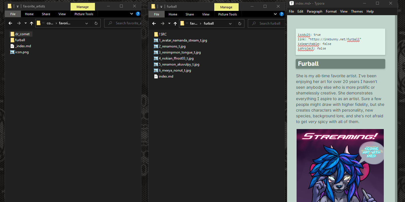
# Ignoring code for a moment, let’s just take a step back. No matter what I choose to do, I’m probably going to store each artist’s thumbnail pictures in their own sub-folders. By default HUGO wants to treat sub-folders as web pages, and the outer folder as a listing or gallery. But I don’t have to actually link to those pages. I could just have the gallery loop over each page, and display its contents directly on the gallery itself.
#
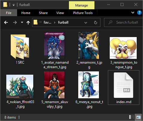 This is very nice from an organization standpoint. I’m using the folders I’m going to create anyway. And making the markdown files is direct and intuitive. Each artist has their own folder so they’re handled in a modular way. Adding or removing an artist from this gallery is almost as simple as adding or removing a folder with pictures in it.
# It’s not quite perfect. The front-matter is kinda sorta proprietary. But HUGO isn’t the only program that can read front-matter from markdown, so I’m not completely locked-in. And it’s still human-readable. I think I like this approach.
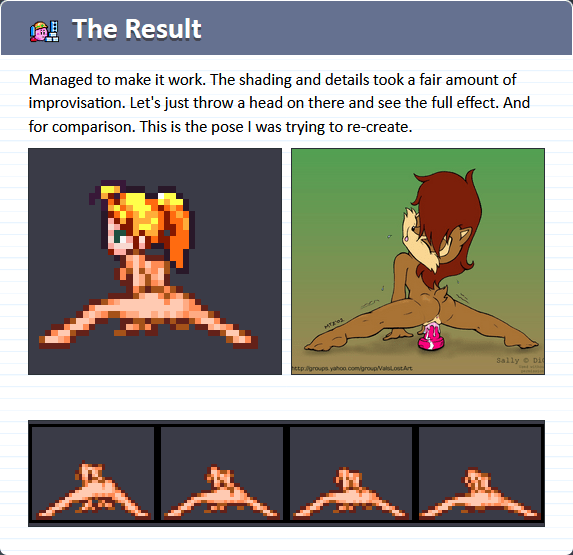
#The Result
# And here’s the result. This accomplishes exactly the same thing as my recommendations on Mastodon.
#
And when it’s resized on smart phones, the thumbnails shrink into Japanese-style vertical strips. This cropping is accomplished in CSS by using object-fit: cover on the images.
#A Better Design
(2024-12-08)
# But I think I can do better than this. My instinct as a website visitor is to want to look at the pictures in front of me. If I click one I expect to see it in full size. It feels rude to unexpectedly jump to a website instead. Maybe I should just expand on my old design for artist recommendations, where you click to see the picture and you have an obvious link button.
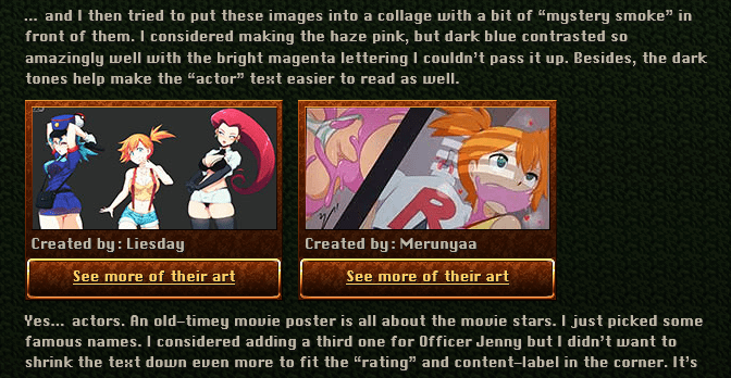
# This approach just feels better, and the thumbnails automatically resize their width in a smarter way too. It’s just a happy side-effect of each one being wrapped inside a link tag. Something to do with how CSS flexbox behaves when the inner img tags are set to a specific height.
# Now to find a way to deal with smart phone resizing.
# I’ll just use breakpoints to hide the extra pictures when they no longer fit nicely.
#Where does this belong?
(2024-12-12)
# Until now my website has been a comprehensive archive of all the things I created. My blog sort of loosened that definition since those articles are viewpoints about subjects, which are hardly accomplishments. A “favorite things” section is by definition definitely not something I created.

#
 So maybe I should re-think how I’m organizing this stuff. If I want to separate these roles from each other, maybe I should make multiple websites that serve different purposes?
.
I already know you can create sub-domains by replacing the “www” at the beginning of the URL, and hosting multiple websites on the same machine. But I have a better idea.
# A “website” is really just a bunch of folders and text files behind the scenes, and I can arrange those any way I want. They don’t necessarily have to be on different physical machines or even have different URLs. They just have to look different from each other, with their own navigation. Nobody really cares what the URL bar at the top says.

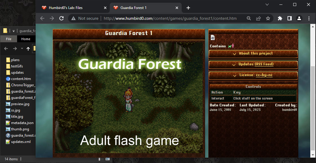
#
So my “favorite things” site could be at humbird0.com/likes
#
My projects can be at humbird0.com/makes
#
And my blog could be at humbird0.com/thinks
#
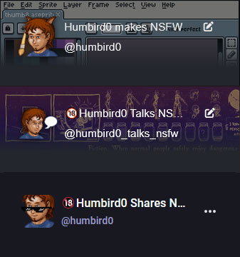
“Humbird0 makes” … “Humbird0 thinks” … “Humbird0 likes”
This has an intuitive grammar to it. I like the idea of using verbs to describe the roles of things. I already do this with my mastodon accounts.
#
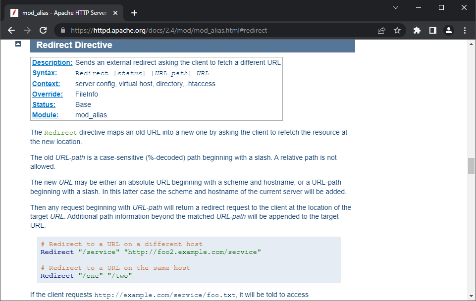
Of course if I make this change, most the the links to my website will break because all of the URLs changed. Most of my website’s files are currently inside of humbird0.com/content . But I can transparently avoid that by using a redirect to tell browsers to go to humbird0.com/makes instead. The old web engineers thought of this.
#
 I should also think ahead a little. At some point I might want to put other things on my Favorite Stuff “website” besides just a list of artists. So “Favorite Artists” should just be one of its sections. I can add more later.
# It’s kind of funny. It would be trivial to just tack-on another section or two to my existing website instead. But the well-organized part of my brain knows that I can do better, and demands it.
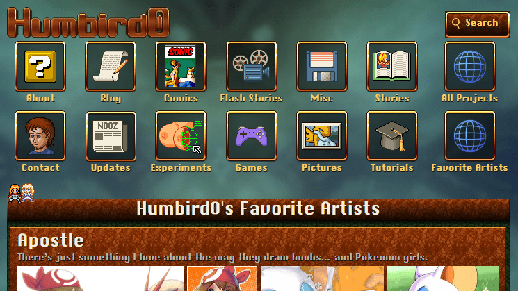
# … Which turns something simple into something daunting. Don’t get me wrong, I can totally do this, but it will take some time to design 2 more websites. In the meantime I still want people to be able to see my favorite artists without having to keep track of which mastodon instance I moved to today. So let’s just put this favorite artists gallery in its intended future location. And in time, a “favorite things” website will emerge around it.
#Discover RSS Feeds
# I think I need to make my website’s RSS feeds easier to find. I currently just have these two mysterious buttons on my “updates” page. But it’s not completely obvious what they do.
# Clicking on them just displays a nice pretty list of updates. And most people probably think that’s all they do. Very few people are going to notice that the URL is actually an XML file. And even fewer people would ever guess that these can be put into an RSS reader.
# I don’t even explain what RSS feeds are! Sure back in 2012 everybody was using them, but it’s been a hot minute since then.
# Another problem is that anybody who is actually looking for RSS feeds on my website won’t be able to find them because the words “RSS” and “Feed” don’t appear anywhere on the page. It doesn’t even have the iconic RSS symbol.
#Multiple RSS Feeds for Favorite Pictures
# I also have an interesting idea. Maybe I can add multiple RSS feeds to may favorite pictures page, as a way to opt-in to each fetish? Kind of like the website’s content filters. Each feed would display the pictures that have that kink.
# At first glance this idea might seem flawed. A picture can have more than one theme, so that same picture would show up in more than one RSS feed. You wouldn’t want to see the same picture multiple times.
# Well actually that might not happen. RSS feeds give each “article” a unique ID, so RSS feed readers can filter out duplicates… in theory. But I don’t know if any of them actually bother to do this. I would have to try out a bunch of them to find out if this feature is common.
#Dodging Censorship Using RSS
# This led me to ponder other creative uses for RSS. These days (as of 2025) a lot of US states and most of Europe legally require websites to verify the age of users using “robust” technology… somehow… whatever that means.
# I don’t like the idea of collecting user data. Is there a way for my website to filter out most young’uns? Hmm… come to think of it how many people even remember how to use RSS? It fell out of popular use around 2012. So if you know how to use it, then you’re probably an adult.
# A fun idea, but it has 2 obvious flaws.
- It over-corrects. The iPhone came out 18 years ago. So there are grown adults today that were born with an iPhone in their hands, and have never used anything else. They would have been only 5 years old when Google Reader was cancelled and the world forgot about RSS, which means a growing number of adults never saw RSS to begin with.
- Let’s be real. RSS is for computer nerds. I mean it should be for everybody. But only a nerd has enough curiosity to discover that it even exists. If iPhones don’t come with a giant “RSS” button on the home screen, it is effectively hidden from most of the world.
# Buuuut…. if I ever need to hide the fact that my website has porn, I could theoretically put it all into RSS feeds instead of HTML pages. I don’t think most regulators or web hosts will think to examine a website’s XML files. After all that’s just “miscellaneous data” for computer programs right?
# (Hackers: It’s a garbage file. It’s junk!)
#Too Wide to be Buttons
(2025-09-01)
# I’ve noticed that a lot of the buttons on my website don’t really feel like buttons. But why? They all have obvious borders and unique color, but somehow it doesn’t feel obvious that you can click on them.
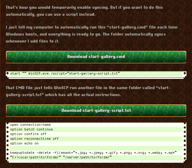
# Wait a minute… the answer is staring me right in the face!
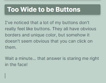
# This is my markdown editor. Do you see that header at the top? Doesn’t that look awfully similar?
# Apparently wide buttons look exactly like headers.
# So the solution is…
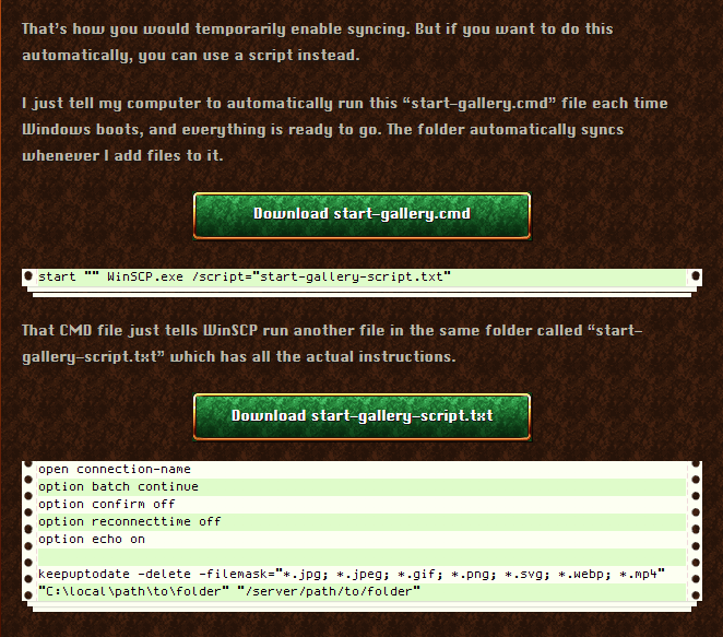
# Yeah, somehow that works! A button needs to feel like a discrete “thing”, separate from the page. I think the key is to break the alignment. If it aligns with the edges of the text, it feels like part of the text. Breaking that alignment breaks the association, so it stops being “text” and becomes something else. It’s own thing. A discrete thing.
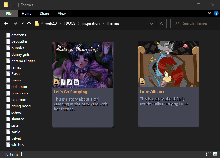
#Themes
(2025-09-10)
# Just swap out the window backgrounds and borders. Maybe even the text colors too.
# I want to re-organize my website into 3 “websites”
- What I make
- What I think
- What I like
# They don’t actually need to be on separate servers. They just need to look like difference sites.
# But… I’m too lazy to completely design 2 new websites from scratch. If only somebody figured out a way to re-use the same layouts with a new coat of paint. Hmm…
# (Winamp Skins)
# Not only does this have a solution. It has more than one solution! Here’s what Final Fantasy 6 does.
# (Final Fantasy 6 window settings)
# I think I go with the Super Nintendo style solution. Easy but effective. Just swap the backgrounds and borders and leave everything else the same. I can even re-use the same CSS file. Just stick a few CSS variables in there. And let another tiny CSS file set those variables.
# Of course I shouldn’t forget about Firefox’s CSS theme selector. My new “websites” will default to different themes from each other, but I can also let people choose the themes as well.
# In theory I have already made things easy for myself. I abstracted away the colors and fonts when I built my website. So their values are stored in a separate .LESS file.
#
So let’s just do the obvious thing and make a CSS variable storing the theme number and have different folders for each theme.
/css/themes/1/background.jpg
/css/themes/2/background.jpg
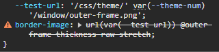
# Oh… css variables don’t work inside of url()

#
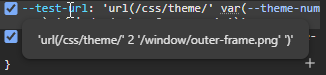
No problem! I’ll just add the word url() inside a variable.
Nope! Because it includes the spaces and quotes in the path, and that’s not teeeeechincally a proper URL.

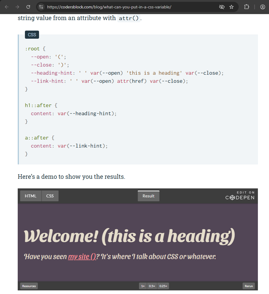
# Apparently combining multiple pieces of text together like this only works for “content”, meaning you’re displaying that text directly. But that doesn’t help me.
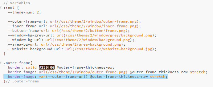
# Okay since I can’t combine text variables together, I’ll just have to store pre-made paths and refer to them… and yeah that works! Here it’s loading from the theme/2 folder which contains inverted versions of all the decoration pictures.
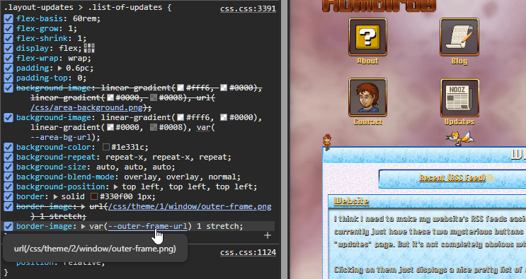
# So now it’s as simple as putting these variables into a few tiny CSS files, adding them to the HTML pages, and letting Firefox pick between the themes. And if you’re using Chrome, well… I guess you’re stuck with the defaults because Chrome doesn’t have this menu.
# This might also be a clever way to hide NSFW content. You could require people to pick the “NSFW” theme in Firefox. And use display:none to hide certain HTML div containers by default when it’s not used, just like I do with my content filters.
# Buuuuuut… the browser always forgets your selection if you go to another page, so… JavaScript to the rescue I guess? Yeah why not! This is not a critical feature anyway. The real goal is to add an easy way to make multiple “websites” look different from each other by default, without any real work.
# And speaking of real work. What DO I want these other sites to look like anyway?