#Anything is possible… Help!!
# I have been meaning to have 3 websites. What I make. What I like. And what I think. Which basically amounts to a projects gallery, a recommendation museum, and a blog.
#
In theory a blog should be the simplest one to create, since people have already made many Hugo themes for that. But I think most blogs look unbearably boring. 
#
 … So my absolute need to customize and decorate makes this project less straightforward, and trying to pick an overall aesthetic theme has put me in a state of analysis paralysis for a few months now. Of course since absolutely nothing is actually at stake this problem is hardly stressful, but still… it sure would be nice to make progress. I know how to make things, I just can’t decide what to make!
#The Magazine Dead-End
#
 At first I toyed with the idea of making it look like a Nintendo Power magazine, and I still like the idea, but I have been flip-flopping on whether to go for it.
# It turns out that multi-column layouts can very easily become impractical in HTML if the article’s text is too long. With magazine layouts, the text has to be tailored and re-written to exactly the right length to fit inside the page / screen you’re viewing it on, otherwise you’ll end up with lots of tedious scrolling. A long multi-column layout means scrolling down to read the first column and then scrolling all the way back up just to start reading the next column. That’s bad! The whole point is to be able to see the entire article, all at once, without needing to scroll at all! But if you don’t know how big the screen is going to be you cannot design a one-screen layout. In a world where phones exist, every screen is different.

# So if I dismiss the Nintendo Power design idea, what can I do instead??
#Random Star Fox Theme
# I know I shouldn’t let my tools do the designing for me, but without any direction I just did some aimless tinkering. Lots of websites look flat, so I wanted a background that conveys depth. A landscape can do that, so as a test I grabbed a background from Star Fox 2 on the Super Nintendo that seemed to have the effect that I wanted. Then I decided, “What the hell, let’s keep that.”
# Unlike my project website, I feel like it’s okay for my blog present things I didn’t make. After all I will probably use it to talk about my favorite things anyway. So sure… it guess my blog is going to have a Star Fox theme. Why not?

#
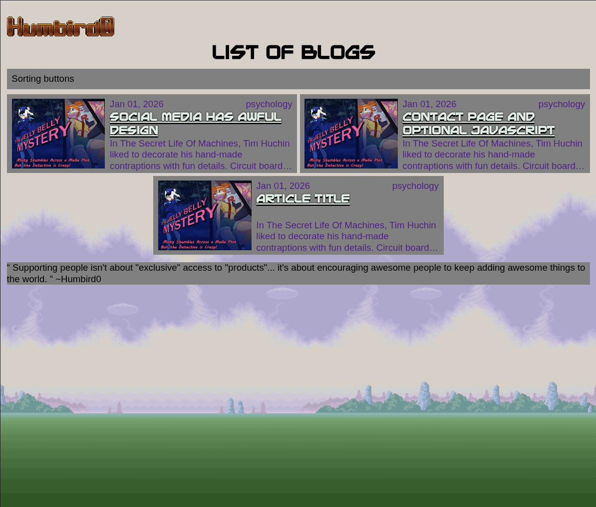
 Having abandoned the magazine-layout idea, I think I’ll mostly stick with my previous blog layout from my project website, with the content on the left and metadata on the right. A multi-column layout would have filled the entire width of the screen with the content, but stretching a single column across a potentially 4K screen would be uncomfortably wide so I have to limit its width to something that is easy to read and find other things to fill the empty space with. And the only other things that even exist on this blog are the table of contents, and the website’s navigation.
# But a blog website barely needs any navigation. The entire website is just a single list of articles… and the articles themselves, and maybe a website logo at the top. Honestly the only “navigation” that needs to exist on the actual articles is just a single link back to the list.

#
 And there is something kind of appealing about a web page that contains nothing except content. A pure document. Something designed to seen on its own instead of just being part of a website. I was reminded of this concept when I read about Project Gemini, a deliberately simpler web standard that tries to encourage people to write meaningful documents, with no decorative elements like “hero images.” Just links to things that actually matter. Personally I happen to enjoy showy maximalist designs, but I also appreciate the idea of something being self-contained and useful.
# Technically there’s no reason why my blog articles even need a website logo. But it is something that people expect to see in order to know which website they are on. The main logo is usually also also a link back to the website’s “home” page. And if nothing else it also acts as a signature showing who wrote the article or where it came from. In my case it can be both.

#Panel Cylinders
#
 So what should the “panels” of my website look like? I need some kind of background behind my text to “frame” it and give it places to “belong”. Continuing with the Star Fox aesthetic maybe I can use some kind of primitive 3D shape? Thinking back on it now I could have just added simple angular bezels to make things look like floating 3D panels…
#
 … but no I had to be ambitious and turn everything into cylinders! This did lead to some interesting (and successful) experiments. So how can you make something look like a cylinder using CSS?
# One obvious thing to try are rounded rectangles. Just stretch the curve ALL the way to the middle to create a half-circle. And then use this at the bottom to create an ellipse to show the “bottom” of the cylinder. But… stretched rounded corners don’t quite curve enough at the edges to look “round”.

# Okay if CSS by itself can’t do it right, maybe I can just draw the shapes using SVG vector graphics and then display those pictures on the top and bottom? This makes the CSS simpler and it looks pretty good. But I still have to manually apply the effect to the top and bottom of every single html tag that is supposed to look like this. Yes I can do this entirely in CSS using :before and :after pseudo elements, but it is still extra work.

#
 Is there any other way to display a picture at the top and bottom of html elements without doing all that? Actually yes! Border images! Normally this is used to surround something with a decorative border, but it’s possible to just make the sides of your border 0 pixels wide.
#
Yes this makes the CSS much easier! No need to add extra things before or after everything. Now to just add the background gradient and… oh.
Okay right. The border is treated like something “inside” of the element so I guess I need to use some kind of mask to hide the corners.


# Hmm… setting the clip-path to the SVG itself doesn’t work at all.

# Alternatively, setting the mask to the SVG doesn’t stretch the same way as the displayed picture does.

# But there are other ways to define the shape. Maybe I can just use “path()” and copy the SVG shape into it? No that always scales the shape proportionally. I actually want it to stretch!
# Maybe I can use “shape()” and manually draw the vector shape in CSS? Hmm… “arc to” doesn’t quite curve right. Maybe I should use bezier curves instead? Yes “curve to” looks perfect! Now to just add a few more lines of text and… oh. It stretches the width AND the height.


# Okay maybe I don’t actually need a mask? Maybe I can just vertically shrink the background color so that it doesn’t spill out above and below the curves? I just need to get the size right and… wait why does that look perfect the first time? And why doesn’t changing the measurements actually change the size?
# So, uuuuh… I didn’t actually need to change the size at all. I just needed to tell the background NOT to repeat and it defaults to stretching to fill the text area. Exactly what I needed! Apparently the solution was much simpler than I thought. Just use a border-image to add a top and bottom, and then fill the middle. No masking necessary at all.


# Now everything can look like surreal floating cylinders. One funny side-effect of this is when the table of contents it empty, the CSS still adds the top and bottom around it resulting in a mysterious floating disc. I kinda like it! And since my table of contents sticks to the top when you scroll down the page, this mystery disc will follow you down too! Fun!


#Header Logo
# Let’s dress up the title text of the articles. If I’m using a Star Fox style then how about making them look like the Star Fox title screen?

# So adding a gradient to text using CSS is kind of a hack. You make the text’s background a gradient, then you make the text itself transparent so only the background is visible, and finally you mask it to the shape of the text.
# That’s a start, but it’s blending into the background. It needs an outline.


# But I’ve painted myself into a corner with the gradient hack. Normally I can add an outline by centering a text shadow and making it really thin, but my text is transparent so the shadow gets drawn on top of the gradient background.


# Another option is to use -webkit-text-stroke which technically works. But “webkit” features generally only work in Google Chrome and I want this to work on all browsers. Besides, it’s putting the outline along the inside of the text, making it look way too thin. The text is supposed to be bold, so I want to add the outline to the outside.

# A 3rd option is to use an SVG filter. You can apply features of Scalable Vector Graphics to other parts of a web page. And SVG files can do things that regular CSS can’t.


